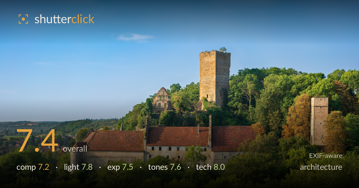
Hilltop castle in morning light
Photo by Roman Eisele

| Focal length | 35 mm |
| Aperture | f / 10.0 |
| Shutter | 1/100 s |
| ISO | ISO 100 |
| Exp. comp. | -0.7 EV |
| Shot at | 08:38 · Aug 12, 2020 |
A handsome elevated view of a hilltop castle complex, carried by warm low-angle light that models the stone tower and rakes across the red-tiled roofs. The layered depth — foreground canopy, castle, distant village and hills — gives real sense of place. What holds it back most is the loose distribution of interest: the ruined keep, the second tower on the right, and the long roofline compete without a firm compositional anchor, and the surrounding trees crowd the lower and right edges. The horizon also sits slightly high, weighting the frame downward. Strong material for a stately architectural landscape that would benefit from a tighter organising structure.
The elevated vantage builds good depth, stacking treetops, the castle band, and the hazy village and hills beyond. The main keep tower sits usefully off-centre near a third line. But the frame carries too many competing anchors — the ruined wall, the tall keep, the distant right-hand tower — with no single dominant relationship pulling them together. Trees encroach heavily along the bottom and right, and the roofline runs almost edge to edge without breathing room. A slightly higher or lateral vantage would help separate the towers and give the complex a clearer read.
Warm, low-angle light — likely early morning given the softness — is the image's biggest strength. It rakes across the tower stonework, revealing texture and coursing, and warms the tiled roofs without blowing them out. The right-hand tower and foliage catch a pleasing golden edge. Shadows are open and directional, giving the buildings volume rather than flat frontal light. The sky is clean and gradated. A touch more shadow-side contrast on the main keep would sharpen its dimensionality, but the timing and direction are well judged for this subject.
The -0.7 EV compensation was a sound call, protecting the bright sky and the sunlit red tiles from clipping while keeping the shadowed foliage readable. Highlights on the roofs and stone hold detail, and the histogram appears well contained across a wide dynamic range. The deep-green foreground shadows retain structure without muddiness. Midtones sit a little dark overall, giving the lower third a slightly heavy feel; a modest local lift on the foreground canopy would balance the frame without touching the well-preserved highlights.
The colour palette works — warm sandstone and terracotta play against cool blue sky and saturated greens, a classic complementary balance for golden-hour architecture. White balance leans warm appropriately for the hour. The green foreground is vivid and could edge toward oversaturation in the lower canopy, flattening some tonal separation between the many overlapping trees. The distant hills carry a natural atmospheric haze that reinforces depth. Contrast is moderate and pleasant; slightly more tonal separation in the massed greens would keep them from reading as a single block.
The settings are well matched to the subject. f/10 on the Loxia 35 delivers front-to-back sharpness suited to a distant architectural landscape, keeping both the castle and the far village in focus without pushing into diffraction softening. ISO 100 yields a clean file with no visible noise, letting the A7R2's resolution render the stonework, tile courses, and window detail crisply. 1/100s is ample for a static subject on a tripod or steady hands at this focal length. The 35mm prime is a natural choice for this framing, and its correction keeps verticals largely honest — the main keep and right tower stand true without obvious keystoning, which matters in architecture. Focus placement looks accurate across the plane. The only minor technical note is that the foreground trees at the bottom edge fall slightly soft relative to the castle, suggesting focus was set on the structure — a defensible priority. Overall this is clean, deliberate execution with no meaningful faults.
What would elevate it
Tags
Shot something like this?
Expert photo critique, on demand — scored across six categories, EXIF-aware. Start with 3 free critiques, no credit card.
critique my photo — free