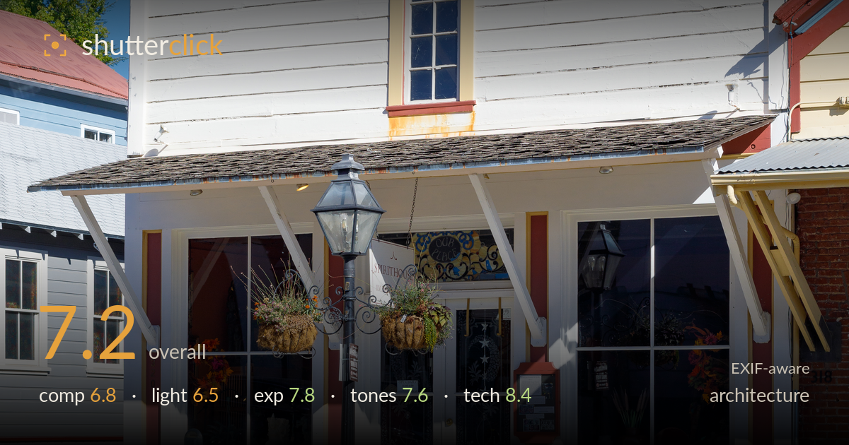
Historic storefront under blue sky
Photo by Frank Schulenburg

| Focal length | 50 mm |
| Aperture | f / 9.0 |
| Shutter | 1/250 s |
| ISO | ISO 100 |
| Exp. comp. | -0.33 EV |
| Shot at | 17:29 · Oct 19, 2020 |
A clean, well-documented facade of a historic clapboard storefront, executed with strong technical discipline and honest colour. The white siding, red trim, and yellow window surrounds are rendered faithfully against a deep blue sky. What holds it back is the framing decision: the vertical is nearly centred but leans slightly, the ornate lamppost bisects the entrance awkwardly, and the flanking buildings intrude without adding much. The hard mid-morning light flattens the wood texture and casts a distracting shadow across the lower left. As record-keeping architecture it succeeds; as an image it wants tighter geometric control and kinder light.
The frame centres the storefront but includes competing neighbours on both sides that dilute the subject rather than provide context. The black lamppost lands directly in front of the entrance, splitting the doorway and creating an unfortunate merger with the hanging sign. The building tilts subtly to the right, so verticals aren't quite true. Generous foreground road and sidewalk anchor the base well. A step to the left, or a tighter crop excluding the yellow building at right, would let the facade breathe as the sole subject.
Mid-morning sun rakes from the upper right, which does model the cornice and window surrounds with some depth, but the overall light is hard and contrasty. The lower-left corner falls into a heavy diagonal shadow that pulls attention away from the entrance, and the clapboard's texture is somewhat flattened where the sun hits straight on. The deep blue sky is a genuine asset. Softer, more even light — an overcast day or the lower angle of late afternoon — would balance the shadowed and lit halves.
Exposure is well judged. The -0.33 EV compensation protects the bright white siding, which holds detail without clipping across most of the facade. Shadow areas in the recessed doorway and dark window glass retain enough information to read. The blue sky is rich and unblown. Only the sunlit white cornice edges push toward the highlight ceiling, but nothing critical is lost. The histogram sits comfortably, with deliberate placement of the bright building against the deep sky. A confident, technically sound exposure for a high-contrast scene.
White balance is accurate and neutral — the whites read clean without a colour cast, and the sky's blue is convincing rather than oversaturated. The red-and-yellow trim palette is faithful and pleasing against the clapboard. Contrast runs a touch high from the harsh light, deepening the shadowed left corner more than ideal. The brick of the neighbouring building at right adds a warm counterpoint. Mid-tone gradation on the white siding is smooth. A slight shadow lift in post would recover the darker corner and even the tonal balance.
Excellent technical execution for architecture. The Zeiss Milvus 50mm at f/9 is an ideal pairing — a near-perfect aperture for edge-to-edge sharpness across a flat facade while avoiding diffraction softening, and the 50mm focal length gives a natural perspective with minimal distortion. Focus is crisp on the building plane, with fine detail visible in the clapboard seams, the shingled awning, and the ornate ironwork of the lamppost. ISO 100 keeps the file clean and noise-free, and 1/250s is more than adequate for a static handheld subject. The lens's excellent correction shows in the straight, undistorted lines. The one technical shortfall is perspective control: the whole facade tilts slightly right and there is mild keystoning as the verticals converge toward the top — the frame wasn't quite squared to the building, and no tilt-shift or careful levelling was used. For architecture this matters. A tripod with a level, or perspective correction in post, would resolve the last piece.
What would elevate it
Tags
Shot something like this?
Expert photo critique, on demand — scored across six categories, EXIF-aware. Start with 3 free critiques, no credit card.
critique my photo — free