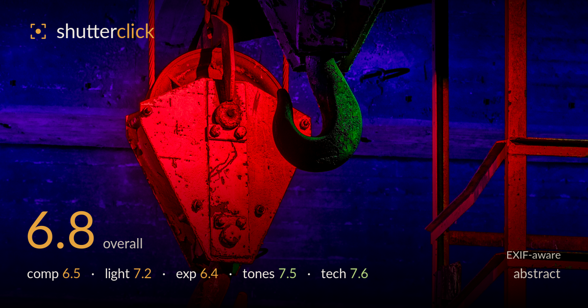
Hooks under red and blue light
Photo by Dietmar Rabich

| Focal length | 151 mm |
| Aperture | f / 13.0 |
| Shutter | 5.0 s |
| ISO | ISO 100 |
| Exp. comp. | 0.0 EV |
| Shot at | 20:51 · Mar 14, 2025 |
A bold colour-lit industrial abstract that trades on saturated red-blue-magenta contrast and heavy hook forms. The colour theatre is the strongest asset — the split of warm crimson against deep cobalt gives the frame real graphic punch, and the green-tinged hook adds a chromatic accent that keeps the palette from feeling merely binary. What holds it back most is compositional crowding: two large pulley blocks, cabling, and a staircase compete without a clear hierarchy, and the deepest shadows swallow detail that the eye wants to read. Tightening the arrangement and lifting the darkest tones would let the shapes breathe and give the colour more room to work.
The two suspended blocks anchor the frame with strong triangular mass, and the diagonal cabling adds tension. But the arrangement is busy — the upper pulley, lower hook block, and the ladder-and-railing structure on the right all vie for attention with no clear lead. The right edge feels cluttered against the cleaner left. The stacked hooks descending on a diagonal is the most compelling relationship; leaning into that and simplifying the surrounding structure would sharpen the graphic read considerably.
The coloured lighting is the driving idea and it largely succeeds — hard directional red raking across the lower block, cool blue filling the background wall, and magenta blending across the upper pulley. The green cast on the central hook is a happy accent that lifts the palette beyond a simple two-colour split. Direction reads believably, shaping the metal forms. The main limitation is that the light falls off into near-total black in the corners, costing texture that would reward the eye.
Exposure leans dark, which suits the moody intent, but the shadows crush to pure black across large regions — the upper-left ceiling and lower-right areas lose all detail. The lit surfaces are well placed and the red block edges toward but doesn't blow its brightest facets. A histogram would show a heavy left-side stack with a thin midtone bridge. Lifting shadows a stop in post, or a marginally brighter capture, would recover structural detail without diluting the drama.
The strongest category — the saturated complementary palette of crimson and cobalt with magenta transitions is confidently handled and genuinely striking. Colour separation between the two blocks reads cleanly. The green hook accent introduces welcome triadic interest. Saturation runs high but stays this side of clipping on most surfaces, though the reddest planes flirt with losing tonal gradation. Contrast is punchy and appropriate to the abstract intent. A touch of restraint on the reds would preserve more surface texture.
The settings are well matched to a static, tripod-based interior. At f/13 the 151mm framing carries deep-enough focus to hold both hook blocks acceptably sharp across their depth, and ISO 100 keeps the shadows clean of noise where any detail survives. The 5-second exposure is sensible for a still subject under fixed coloured lighting, and the 70-300mm at the long-ish end compresses the two blocks pleasingly against the background. Focus appears placed on the near red block, which is reasonable given it carries the most detail. The one caution is that f/13 on a full-frame sensor at this focal length invites some diffraction softening — f/8 to f/9 would likely have held equal depth here with marginally crisper micro-detail on the rusted surfaces. Overall execution is solid and deliberate; the technical choices serve the image rather than fighting it, and there is no motion or noise penalty to speak of.
What would elevate it
Tags
Shot something like this?
Expert photo critique, on demand — scored across six categories, EXIF-aware. Start with 3 free critiques, no credit card.
critique my photo — free