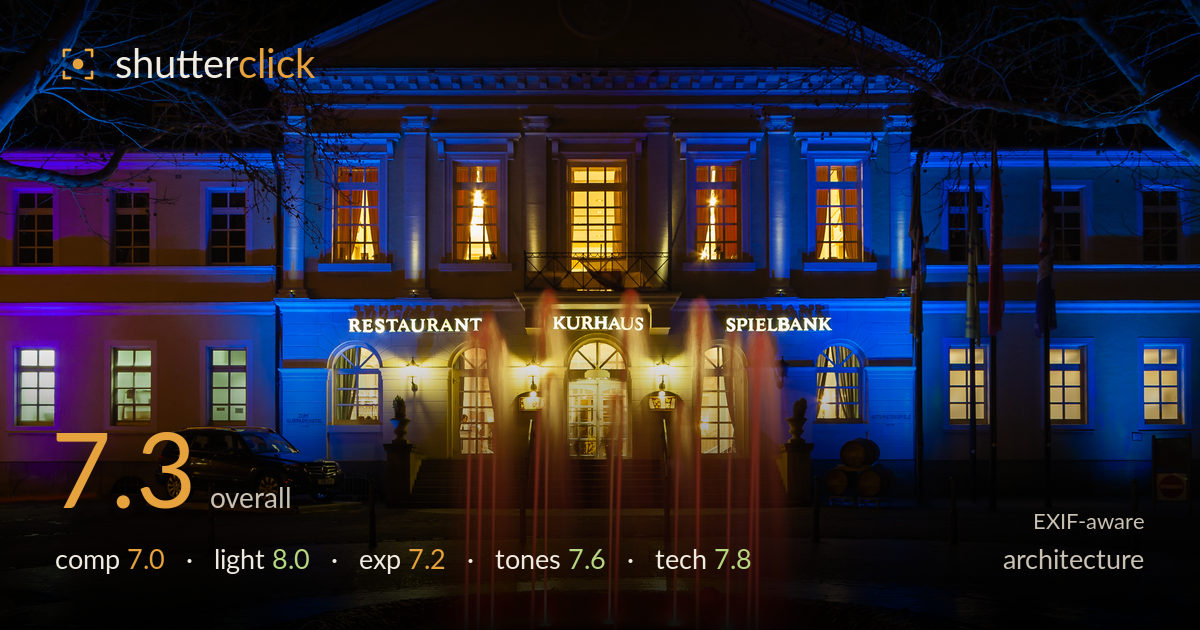
Illuminated kurhaus and red fountain at night
Photo by Friedrich Haag

| Focal length | 17 mm |
| Aperture | f / 8.0 |
| Shutter | 3.0 s |
| ISO | ISO 200 |
| Exp. comp. | 0.0 EV |
| Shot at | 21:16 · Mar 14, 2009 |
A confident night architecture frame that balances a symmetrical, floodlit facade against a lively red fountain, and the colour contrast between the cool blue building and warm interior windows carries real impact. The frame is well centred and the verticals largely hold. What most holds it back is the foreground: the wet plaza and fountain surround read as dark, empty mass that eats the lower third, and the overhead branches intrude awkwardly at the top corners. The fountain, though a striking feature, partially obscures the entrance and 'KURHAUS' signage. Tighter attention to those edges and foreground balance would lift a strong exposure into a polished result.
Centred symmetry suits the formal facade, and the fountain anchors the middle with strong colour contrast. However, the fountain jets rise directly across the entrance and partly veil the 'KURHAUS' lettering and doorway, softening the building's role. The lower third is a large expanse of dark, wet paving that adds little beyond reflection. Bare branches creep into both top corners and the top edge, framing loosely rather than deliberately. A slightly higher vantage or lower framing would rebalance the foreground weight against the facade.
The mix of light sources is the image's biggest strength. Cool blue floodlighting sculpts the stonework while warm tungsten glow from the interior windows provides a rich complementary counterpoint, and the entrance lamps add welcome focal warmth. The red fountain jets introduce a third accent that ties the palette together. Purple spill on the left wing adds variety without feeling arbitrary. The blue-hour timing keeps the sky from going flat black and preserves the tree silhouettes. Well-observed use of the venue's own lighting scheme.
The three-second exposure holds the bright interior windows and the illuminated 'RESTAURANT' and 'SPIELBANK' lettering without serious clipping, which is a good result given the range of sources. Highlights in the warmest window panes edge toward blowing but retain some structure. Shadows in the paving and fountain surround fall heavy and nearly featureless, sacrificing detail in the lower half. The overall balance reads deliberate for a night scene, though a touch more shadow recovery would reveal the wet-stone texture without lifting noise excessively.
The blue-versus-amber colour relationship is the tonal engine here and it works, with the red fountain acting as a saturated accent that draws the eye. White balance leans cool on the facade, which reads as intentional stage lighting rather than error. Saturation is pushed but stays this side of garish. The dark foreground crushes toward pure black, flattening tonal gradation in the lower third. A little more midtone separation in the wet paving would preserve the reflections without diluting the vivid colour contrast above.
The settings are well matched to a night architecture scene. f/8 at 17mm on the 10-22mm ultra-wide keeps the whole facade sharp front to back and sits in the lens's sweet spot for corner performance. ISO 200 keeps noise minimal, essential in the dark foreground where shadow lifting would otherwise reveal grain quickly. The three-second exposure is the deliberate choice that renders the fountain jets as smooth streaks of light rather than frozen droplets, and clearly required a tripod, which the crisp building edges confirm. Focus is accurate across the facade. The wide focal length introduces mild perspective effects but verticals hold well, suggesting either careful levelling or a fairly square-on position. The aging 350D sensor limits dynamic range, which shows in the heavy shadows, but the exposure was managed to protect highlights first. Sound execution overall; a mild perspective correction in post would tidy the slight lean at the frame edges.
What would elevate it
Tags
Shot something like this?
Expert photo critique, on demand — scored across six categories, EXIF-aware. Start with 3 free critiques, no credit card.
critique my photo — free