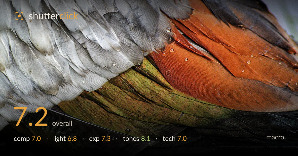
Iridescent feathers in the rain
Photo by TerriAnneAllen

No EXIF metadata in this file
Technical analysis based on visual assessment only.
A close study of duck plumage that succeeds most through its colour: the diagonal run from cool grey-white through iridescent olive-green into rust and deep charcoal is genuinely striking and holds the frame together. The layered feather structure gives a strong sense of pattern and rhythm. What holds it back is critical sharpness — the diffuse light flattens the fine barb texture that macro thrives on, and no single plane is rendered crisply. A raking light and a tighter focus discipline would turn a good abstract of colour into a detail study with real bite.
The strong diagonal sweep of feather bands from upper right to lower left gives the frame a clear directional energy, and the colour transition across it reads as a natural leading structure. The layering of feather rows builds rhythm. The blurred grey background strip along the top-right edge is a weak zone that adds little and slightly dilutes the otherwise all-over fill. Cropping into the plumage entirely, removing that background sliver, would keep the frame pure texture and colour and strengthen the abstract reading.
The soft, overcast light renders the colours evenly and avoids blown highlights on the glossy feather surfaces, which suits the iridescent greens and rusts. But that same flat, diffuse light is the shot's main limitation: it fails to model the fine feather barbs, so the surface reads as broad colour fields rather than crisp individual filaments. A low, raking side light would carve out edge separation between feathers and reveal the micro-texture that gives macro plumage work its dimensionality.
Exposure is well controlled across a demanding range — the bright whites at left retain detail without clipping, and the dark charcoal feathers at lower right hold shadow information rather than blocking up. The midtones through the green and rust bands sit comfortably, giving the colour room to breathe. The water droplets scattered across the surface keep small specular highlights in check. A touch more shadow lift in the deepest lower-right feathers would recover a little more structure there.
The strongest element of the image. The colour progression — cool grey-white, iridescent olive and bronze-green, warm rust and burnt orange, into near-black — is rich and well balanced, and white balance reads neutral and true. Contrast is judged well enough to keep the iridescence alive without oversaturating into candy. The green-to-rust transition band is the emotional centre and it sings. Saturation stays believable throughout. Tonal gradation across the feather rows is smooth and natural.
As an abstract of colour this holds up, but judged as macro the technical execution falls short of the genre's core demand: precise focus on a defined plane. No area of the frame is truly tack-sharp — the white feathers at left and the rust band at right both show softness, and the fine barb structure that should resolve into individual filaments stays mushy. This points either to a focus plane that missed the intended peak or to diffraction/motion softening the whole frame. The scattered water droplets are the sharpest cues available and even they lack crisp edges. Depth of field appears reasonable for the shallow feather relief, so the issue is focus accuracy rather than aperture choice. Working from a stable support, stopping down modestly, and focusing carefully on a single feather row — or focus-stacking across the layers — would deliver the fine detail this subject rewards. The colour and pattern carry the frame; sharpness is what would elevate it.
What would elevate it
Tags
Shot something like this?
Expert photo critique, on demand — scored across six categories, EXIF-aware. Start with 3 free critiques, no credit card.
critique my photo — free