Iridescent folds of woven fabric
Photo by Engin_Akyurt

No EXIF metadata in this file
Technical analysis based on visual assessment only.
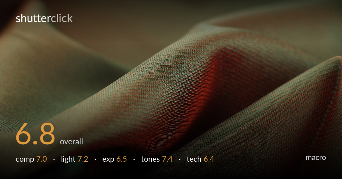
A confident study of fabric drape, carried by the diagonal fold sweeping across the frame and the iridescent shift from olive-green to deep red as the weave catches light. The shimmer of the two-tone shot fabric is the real subject, and it reads beautifully through the midframe. What holds it back is focus placement: the sharp plane sits in a relatively narrow band across the centre, while the most graphically interesting fold edges fall into softness. The deep shadow in the lower portion swallows weave detail it could have kept. Tighter focus discipline and a touch more shadow recovery would lift it.
The diagonal fold running lower-left to upper-right gives the frame a strong spine, and the soft out-of-focus crest top-left adds depth and breathing room. The valley of the fold draws the eye through the iridescent transition nicely. The lower-right corner crowds into near-black, weighting the frame heavily downward, and the brightest weave detail sits slightly low-centre rather than on a stronger intersection. A composition that gave the brightest, most textured ridge a clearer anchor point would feel less evenly spread.
Soft directional light rakes across the weave from upper right, which is the correct instinct for fabric — it pulls out the diagonal twill texture and makes the iridescence sing where the green and red planes meet. The gradient from lit ridge into shadowed valley shapes the drape convincingly. The fall-off into the lower-right is steep, though, killing texture in a sizeable chunk of the frame. A second, gentler fill from the lower side would have preserved detail in those shadowed folds without flattening the modelling.
Midtones on the lit ridges are well placed and hold the weave structure cleanly. The trouble is the shadow end: the lower-right and the deep valley folds crush toward black, losing texture that the rest of the frame proves was worth keeping. Highlights are restrained with no clipping on the brightest red band. The histogram leans dark overall, which suits the mood but sacrifices recoverable detail. A slightly lifted exposure or shadow lift in post would balance the tonal spread without washing out the richness.
The colour is the standout — the shot-fabric iridescence shifting from muted olive to oxblood red is rendered with real subtlety, and the warm/cool interplay across the weave gives the image its character. White balance feels deliberately warm, suiting the material. Contrast is handled with restraint on the highlights, though the shadows tip slightly muddy where green and red mingle into brown. The saturation stays believable rather than pushed. A touch more separation in the darker folds would keep the colour story intact deeper into the frame.
The shallow depth of field is appropriate for macro fabric work, but the focus plane is the weak link. The sharpest weave detail sits in a band across the centre-left, while the graphically important fold crest and the lower folds drift soft — for a texture study, the eye wants crisp thread structure across more of the key ridge. Where focus lands, resolution of the twill weave is genuinely good, with individual threads cleanly described. Noise is well controlled and there is no visible motion blur, suggesting a stable setup. For this kind of subject, a narrower aperture or a focus stack of two or three frames would have held the full sweep of the lit fold sharp without sacrificing the soft background fall-off. The current single-plane approach leaves too much of the most interesting structure on the soft side of the focus transition. Lens rendering and microcontrast are otherwise strong.
what would elevate it
tags
Shot something like this?
Expert photo critique, on demand — scored across six categories, EXIF-aware. Start with 3 free critiques, no credit card.
critique my photo — free