Karate belts and patches
Photo by stevepb

No EXIF metadata in this file
Technical analysis based on visual assessment only.
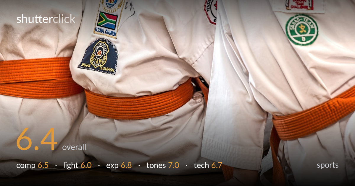
A tightly observed detail shot that trades the decisive action for texture and symbolism — orange belts, embroidered patches, and a single grounded hand telling the story of kneeling karateka. The repeating belts and crisp uniforms give it graphic strength, but the framing is busy and lacks a clear hierarchy; the eye wanders between three similar bodies without settling. The hand pressed to the floor is the most human, narrative element and deserves more emphasis. Light is flat and even, serviceable but doing little to model the white fabric. A more decisive crop and a stronger focal anchor would lift it.
The horizontal rhythm of three orange belts against white gi creates a strong graphic repetition, and the cropped, abstracted approach is a bold choice over a wide action frame. But the arrangement is crowded and competing — three near-identical torsos give the eye no clear place to land. The hand pressed to the floor at lower centre is the genuine focal point and the most telling gesture, yet it sits small and almost lost. Tighter framing around that hand and one belt would resolve the clutter into a clear statement.
Even, diffuse indoor light keeps the white uniforms readable without blowing out, which is the safe call for a high-key subject. The trade-off is flatness — the gi fabric reads as a broad white mass with little of the fold-and-shadow modelling that would give it dimension and texture. The patches retain their colour and detail, which helps. A more directional or raking light would carve the creases of the fabric and lend depth, separating the overlapping bodies that currently merge into one tonal block.
Exposure is well controlled for a difficult high-key subject. The white gi holds highlight detail across the folds rather than clipping to paper, and the embroidered patches keep their saturation and legibility. Shadow areas in the deeper creases and the wooden floor retain detail without muddiness. The midtones of the skin tone on the hand sit naturally. If anything, the overall brightness is slightly cautious, leaving the frame a touch flat, but that protects the highlights — a deliberate and defensible trade for this fabric.
The colour relationship carries the image: warm orange belts against cool-neutral white, grounded by the warm brown floor — a clean, satisfying palette. White balance reads accurate, with the gi neutral rather than tinted, and the patches showing faithful reds, greens and blues. Contrast is moderate and the tonal range well distributed. The orange is vivid without looking oversaturated. The overall rendering is pleasing and coherent; a touch more micro-contrast in the white fabric would add separation, but the colour handling is the photo's quiet strength.
Focus appears placed on the central belt and patches, which are crisp, and the hand on the floor holds reasonable sharpness too. Depth of field looks moderate — enough to keep the foreground subjects defined while letting the floor fall slightly soft, which suits the cropped, detail-driven intent. No motion blur is evident, so shutter speed was sufficient for these static, kneeling figures. Noise is well controlled, suggesting a sensible ISO under the available light. The lens choice and working distance produce a flat, frontal rendering that emphasises the graphic patches but flattens the bodies into one another. Sharpness is consistent where it matters, and there's no visible chromatic aberration along the high-contrast patch edges. The main technical limitation is not execution but framing decisions — the focus and depth serve the patches well, but a slightly tighter plane of focus isolating the hand or one belt would have given the technical choices a clearer subject to serve.
What would elevate it
Tags
Shot something like this?
Expert photo critique, on demand — scored across six categories, EXIF-aware. Start with 3 free critiques, no credit card.
critique my photo — free