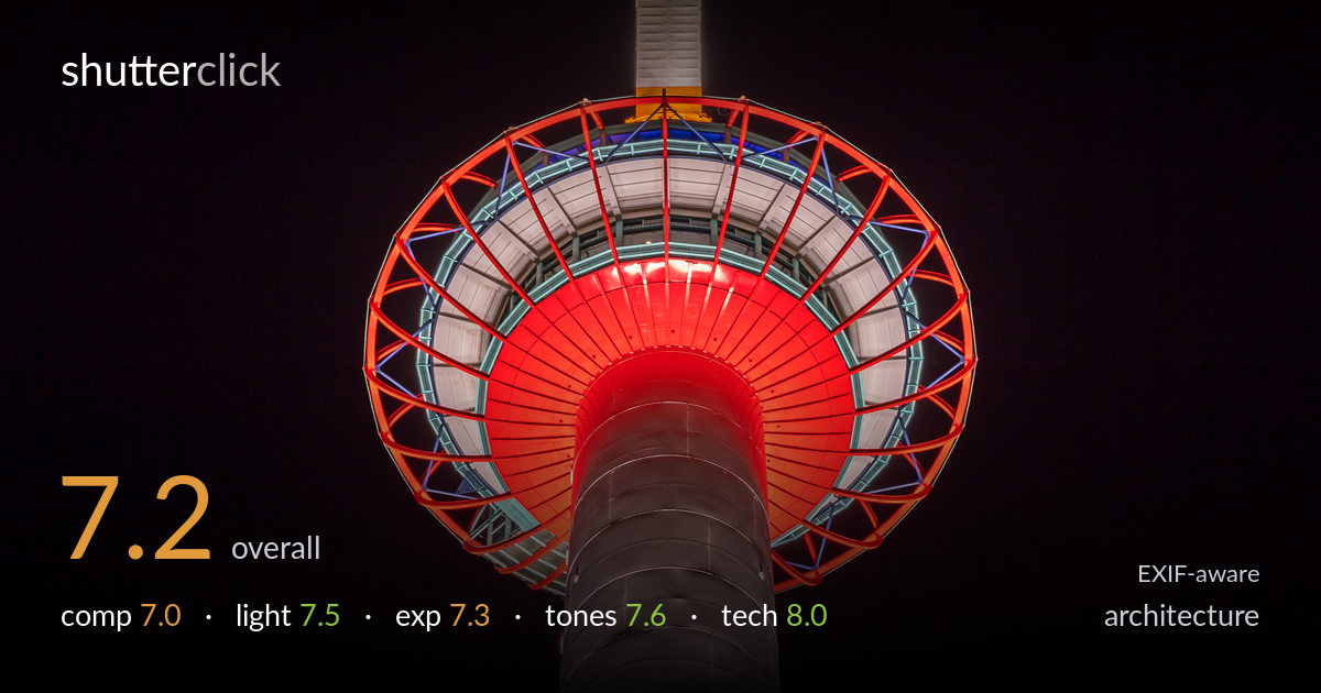
Kyoto tower glowing at night
Photo by Basile Morin

| Focal length | 63 mm |
| Aperture | f / 8.0 |
| Shutter | 1/2 s |
| ISO | ISO 50 |
| Exp. comp. | 0.0 EV |
| Shot at | 18:45 · Jun 10, 2019 |
A bold worm's-eye view that turns Kyoto Tower's observation deck into a glowing, almost organic crown against pure black. The red, blue and orange artificial lighting carries the frame, and the upward angle gives the structure real presence and symmetry. What holds it back is the slightly cramped placement of the deck against the top edge and a base that runs flat off the bottom, leaving the eye unsure where the structure begins and ends. The black sky is clean but fills a lot of the frame without contributing. Strong execution overall, just short of a fully resolved composition.
The centred, symmetrical column works for this subject, and the rising taper draws the eye straight up to the illuminated deck. The crown is the clear focal point, well anchored by the blue base. However, the deck sits very close to the top edge, leaving little breathing room above the antenna, while the lower structure is cropped flat across the bottom. Centring the column slightly lower in the frame, or allowing a touch more sky above the tip, would balance the heavy upper element against the negative space below.
The artificial lighting is the picture's strongest asset: the red glow of the underside, the blue ring of the base, and the warm bulb string create a layered, three-tone palette that reads clearly against the black. Direction is even across the cylindrical shaft, revealing its banded surface texture nicely. The deck's interior is slightly hot where the red concentrates, but it stops short of destroying detail. Shooting during late blue hour rather than full dark would have added a graded sky to separate the silhouette edges.
Exposure is well judged for a night subject. The lit shaft retains its banded detail without blowing, and the shadow side of the column holds gradation rather than crushing to black. The brightest red panels under the deck push toward clipping but keep just enough texture. ISO 50 keeps the file clean. The vast black sky is intentional and reads as deliberate rather than underexposed. A marginally darker exposure on the deck's red core would have preserved the last of the highlight detail there.
The colour separation is the highlight here: saturated red, electric blue and warm amber sit cleanly against neutral black, and the white balance on the metallic shaft stays believably cool-neutral. Contrast is high but suits the subject, and the tonal range from the silvery banding to the deep sky is well managed. The reds are slightly oversaturated in the deck interior, where they begin to bleed into one mass. A small reduction in red saturation would recover some of the structural detail lost in that glow.
The settings are well matched to the situation. At f/8 on the 24-70mm at 63mm, depth of field easily covers the entire structure, and diffraction stays a non-issue on the 5D Mark IV. ISO 50 delivers a clean, noise-free file, which is exactly right for a static, tripod-based night frame. The 1/2 second shutter is fine given there is no moving element to worry about, and the lack of visible blur confirms a stable support. Focus is accurate on the lit deck and the banded shaft, both rendered crisply. The 63mm choice keeps perspective distortion modest while still letting the upward angle dramatise the taper. The only refinement would be perspective: the column appears to lean very slightly, and a careful lens-correction or a more deliberately squared camera position would lock the verticals. For an architecture night shot, the technical execution is essentially clean and deliberate throughout.
what would elevate it
tags
Shot something like this?
Expert photo critique, on demand — scored across six categories, EXIF-aware. Start with 3 free critiques, no credit card.
critique my photo — free