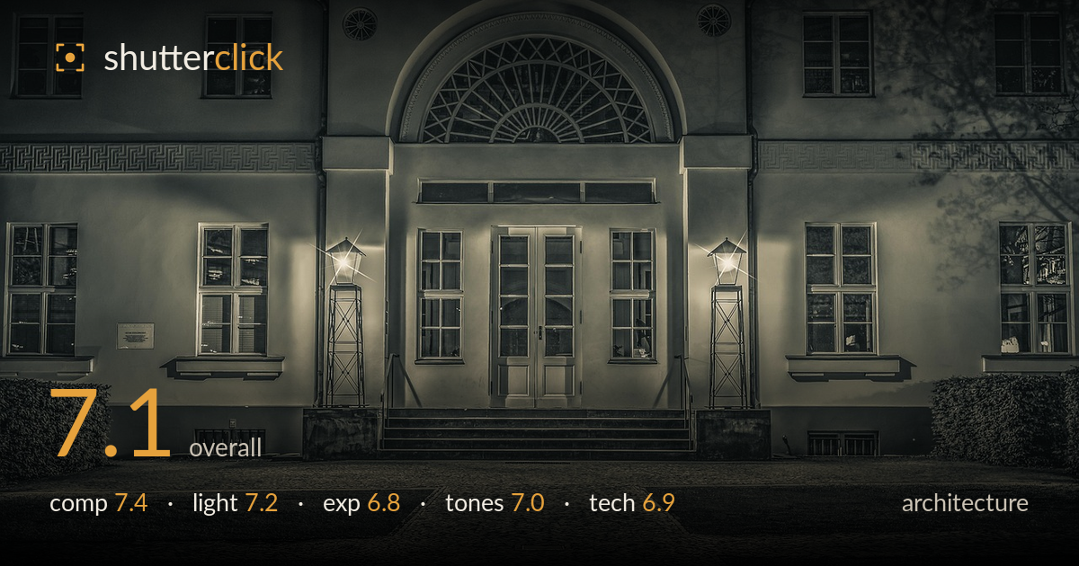
Lantern-lit entrance at night
Photo by scholty1970

No EXIF metadata in this file
Technical analysis based on visual assessment only.
A confident, symmetrical facade study built around a strong central axis — the fan-lit arch, the paired lanterns, and the twin flanking windows create pleasing bilateral balance. The strongest weakness is the paving in the foreground: the pale converging path lines pull toward the door but end up busy and slightly distracting, and the lower third feels tonally muddy. Verticals are close to true but drift very slightly at the frame edges. The lantern flares are handled well as accents. A cleaner foreground and tighter perspective control would push this from competent architectural documentation to something more assertive.
The bilateral symmetry is the backbone here, and it mostly holds — the central door, arched fanlight, and matching lanterns anchor a clear axis. The two ground-in paving lines converge toward the entrance, which is a nice leading device, but the crossing paths clutter the lower frame and split attention. Hedges bookend the base effectively. The tree branch top-right adds a touch of organic relief against the geometry. A hair more headroom above the arch versus foreground would tighten the balance, since the pavement currently claims too much real estate.
Night lighting is the draw, and the two lanterns provide warm anchors with controlled starburst flares that read as intentional accents rather than blown highlights. Illumination on the facade is even and soft, revealing the plaster texture and the Greek-key frieze without harsh contrast. The doorway glows gently from within, drawing the eye. The upper windows fall dark, which suits the mood. The foreground pavement, however, sits in an ambiguous half-light that flattens rather than sculpts, leaving the lower frame lifeless.
Exposure is largely well judged for a night scene — the facade retains detail across midtones and the lantern flares hold without gross clipping beyond their cores. Shadow areas in the upper windows go deep but purposefully. The main shortfall is the foreground: the paving reads murky and underexposed, losing the texture that would reward the eye traveling toward the door. Some highlight recovery on the lantern cores and a lift in the lower shadows would balance the tonal distribution across the frame.
The split-toned, near-monochrome treatment with a cool-green-into-warm cast gives the scene a moody, aged character that fits the classical architecture. Contrast is moderate and the midtone gradation on the plaster is smooth. The lantern warmth provides welcome tonal punctuation. That said, the overall palette leans slightly flat and heavy in the lower half, and the greenish cast can feel a touch artificial. A cleaner separation between the warm lamplight and cool ambient tones would add depth.
Focus is accurate across the facade plane, with the window muntins, frieze detail, and door paneling all rendered crisply — good discipline for a frontal architectural shot. The apparent depth of field is deep enough to keep both foreground paving and building sharp, suggesting a stopped-down aperture and tripod support, which the clean shadows and lack of visible blur support. The lantern flares indicate a small aperture that also produced the starburst effect — a reasonable trade. Noise is well controlled in the midtones, though the deeper shadows show some softening. Verticals are close to corrected but the outermost window frames lean very slightly, hinting at incomplete perspective correction or a lens with mild distortion. For a frontal facade, a longer focal length from further back, or careful in-post keystone correction, would lock the parallels dead straight. Overall a technically sound capture with room to refine the geometry and the shadow rendering in the lower frame.
What would elevate it
Tags
Shot something like this?
Expert photo critique, on demand — scored across six categories, EXIF-aware. Start with 3 free critiques, no credit card.
critique my photo — free