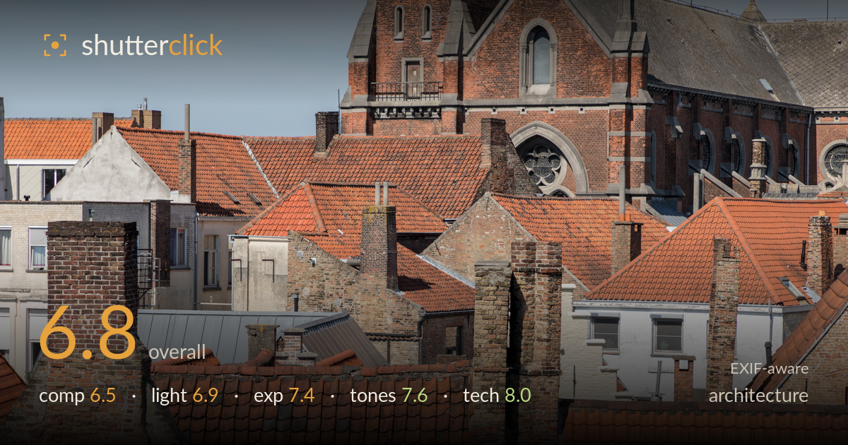
Layered rooftops beneath a church tower
Photo by Dietmar Rabich

| Focal length | 105 mm |
| Aperture | f / 9.0 |
| Shutter | 1/200 s |
| ISO | ISO 100 |
| Exp. comp. | 0.0 EV |
| Shot at | 16:25 · Aug 6, 2018 |
A dense, layered study of terracotta rooftops that trades on repetition and texture rather than a single hero subject, and the warm brick palette carries genuine appeal. The church tower anchors the top of the frame and gives the compression something to build toward. What holds it back is organisation: the layering reads as an even wall of roofs without a clear entry point or hierarchy, and the framing leaves ambiguous edges. The light is competent but the near-frontal midday angle flattens the very texture the subject depends on. A stronger sense of visual path through the tiles would lift this considerably.
The telephoto compression stacks rooftops into a satisfying mosaic of ridgelines and chimneys, and the church tower gives the upper frame a natural terminus. But the arrangement lacks a clear focal anchor — the eye wanders across evenly weighted roofs without being led anywhere. The chimney stacks compete rather than cooperate, and the left edge trails off into partial buildings that weaken the border. Placing the strongest diagonal ridge as a deliberate leading line, and giving the tower more breathing room, would turn a texture field into a composition with direction.
Midday sun from the front-left gives clean, even illumination across the brick and tile, and the warm terracotta responds well to it. The trade-off is flatness: the light strikes the roof planes too head-on to rake across the tile ridges, so the corrugated texture that should be the star reads softer than it could. Shadows under the eaves and chimneys are present but shallow. Lower, more raking light from a side angle would carve depth into every ridge and separate the overlapping planes far more emphatically.
A well-judged exposure that holds highlight detail in the brightest white-rendered walls while keeping the shaded brick faces open. The histogram sits comfortably in the mid-to-upper range with no meaningful clipping in the terracotta, and the sky retains its gradient. Deep shadow pockets between roofs stay just readable. It is an even, low-risk exposure appropriate to the flat light — nothing is lost, though the lack of a strong tonal extreme keeps the image feeling somewhat uniform in brightness across the frame.
The warm-red terracotta palette is the image's biggest strength, rendered richly and consistently without oversaturation. White balance is accurate — the neutral render walls read clean, the brick warm but believable. The pale blue sky provides a restrained complementary counterpoint at the top. Contrast is moderate and suits the material, though a touch more separation between the many similar orange tones would help the roofs read as distinct planes rather than one continuous surface. Overall the colour handling is mature and faithful to the scene.
The settings are well matched to the subject. At 105mm the telephoto compression is used purposefully to stack the rooftops, and f/9 delivers deep, front-to-back sharpness that keeps both foreground tiles and the distant church tower crisply resolved — exactly right for this kind of layered architectural study. ISO 100 yields a clean file with no visible noise, and 1/200s is more than sufficient for a static scene handheld at this focal length, aided by the lens's stabilisation. Focus appears accurately placed across the roof planes with good edge detail in the tile ridges and brickwork. The L-series lens shows its quality in corner-to-corner clarity and controlled chromatic aberration along the high-contrast rooflines against the sky. Technically there is little to fault; the only consideration would be that such uniform depth of field, combined with flat light, gives every plane equal emphasis — a slightly wider aperture would not have helped here, so the execution is sound. This is clean, competent capture.
What would elevate it
Tags
Shot something like this?
Expert photo critique, on demand — scored across six categories, EXIF-aware. Start with 3 free critiques, no credit card.
critique my photo — free