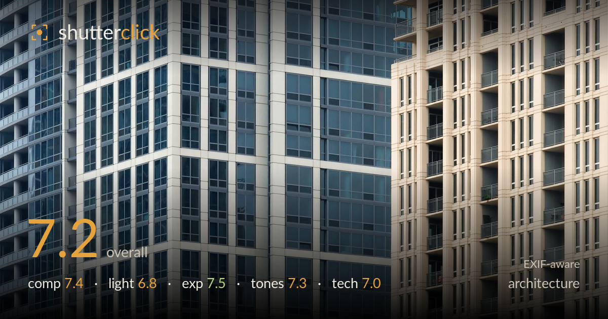
Layered towers in cool and warm
Photo by Alvesgaspar

| Focal length | 95 mm |
| Aperture | f / 14.0 |
| Shutter | 1/30 s |
| ISO | ISO 400 |
| Exp. comp. | 0.0 EV |
| Shot at | 20:07 · Nov 11, 2007 |
A confident study of urban density that plays three tower facades against one another — the blue-glass corner at centre, the grey slab behind it, and the warm beige balconied block on the right. The compression flattens depth into layered pattern, and the material and colour contrast between the cool glass and warm concrete carries the frame. What most holds it back is that the composition sits between two ideas: the projecting glass corner is a strong anchor but isn't given quite enough dominance, and the crop lets the warm block crowd the right edge without resolving. Tightening the visual hierarchy would sharpen the graphic payoff.
The projecting glass corner is the natural focal point and its placement left of centre works, using the vertical seam as a spine. The layering of three facades reads as a deliberate essay in urban repetition. The weakness is balance: the warm right-hand block occupies nearly a third of the frame yet competes rather than supports, and the top edge clips the balconies awkwardly. Verticals are held reasonably true. A crop favouring the corner, or a cleaner division between the cool and warm masses, would tighten the graphic tension.
Flat, diffuse daylight — likely overcast or open shade — keeps the glass reflections muted and the concrete evenly lit. This suits the pattern-driven approach, but the light does little to model the projecting corner, so the sense of three-dimensional relief is softer than the geometry deserves. The warm block on the right catches slightly more directional light, which is why it separates in tone. Raking side light across the facades would carve the mullions and balcony ledges into deeper relief and reinforce the layered depth.
Well controlled across a demanding range of tones. The bright concrete panels hold detail without clipping, and the darker glass retains reflection information rather than blocking up. The histogram sits comfortably in the midtones with no meaningful loss at either end. Exposure decisions read as deliberate and even, appropriate for a flat-light architectural study where preserving surface detail is the priority. There is a little headroom to lift the shadowed recesses of the beige block, but nothing here reads as an error.
The cool-versus-warm contrast between the blue-grey glass tower and the sandy beige apartment block is the image's strongest asset, and white balance keeps both convincing. Tonal range is broad but gently handled, matching the soft light. Saturation is restrained and believable. Contrast could be pushed slightly to give the mullion grids more snap, and the greys risk feeling a touch muddy in the shadowed glass. Overall a coherent, muted palette that serves the architectural subject without distraction.
At 95mm the telephoto compression is doing exactly the right job — flattening three separated buildings into a single stacked plane, which is the point of the image. f/14 gives depth of field to spare across the receding facades, and everything from the near corner to the far grey slab renders acceptably sharp. The trade-off is that 1/30s handheld at that focal length is marginal; there is a slight softness across the frame that reads more like camera shake or the D80's older sensor resolving limits than critical focus. A faster shutter or tripod would have secured true edge-to-edge crispness on the mullion grids, where sharpness matters most in this pattern-heavy subject. ISO 400 is a sensible balance and noise is well managed for this sensor. Focus placement on the central corner is correct. The aperture choice is defensible, though f/8–f/11 would have avoided diffraction softening while still covering the depth, and freed shutter speed to freeze any handshake.
What would elevate it
Tags
Shot something like this?
Expert photo critique, on demand — scored across six categories, EXIF-aware. Start with 3 free critiques, no credit card.
critique my photo — free