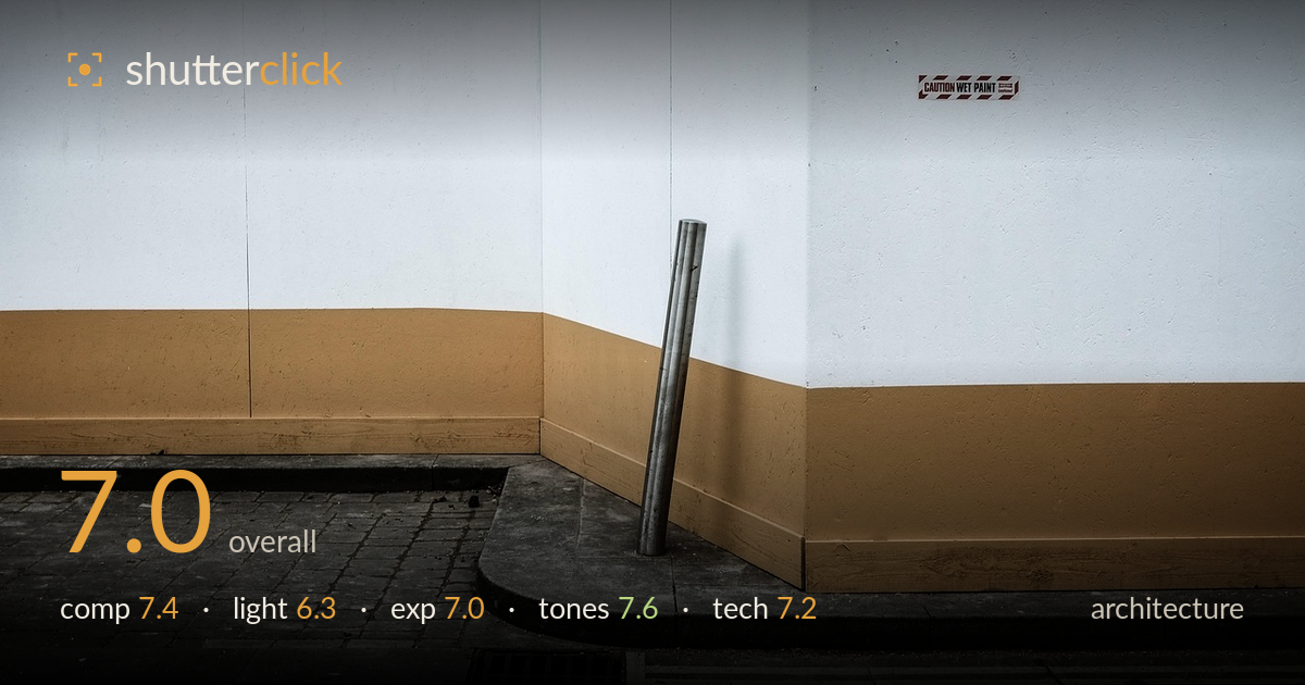
Leaning pole at a painted corner
Photo by 6220795

No EXIF metadata in this file
Technical analysis based on visual assessment only.
A quietly graphic minimalist study built on horizontal colour bands — blue, white, tan — anchored by a lone leaning pole at the wall's corner. The strongest move is the way the corner splits the frame into two planes while the pole and its shadow give the eye a single resting point. The 'CAUTION WET PAINT' sticker adds a small note of wit. What holds it back most is flat, directionless light that leaves the surfaces reading as paint rather than texture, and a lower-left pavement zone that stays muddy and unresolved. Tighter attention to the corner geometry would sharpen the whole.
The layered colour bands create a strong horizontal rhythm, and placing the corner off-centre gives the frame two distinct planes to play against each other. The leaning pole is the pivot the eye lands on, well positioned at the wall's meeting point with its shadow reinforcing it. The pavement and curb sweep in from lower left, adding depth. The lower-left quarter, though, is a dead zone of grey brick that competes for weight without contributing. A slightly higher or tighter framing would let the geometry carry more cleanly.
The light is soft and overcast — even across the wall, which keeps the colour bands clean but flattens the surfaces. There's no raking angle to reveal the texture of the render or the grain of the painted trim, so everything reads as flat paint. The pole's shadow is the one directional cue, and it's faint. For architecture that lives on surface and geometry, a lower sun grazing across the wall would have modelled the planes and given the corner more three-dimensional presence.
Exposure is well controlled for the flat conditions. The white band holds highlight detail without clipping, and the darker pavement retains structure in the brick and drain. The overall balance leans slightly dark, giving the muted mood a controlled feel rather than an underexposed one. Midtones in the tan trim sit comfortably. The lower-left shadows verge on murky, and a touch of shadow lift there would recover the brick detail that currently disappears without meaningfully changing the mood.
The muted palette is the photo's best asset — desaturated blue, cool white, and warm tan sit in pleasing tension, and the restrained saturation keeps it from looking like a paint chart. White balance is neutral to slightly cool, which suits the overcast light. Contrast is judged well: enough separation between bands, gentle roll-off in the whites. The grey pavement anchors the warmth without fighting it. A hair more warmth in the tan could strengthen the complementary play against the blue, but the grade is coherent as is.
Focus sits accurately on the wall and pole, with sharpness holding across the flat plane — appropriate for a subject at near-uniform distance. Depth of field is clearly sufficient; nothing important falls soft. Noise is well controlled in the shadow areas, and the surfaces render cleanly without smearing. The pole is rendered crisply enough to read its cylindrical form and slight lean. The main technical weakness is not the capture but the geometry: the corner's converging trim lines drift slightly, and the horizontal bands aren't perfectly level across the frame, so the eye senses a faint tilt. For architecture where lines carry the image, precise vertical and horizontal alignment matters. A small perspective correction in post would square the bands and let the minimalist structure feel deliberate rather than approximate. Overall execution is competent and clean — the fundamentals are sound, and only the fine geometric discipline separates this from a polished result.
What would elevate it
Tags
Shot something like this?
Expert photo critique, on demand — scored across six categories, EXIF-aware. Start with 3 free critiques, no credit card.
critique my photo — free