Legs along the subway aisle
Photo by Engin_Akyurt

No EXIF metadata in this file
Technical analysis based on visual assessment only.
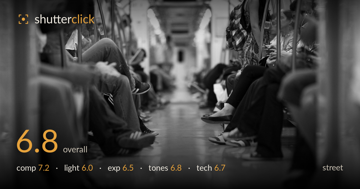
A low, floor-level vantage point turns an ordinary subway car into a strong receding perspective, with two rows of legs framing a central aisle that pulls the eye deep into the carriage. The concept is the photograph's biggest asset. What holds it back is the absence of a single anchoring moment — the frame reads as a pattern of legs and shoes rather than a decisive gesture or interaction. The extremely shallow depth of field also leaves much of the mid-ground and both edges soft, so the eye never fully lands. Monochrome suits the transit mood well.
The eye-level-to-the-floor viewpoint is the standout decision, using both rows of seated passengers as symmetrical framing lines that converge on the vanishing point down the aisle. The polished floor doubles the geometry with reflections. The near foreground on both sides, however, is dominated by out-of-focus knees and a bag that add bulk without content, crowding the edges. A slightly higher or more centred position on the aisle would tighten the symmetry, and a defined focal figure somewhere along the receding line would give the composition a destination rather than just a direction.
The carriage's overhead fluorescent light is flat and even, which is authentic to the setting but does little to model the subjects — legs and torsos fall into shapeless mid-grey with few defining shadows. The reflections on the floor are the one place light does real work, adding a glossy vertical smear that reinforces the perspective. Some window light from the right rim-lights the standing figure and backpack, offering a hint of separation. Shooting toward a doorway or brighter pocket of light would give the frame a tonal focal point it currently lacks.
Exposure is generally well controlled for a dim interior. Highlights on the floor reflections and the bright far end of the carriage hold together without harsh clipping, and shadow areas in the clothing retain enough detail to read. The midtones sit a touch low overall, giving a slightly murky feel through the seated figures. The brightest patch deep in the aisle draws the eye correctly. A modest lift to the shadows would open up the dark trousers and shoes that currently merge into one mass in the lower right.
The black-and-white conversion fits the utilitarian transit subject and the mixed artificial light well, sidestepping the ugly colour casts subways usually produce. Contrast is moderate, leaning soft, which keeps the mood but leaves the image wanting a stronger anchor at each end of the tonal scale — true blacks in the shadows and cleaner whites in the distant highlight. Mid-tone gradation across the floor is smooth and pleasing. A slightly steeper contrast curve, or a subtle dodge on the reflective floor, would give the tones more snap without losing the atmosphere.
The wide aperture that created this dramatically shallow depth of field is the double-edged sword of the frame. It renders the polished floor and the vanishing aisle beautifully, with soft falloff into the distance, but it also leaves both foreground edges and much of the mid-ground beyond usable sharpness. In street work, that isolation only pays off if the sharp plane lands on a meaningful subject; here it settles on a patch of floor and the mid-carriage legs, so nothing critical is decisively rendered. The focus appears accurate to where it was placed, just placed on empty geometry rather than a person. Noise is well managed for what looks like a low-light interior, and there is no obvious motion blur despite the moving train, suggesting a shutter fast enough for the conditions. Stopping down a stop or two would have carried sharpness further down the aisle and given the receding rows of passengers the definition they need to function as subjects rather than soft shapes.
What would elevate it
Tags
Shot something like this?
Expert photo critique, on demand — scored across six categories, EXIF-aware. Start with 3 free critiques, no credit card.
critique my photo — free