Lifebuoy before the storm
Photo by Dietmar Rabich

| Focal length | 35 mm |
| Aperture | f / 4.5 |
| Shutter | 1/1000 s |
| ISO | ISO 100 |
| Exp. comp. | 0.0 EV |
| Shot at | 15:00 · Nov 2, 2019 |
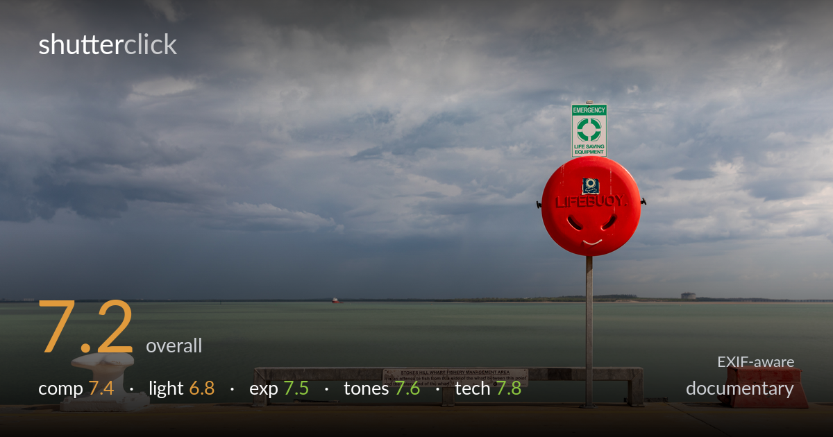
A red lifebuoy housing — its moulded vents reading like a smiling face — anchors a quiet wharf scene beneath a brooding storm sky, and that small visual joke against the gathering weather is the picture's real strength. The colour contrast of the saturated red against muted teal water and grey cloud is genuinely effective. What holds it back is a slightly cluttered foreground band of bench, bollard and red block competing for attention, and a horizon that sits very close to centre. The storm light is dramatic but flat on the subjects. A cleaner read of the central gag would lift it.
The red buoy is well placed off-centre on the right third, and its accidental smiley face gives the frame a wry focal point that plays nicely against the storm. The white bollard balances the left, and the bench provides a horizontal anchor. However, the horizon sits almost dead-centre, splitting sky and water evenly when the dramatic clouds deserve more room. The foreground apron of concrete is generous but a little empty, and the red block at the far right edge clutters the corner without contributing. A higher horizon would commit to the sky.
The pre-storm light is the scene's atmosphere — heavy, layered cloud with a dark squall line dropping rain in the distance, contrasted against brighter cloud above. It carries genuine mood. The subjects on the wharf, though, sit in flat, diffuse light that does little to model their forms; the buoy and bollard read as evenly lit shapes rather than sculpted objects. The drama lives entirely in the sky while the foreground stays inert. A moment of breaking light raking across the deck would have tied the two halves together.
Exposure is well judged across a tricky range. The bright cloud highlights hold detail without blowing out, the dark squall band retains gradation, and the red buoy stays saturated rather than clipping into a flat blob — easy to lose at this intensity. The white bollard keeps texture in its highlights. Shadow areas in the storm are deep but not crushed. The concrete foreground is bright but controlled. At ISO 100 the dynamic range is used cleanly with no signs of recovery artefacts. A solid, deliberate exposure that handles the contrast confidently.
The colour relationships do the heavy lifting: vivid red against the cool teal-green water and neutral grey cloud is a strong, clean triad. White balance is believable for stormy daylight, holding the moody grey without a colour cast. The water's milky jade tone is appealing and distinct. Contrast is moderate, suited to the overcast conditions, and the warm concrete apron adds a grounding note against the cool upper frame. Saturation is pushed just enough on the red to make it pop without going garish. Tonal separation between cloud layers reads well.
The settings are sound and well matched to the conditions. At 35mm on the EF24-105mm f/4L the perspective is natural and free of distracting distortion, appropriate for a documentary wharf scene. f/4.5 yields enough depth of field at this distance to keep the buoy, bollard and distant shoreline all acceptably sharp, and there's no need to stop down further given the flat lighting. 1/1000s is far faster than required for a static subject from a tripod-steady stance, but it costs nothing here at ISO 100, where noise is absent and tonal smoothness is excellent. Focus appears accurate on the buoy housing, with crisp lettering. The only quibble is that such a fast shutter is overkill — a slower speed could have allowed a smaller aperture for even more front-to-back bite, or simply confirms there was headroom unused. Overall the execution is clean, the file quality high, and nothing technical undermines the image.
what would elevate it
tags
Shot something like this?
Expert photo critique, on demand — scored across six categories, EXIF-aware. Start with 3 free critiques, no credit card.
critique my photo — free