Light at the top of the stairs
Photo by Activedia

No EXIF metadata in this file
Technical analysis based on visual assessment only.
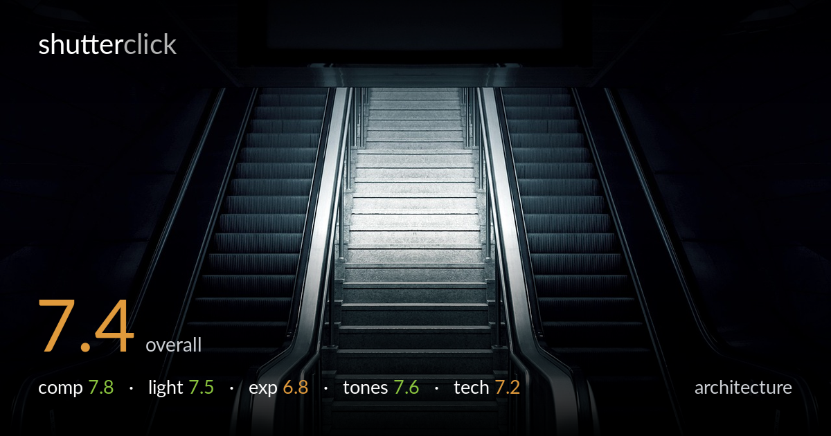
A strong symmetrical composition that uses two flanking escalators to funnel the eye up a brightly lit central staircase — the light-at-the-top metaphor reads instantly and works. The near-perfect symmetry and converging handrails carry real graphic weight. What most holds the frame back is the heavy vacuum of black on both flanks, which swallows the escalator steps into near-featureless shadow, and a slightly soft, glowing central highlight that drifts toward washing out. A touch more shadow recovery and a hint less bloom on the bright steps would tighten an already disciplined image.
The mirror symmetry is the backbone here, and it holds well — the two escalators converge cleanly toward the central staircase, which acts as a natural vanishing channel. The vertical handrails reinforce the funnel and pull the eye up to the bright landing. The dark overhead sign at top frames the scene but cuts slightly awkwardly into the very top edge. The foreground floor tile anchors the base nicely. Centering is justified by the subject's symmetry, so it doesn't feel static.
A single concentrated pool of light on the upper staircase does most of the storytelling, drawing the eye toward an implied exit. That high-key center against deep ambient shadow gives the frame its mood and tension. The trade-off is steep: the escalator treads on both sides fall into near-total darkness, losing the ribbed texture that would otherwise reward the eye. The bright landing also borders on glowing rather than crisply defined, softening the geometry exactly where detail would strengthen it.
The exposure is built around the bright central steps, which sit just at the edge of clipping — the brightest treads lose some tonal separation and read as a soft glow rather than sharp stone. The deep shadows are clearly intentional for mood, but they crush a fair amount of escalator detail that could have stayed readable. The midtone staircase is well placed. A bracketed or RAW-recovered version would hold both the highlight texture and a touch more shadow information.
The cool, desaturated blue-grey grade suits the cold, industrial subject and gives the image a quiet, almost cinematic stillness. Contrast is high and deliberate, with deep blacks framing the luminous core. The monochromatic palette keeps the geometry clean and undistracting. White balance leans intentionally cold, which works. The only tonal weakness is the transition zone around the bright steps, where the roll-off is abrupt and the highlight tips toward pure white rather than retaining the stone's gradation.
Focus appears accurate across the central staircase and the near handrails, with the symmetry well aligned to the frame's vertical axis — the verticals stay genuinely vertical, which is exactly what this kind of architectural symmetry demands. Depth of field is sufficient to keep the whole receding structure acceptably sharp, suggesting a measured aperture rather than a wide-open one. Noise is well controlled in the midtones, though the deepest shadows likely hide some that simply isn't visible because there's no detail left to show. The main technical limitation is the highlight handling on the upper steps, which blooms slightly and softens the texture that the lens otherwise resolves cleanly elsewhere. A polariser or careful exposure for the bright zone would have preserved that detail. Overall this is competent, controlled execution: stable framing, clean lines, and good sharpness where it matters, let down only by the highlight clipping at the focal point of the image.
what would elevate it
tags
Shot something like this?
Expert photo critique, on demand — scored across six categories, EXIF-aware. Start with 3 free critiques, no credit card.
critique my photo — free