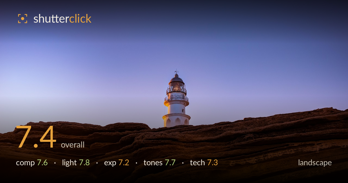
Lighthouse above the eroded rock
Photo by Leolo212

No EXIF metadata in this file
Technical analysis based on visual assessment only.
A strong low-angle concept: the layered rock foreground rises to reveal the lighthouse against a clean gradient sky, and the warm-cool colour split does real work. The main limitation is the lighthouse's placement — it sits just left of centre and its base is partly swallowed by the ridge, weakening the sense of a full, standing structure. The lower two-thirds of rock is dramatic but a touch repetitive without a single anchor point to lead the eye. Cleaner layering and a slightly higher vantage that clears the tower's base would elevate this from a good idea to a resolved image.
The low viewpoint turns the eroded rock into a foundation for the lighthouse, and the diagonal strata pull the eye upward and rightward. The tower sits near a thirds line, which reads well, but its base is clipped by the ridgeline, so it reads as peeking rather than standing. The vast sky is a deliberate, effective negative space, though the frame gives more than half to foreground rock that grows a little repetitive. A viewpoint clearing the tower's full height would strengthen the subject-ground relationship.
Twilight side light rakes across the rock, catching the ridges and carving out the sedimentary layers with warm amber against blue shadow. That directional low light is the image's biggest asset, giving the foreground genuine three-dimensionality. The lighthouse, catching the last cool glow, separates cleanly against the graduated sky. The one weakness is the lower-left foreground, where shadow flattens into near-featureless dark and loses the texture that the rest of the rock displays so well.
Exposure is largely well judged for the blue-hour conditions. The sky gradient holds smoothly without banding, and the white lighthouse retains detail rather than blowing out. Midtones on the sunlit rock are placed nicely. The shadowed foreground, particularly bottom-left, drops toward black and surrenders some recoverable texture — a lift there would balance the tonal spread. Otherwise the dynamic range is handled with restraint, and nothing important is clipped in the highlights.
The warm-cool palette is the tonal signature here: golden-amber rock against a violet-to-blue sky gradient. That complementary split is pleasing and reads as authentic twilight rather than heavy grading. White balance sits believably. Contrast is well controlled, letting the sky stay soft while the rock carries the punch. The only caution is the deep foreground shadows tipping slightly cold and muddy, which mutes the warmth in the corners. A gentle warmth lift in the shadows would tie the palette together.
From visual evidence the capture is competent for the conditions. Depth of field appears deep, with both the near rock texture and the distant lighthouse acceptably sharp, suggesting a suitably small aperture and a focus point that covered the scene well. Detail on the lighthouse is crisp enough to resolve the railing and lantern gallery, indicating either a stable support or a shutter fast enough for the light level, since low-light landscapes at this hour typically demand a tripod. Noise is well controlled in both the smooth sky and the shadowed rock, pointing to a modest ISO and clean processing. The lens rendering looks natural with no obvious distortion at the horizon. The main technical shortfall is compositional rather than mechanical — the framing that clips the lighthouse base. Focus stacking would not be needed here given the apparent sharpness throughout, so execution is solid; the room to grow lies in vantage and shadow retention.
What would elevate it
Tags
Shot something like this?
Expert photo critique, on demand — scored across six categories, EXIF-aware. Start with 3 free critiques, no credit card.
critique my photo — free