Lighthouse at the harbour mouth
Photo by lukasbieri

No EXIF metadata in this file
Technical analysis based on visual assessment only.
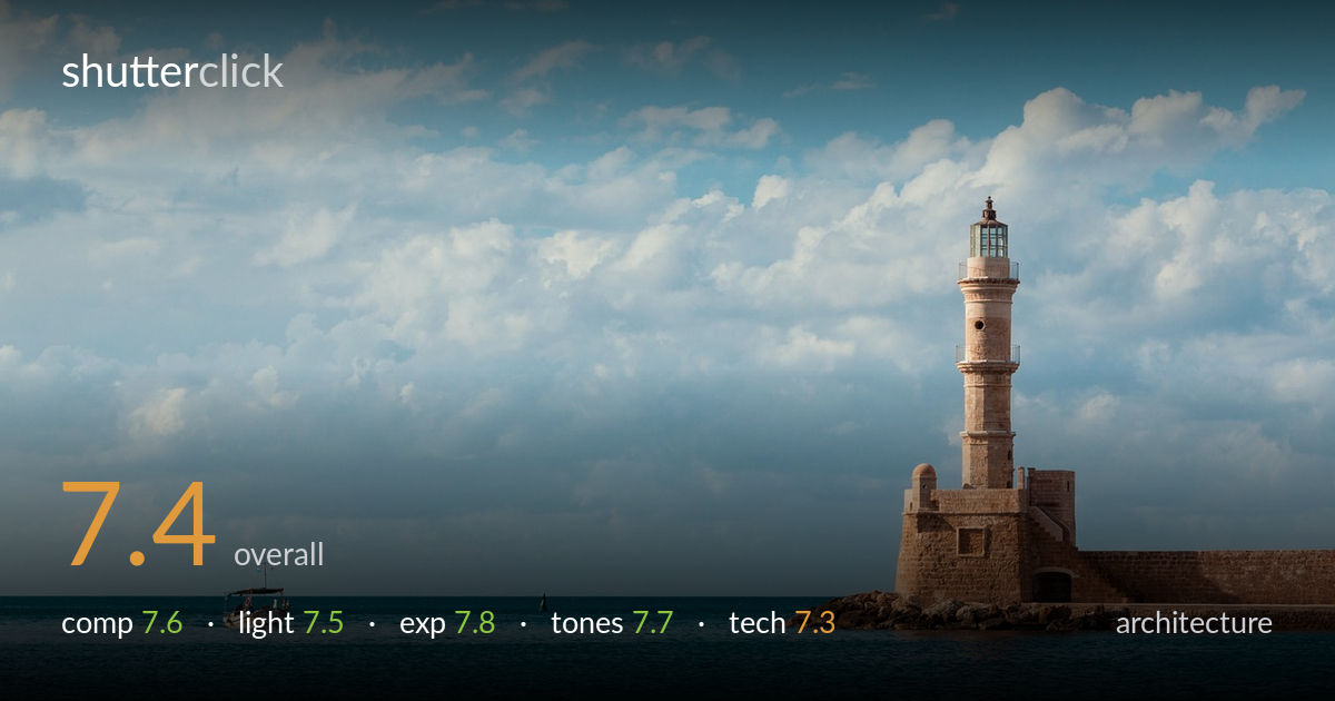
A clean, well-balanced harbour scene where the lighthouse anchors the right third and the small boat provides a deliberate counterweight on the left — a smart use of negative space and scale. Warm stone against cool water and sky reads pleasantly. What most holds it back is a slightly low horizon that gives the upper sky more weight than its cloud interest fully earns, and a lighthouse that crops awkwardly close to the right edge, leaving no breathing room on that side. The light is warm but not at its richest. A solid, postcard-strong frame with refinements available.
The lighthouse sits firmly on the right third with the boat as a small left-side counterpoint, and that visual dialogue across the water is the frame's strongest idea. The horizon falls low, giving the sky room, though the cloud field is even rather than dramatic, so the lower third of water does much of the heavy lifting. The lighthouse crowds the right edge, with the seawall running out of frame; a touch more space on that side would settle the geometry. The lone buoy adds a quiet mid-frame marker.
Warm, fairly low side light rakes across the stone, picking out the tower's masonry texture and giving the structure dimension against the cooler sky and sea. The shadowing on the lighthouse body reads naturally and shapes the cylindrical form well. It is gentle rather than golden-hour rich, so the stone glows softly without the deeper amber that late light would bring. The sky's diffuse cloud cover keeps contrast moderate and even, which suits the calm mood but limits drama in the upper frame.
Exposure is well judged across a wide brightness range. The lit stone holds highlight detail without clipping, and the deeper blue water retains tone and structure rather than blocking up. The brightest cloud edges stay just within range. Midtones sit comfortably, giving the scene an open, airy feel without looking washed out. Nothing reads as accidental — the balance between bright sky and darker foreground water is handled cleanly, leaving usable detail throughout. A confident, even tonal placement across the frame.
The complementary palette of warm sandstone against teal-blue water and sky is the image's tonal signature, and it works. White balance leans slightly cool in the water, which deepens the blues attractively while the stone stays warm. Contrast is moderate and gradation in the sky is smooth. The blue could feel a touch overcooked in the foreground water, edging toward a stylised teal-and-orange look; pulling saturation back marginally there would keep it natural. Overall a pleasing, cohesive colour treatment.
Sharpness on the lighthouse looks good, with the masonry detail and railing resolving cleanly, suggesting accurate focus on the primary structure and an aperture deep enough to hold the scene front to back. The distant boat and buoy are rendered with reasonable detail given their size in the frame. Noise is not an issue in this lighting. Depth of field is appropriate for an architectural landscape — everything that matters reads sharp. The verticals of the tower appear close to true, with only minor lean that strict architectural judgement would flag; careful perspective correction would lock them perfectly upright. The framing's tightness on the right edge is the main execution concern, as it leaves the seawall clipped rather than fully resolved. A slightly wider field of view or a step back would have preserved that geometry. Lens choice appears well suited to the distance and subject, compressing the elements without distortion artefacts at the edges.
What would elevate it
Tags
Shot something like this?
Expert photo critique, on demand — scored across six categories, EXIF-aware. Start with 3 free critiques, no credit card.
critique my photo — free