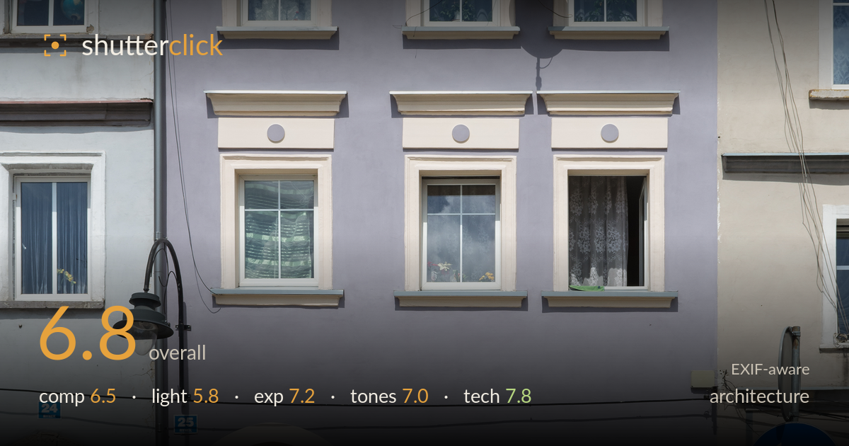
Lilac townhouse facade on the corner
Photo by Jacek Halicki

| Focal length | 32 mm |
| Aperture | f / 10.0 |
| Shutter | 1/400 s |
| ISO | ISO 200 |
| Exp. comp. | 0.0 EV |
| Shot at | 12:04 · May 10, 2015 |
A clean, documentary-style facade study that captures the lilac townhouse with its trim and window detailing legibly, but the frontal harsh midday light flattens what could have been richly modelled stucco relief. The verticals are largely controlled, which matters for architecture, and the pastel palette reads pleasantly. What most holds the image back is the timing of light: the overhead sun leaves the facade evenly lit but lifeless, and the intruding traffic sign and utility clutter on the right compete with the subject. A cleaner isolation of the central building and softer, raking light would elevate it from a competent record to a considered architectural portrait.
The lilac facade is centred and fills the frame well, giving a clear cataloguing view that suits documentary architecture. Verticals run close to true, and including slivers of the flanking buildings gives useful context. However, the blue turn-arrow sign and its pole crowd the lower right and pull attention away from the subject. The cobbled foreground band at the base adds a grounding edge but little else. A slightly higher vantage or a step left would have balanced the neighbouring facades more evenly and reduced the sign's intrusion.
This is the weakest element. The high midday sun strikes the facade almost frontally, producing flat, even illumination that suppresses the very stucco cornices, window surrounds, and roundels the shot depends on. Shadows fall hard and short under the sills, offering little modelling. The white trim borders on glare in places. Low, raking side light from early morning or late afternoon would have carved out the relief detailing and given the flat plaster surface dimension and warmth rather than the current uniform brightness.
Exposure is well judged for a bright day. Highlights on the white window frames hold detail rather than blowing out, and the pastel wall sits comfortably in the upper midtones. The shaded archway doorway goes deep but retains just enough to read as a passage rather than a black void. The sky keeps its blue and cloud texture without clipping. Overall a balanced histogram with no significant loss at either end, and the choices appear deliberate throughout.
The lilac-and-cream palette is rendered faithfully with pleasing separation between the wall, trim, and the cooler neighbouring facades. White balance looks neutral, and the blue sky adds a complementary lift. Contrast is moderate, appropriate for a record shot, though the midday light pushes the overall look slightly clinical. Saturation is restrained and natural. The muted pastels carry the mood well; a touch more warmth in the grade could have softened the flatness the lighting imposes.
The settings are well matched to the task. At f/10 the entire facade sits within the depth of field, keeping trim, windows, and neighbouring buildings uniformly sharp — the right call for a documentary architecture frame where front-to-back clarity matters. ISO 200 keeps noise negligible, and 1/400s is more than adequate for a static handheld subject with no risk of shake at 32mm. The 18-140mm zoom at 32mm gives a fairly natural perspective with modest distortion, and verticals hold well, suggesting careful alignment or minor correction. Focus is accurate across the plane, and edge-to-edge resolution holds up on the fine window mullions and stucco detail. The only technical caveat is that f/10 on this sensor sits near the onset of diffraction, though the effect here is minimal. A polarizer could have deepened the sky and cut glare off the glass and white plaster. Sound, considered execution overall.
What would elevate it
Tags
Shot something like this?
Expert photo critique, on demand — scored across six categories, EXIF-aware. Start with 3 free critiques, no credit card.
critique my photo — free