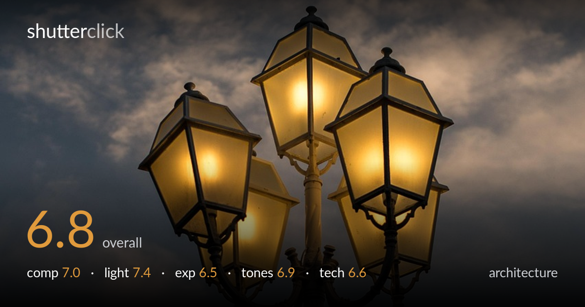
Lit lanterns against a dusk sky
Photo by ClickerHappy

No EXIF metadata in this file
Technical analysis based on visual assessment only.
The warm glow of five lit lanterns against a cool dusk sky is the strength here — a clean, evocative colour contrast that carries the frame. The cluster sits slightly above centre with breathing room above, and the symmetry of the lamp head reads well. What most holds it back is the busy, slightly muddy mid-tone sky competing with the subject, and lamp glass that blows toward pure white in the brightest panels, flattening their detail. A more deliberate underexposure of the sky or a richer twilight moment would let the lanterns dominate more cleanly.
The lamp cluster anchors the lower-centre frame with generous sky above, which suits the upward viewpoint and gives the ornate ironwork room to breathe. The five-lantern arrangement is roughly symmetrical and reads clearly. The pole runs straight down the centre to the bottom edge, which feels slightly static — and the lowest lantern is clipped at the right edge. Placing the cluster fractionally lower or shifting it off the central axis would add tension, and including a touch more context below could ground the subject.
The timing is the real win: dusk balances the warm tungsten glow of the lanterns against the cool blue-grey sky, a colour-temperature contrast that gives the image its mood. The lit glass panels shape the lantern forms nicely and the ironwork falls into clean silhouette. The sky's diffuse cloud light is soft but uneven, leaving some flat, heavy patches that pull attention. A slightly later blue-hour moment would deepen the sky and let the lamps glow even more decisively.
Exposure is a reasonable compromise but leans bright in the lanterns — the strongest panels push toward clipping, losing the texture of the frosted glass and the filament detail. The sky retains midtone information but sits muddy rather than rich. Pulling exposure down would protect the glass highlights and let the warm light feel more like a glow than a blowout, while the silhouetted ironwork has enough shadow detail to read structure without going fully black.
The amber-versus-blue palette is the image's signature and it works. White balance reads true to dusk, keeping the sky cool and the lamps warm. Contrast is moderate; the mid-tone sky feels slightly flat and greyed, lacking the depth that would make the warm tones pop harder. The brightest lantern panels skew toward an uninflected white. A small saturation lift in the blues and a recovery of warmth in the glass highlights would tighten the colour story.
Focus appears accurate on the lamp head, with the ironwork, finials and glass framing all rendered sharply enough to read the ornate detail. Depth of field looks sufficient to hold the whole cluster, appropriate for the subject. There's no obvious motion blur, suggesting a stable handheld or supported frame. Noise is controlled in the sky, with only mild texture in the darker cloud regions, so ISO appears to have been kept reasonable for the light. The chief technical weakness is highlight handling in the brightest glass panels, where detail is lost — a bracketed exposure or a shot timed for dimmer ambient light would preserve that texture. The framing also clips the lowest right lantern, which a slightly wider field or a step back would have avoided. Overall the execution is competent and clean; the limitations are about highlight management and edge framing rather than focus or sharpness.
what would elevate it
tags
Shot something like this?
Expert photo critique, on demand — scored across six categories, EXIF-aware. Start with 3 free critiques, no credit card.
critique my photo — free