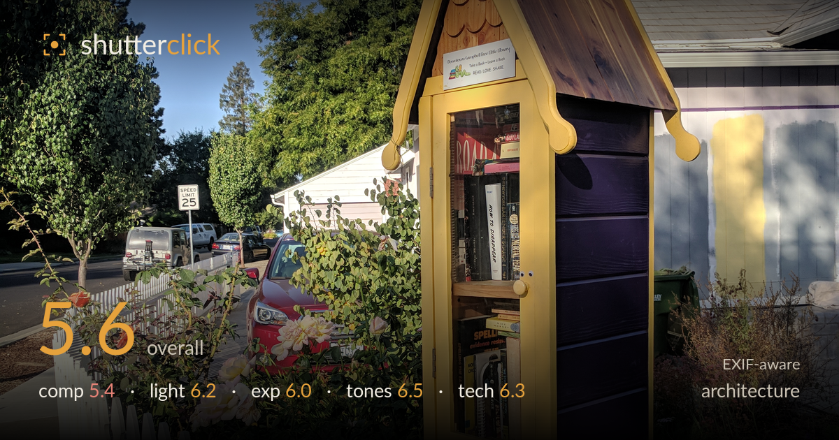
Little free library on the corner
Photo by Grendelkhan

| Focal length | 5 mm |
| Aperture | f / 2.0 |
| Shutter | 533/1000000 s |
| ISO | ISO 60 |
| Exp. comp. | 0.0 EV |
| Shot at | 09:03 · Oct 10, 2017 |
A charming little-library subject rendered with pleasant late-afternoon warmth, but the framing lets it down. As an architectural study the tall yellow-and-purple box sits centred and slightly crowded, with the white picket fence dominating the lower half and a busy hedge, cars, and rooflines fighting for attention behind. The peaked roof and purple slats have real graphic potential, but the perspective is a little tilted and the structure never gets a clean backdrop to read against. Cleaner separation, a straighter vertical, and a tighter emphasis on the box's geometry would elevate a good documentary snapshot into a genuine architectural portrait.
The little library is placed near centre and reads clearly, but the composition is cluttered around it. The white picket fence occupies a large foreground wedge without adding much, while the hedge, parked cars, and neighbouring roof compete behind the subject. The peaked roof and vertical purple slats are the strongest graphic elements yet they aren't isolated enough to sing. A lower angle emphasising the peak against open sky, or a step left to place the box against the plain house wall, would give the geometry room to breathe.
Low, warm side light from the late afternoon rakes across the cedar roof and yellow trim, giving the shingles pleasant texture and the whole scene a golden feel. The direction works in the subject's favour. However, the light also throws the glass-fronted book compartment and the purple side into deeper shadow, so the interior loses clarity. The bright sky and sunlit fence sit at a very different level from the shaded box front, creating a contrast spread that flattens the subject's detail where it matters most.
Exposure is broadly well judged for a high-contrast scene. The sky holds its blue without clipping and the sunlit cedar retains highlight detail. The trade-off falls on the shadowed book compartment behind the glass, which sinks toward muddy and loses the titles that give the subject its character. The white fence stays just short of blowing out. Overall a sensible middle path, but a touch of fill or exposing a stop brighter for the interior, then recovering the sky, would balance the tonal extremes better.
The warm-cool palette is appealing: golden trim and cedar against a clean blue sky, with the purple slats adding an unexpected accent. White balance leans slightly warm, flattering here. The rose blossoms and red car add colour interest without overwhelming. Saturation looks natural rather than pushed. The main weakness is the shadowed side of the box, where the purple goes dull and murky, and the overall contrast is a little heavy, crushing subtle mid-tones in the foliage. A gentler contrast curve would preserve more gradation.
The 5mm phone lens at f/2.0, 1/1876s and ISO 60 delivers clean, noise-free capture with plenty of depth of field, so the whole scene is acceptably sharp front to back. That deep focus suits the architectural intent. The wide lens, however, introduces the usual small-sensor limitations: verticals lean slightly and the box tilts a touch, which reads awkwardly for a structure that depends on straight lines. Getting square to the subject and holding the phone level, or correcting perspective in post, would fix the keystoning. The fast shutter is overkill for a static subject but does no harm and freezes the surroundings cleanly. Detail in the sunlit cedar is crisp; the shaded glass front resolves less well simply because it sits in shadow, not from any focus error. Overall a technically competent grab shot from a capable phone, held back mainly by the uncorrected verticals and the wide-angle stretch pulling the composition wide.
What would elevate it
Tags
Shot something like this?
Expert photo critique, on demand — scored across six categories, EXIF-aware. Start with 3 free critiques, no credit card.
critique my photo — free