Lively carousel square
Photo by Tama66

No EXIF metadata in this file
Technical analysis based on visual assessment only.
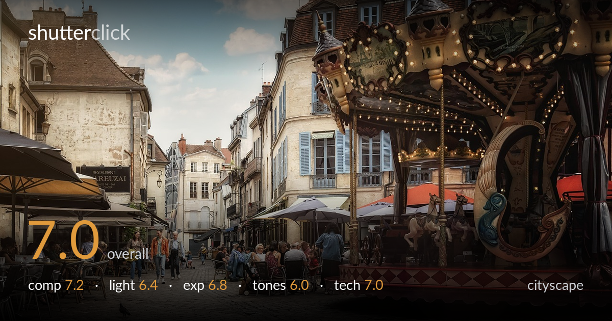
A lively European square scene with a strong sense of place, anchored by the ornate carousel on the right and a receding street of historic facades on the left. The composition reads well, with the carousel's mass balanced against the architectural depth. What most holds it back is the heavy HDR-style tone processing, which flattens contrast, dulls the highlights, and lends the whole frame a slightly murky, oversaturated cast. The light is also flat, gentle overcast that limits dimensionality. Cleaner tonal handling and a moment of stronger directional light would let this busy, characterful scene breathe.
The frame balances two competing anchors effectively: the carousel's ornate bulk on the right against the receding street of facades and cafe umbrellas on the left, with cobblestones leading the eye in from the foreground. The lone pigeon adds a quiet focal accent. The carousel is slightly cramped against the right edge, clipping its canopy, and the busy clutter of cafe diners competes for attention without a clear hierarchy. A touch more room around the carousel or a stronger single subject would tighten the read.
The light is soft and diffuse under a partly clouded sky, even across the scene with no harsh shadows to model the architecture. This keeps detail readable throughout but leaves the facades and cobblestones feeling flat and dimensionless. The carousel's string lights add small warm accents but don't register strongly against the bright daylight. A lower sun angle, raking across the cobbles and catching the stonework, would carve out texture and depth, and would let the carousel illumination read with more presence against a dimmer surround.
Exposure is broadly well controlled across a wide dynamic range, holding detail in both the bright sky and the shaded cafe interiors. Highlights in the clouds are largely retained, and shadow areas under the umbrellas keep usable information. The midtones, however, sit a little heavy, contributing to an overall murkiness. The cobblestone foreground edges toward dull rather than luminous. A modest lift in the cleaner highlights and a small reduction in the compressed shadow regions would restore some snap without sacrificing the broad range already captured.
Tones are the weakest element here. The heavy HDR-style processing flattens local contrast and pushes saturation into a slightly grimy, oversaturated register, giving stonework and cobbles a muddy ochre cast. The blues of the sky and shutters survive but feel muted within the overall murk. White balance leans warm-neutral and is acceptable. Dialing back the tone-mapping, restoring micro-contrast, and easing global saturation would clean up the palette considerably and let the genuine variety of facade colours read more honestly.
From visual evidence, the image appears shot at a moderate focal length with a fairly deep depth of field, keeping both the foreground cobbles and the distant facades acceptably sharp, which suits a cityscape needing front-to-back detail. Focus seems accurate on the mid-ground architecture, and there's no obvious motion blur despite the moving figures, suggesting an adequately fast shutter. The most visible technical concern is the post-processing rather than capture: the tone-mapping introduces a slightly artificial, over-detailed texture and some haloing around the rooflines against the sky, a common HDR artifact. Verticals on the buildings hold reasonably well with only minor convergence, decent for a handheld frame. Overall sharpness is competent rather than crisp, partly softened by that same processing. A lighter touch in tone-mapping, cleaner output sharpening, and attention to the halos along high-contrast edges would lift perceived image quality more than any change in capture settings would.
What would elevate it
Tags
Shot something like this?
Expert photo critique, on demand — scored across six categories, EXIF-aware. Start with 3 free critiques, no credit card.
critique my photo — free