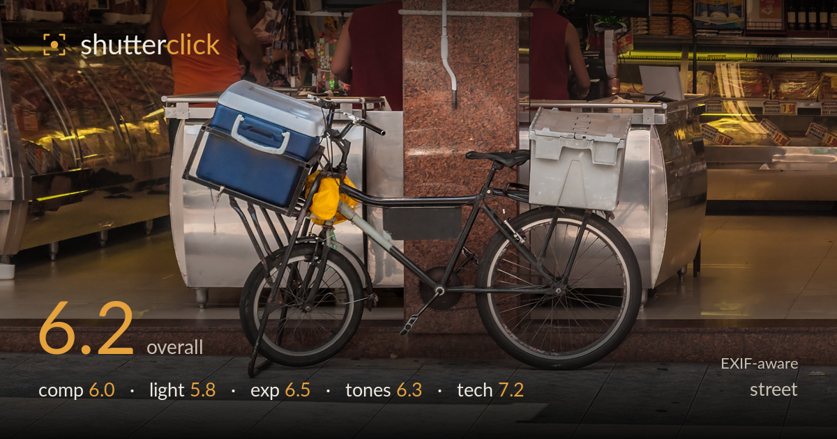
Loaded delivery bike at the market
Photo by Wilfredor

| Focal length | 70 mm |
| Aperture | f / 10.0 |
| Shutter | 1/400 s |
| ISO | ISO 320 |
| Exp. comp. | 0.0 EV |
| Shot at | 13:28 · Nov 27, 2016 |
The delivery bike is a strong central character — the loaded cooler, the yellow bag, the utilitarian frame all speak to a working-life scene in a market. The problem is that the bike sits almost dead-centre against a wall of metal counters and busy background, and the human activity behind it is cut off and undirected, so the frame reads as documentation of an object rather than a moment. The strongest asset, the vendors working at the counter, is relegated to the top strip and obscured by the granite pillar. Sharpness and exposure are handled well; storytelling intent is what most holds it back.
The bike is placed centrally and profile-on, which keeps it legible but static. The chaotic backdrop of stainless counters, price tags, and a granite pillar competes with the subject rather than supporting it, and the pillar bisecting the frame behind the seat splits attention. The people — the real life of the scene — are cropped at the shoulders and pushed to the top edge, so their gestures never connect to the bike. Foreground tile fills the lower third with little purpose. A lower angle or waiting for a figure to interact with the bike would tie the elements together.
The light is flat, indoor market illumination — a mix of overhead fluorescents and daylight spilling in — with no clear direction to model the bike or separate it from the metal behind. The stainless surfaces bounce light unevenly, creating patches of glare rather than shape. The pool of sunlight on the tile at lower right is the one directional accent, but it sits away from the subject and goes unused. The overall effect is even but uninspiring, leaving the bike frame merging tonally with its dark surroundings instead of standing forward.
Exposure is well controlled for a tricky mixed-light interior. The reflective counters and bright product shelves at the edges hold detail without blown highlights, and the black bike frame retains shadow information rather than crushing to solid black. The sunlit tile at lower right sits near the top of the range but stays under control. The midtones on the granite pillar and the blue cooler read cleanly. Nothing here reads as accidental — the balance across a wide brightness range is deliberate and competent.
The palette leans warm from the market's tungsten and reflected gold surfaces, which gives the scene a consistent ambience but also a slightly muddy cast across the neutrals. The blue cooler and yellow bag provide welcome colour anchors against the browns and greys. White balance is a touch warm — the stainless steel takes on a yellow tint that could be neutralised. Contrast is moderate and the tonal range is full, but the mid-tones feel a little flat and could use more separation to lift the bike from its backdrop.
At 70mm, f/10, 1/400s and ISO 320, the settings are well matched to a static subject in mixed light. The f/10 aperture delivers front-to-back sharpness that keeps the whole bike crisp, and detail on the tyre treads, spokes, and cooler latch is clean. Focus lands accurately on the frame and wheels. 1/400s easily freezes the parked bike and the slight movement of the vendors behind. ISO 320 keeps noise negligible with no visible grain in the shadows. The 70-300 lens on the long end compresses the scene slightly, flattening the depth between bike and counters — a wider focal length from closer in would have given more spatial separation. The deep depth of field is a reasonable choice for a documentary object study, though a wider aperture could have softened the cluttered background to isolate the subject. Execution is sound throughout; the technical decisions serve the frame competently even if they don't work to solve its compositional clutter.
What would elevate it
Tags
Shot something like this?
Expert photo critique, on demand — scored across six categories, EXIF-aware. Start with 3 free critiques, no credit card.
critique my photo — free