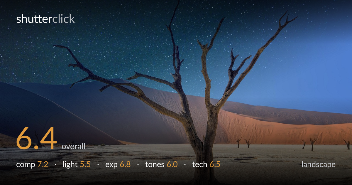
Lone dead tree beneath the stars
Photo by jpdvg

No EXIF metadata in this file
Technical analysis based on visual assessment only.
A striking subject — a skeletal Deadvlei tree against dune and star field — anchors a composition with genuine graphic power. What most holds it back is the credibility of the light: the tree, dune and cracked pan carry warm, directional daylight while the sky is a dense star field, a combination the natural world cannot produce simultaneously. That composite quality undercuts the drama it reaches for. The framing and the branching silhouette are the real strengths; if the foreground light and the sky read as one moment, the image would gain the conviction its subject deserves.
The gnarled tree is placed just right of centre with its crown filling the upper frame, and its branch structure fans into strong negative space — a confident silhouette against the dune. The diagonal dune ridge sweeps from upper left down to the pan, providing depth and scale. The cracked white floor gives useful foreground texture. Placement of the exposed roots low in the frame grounds the tree well. A touch more room beneath the roots and slightly less dead sky at top would tighten the balance.
This is the weak point. The tree, dunes and pan are lit by warm, low, directional daylight — visible in the orange dune face and the shadow modelling on the trunk — yet the sky is a full night star field. Those two lighting states cannot coexist naturally, and the mismatch reads as a composite. The warm glow on the sand is attractive on its own terms, but paired with stars it strains believability and dilutes the mood. A single coherent light state, day or night, would carry far more conviction.
Exposure is handled reasonably across a very wide range. The bright cracked pan holds detail without blowing out, and the shadowed dune retains gradation. The tree sits as a near-silhouette with just enough surface texture on the trunk. The star field is exposed to show density without crushing the sky to black. The main tension is not technical clipping but the impossibility of exposing sunlit sand and a star sky in one honest frame — a symptom of the lighting compositing rather than a metering fault.
The palette leans on a strong warm-cool split — teal-to-blue sky over orange dune and pale grey pan. It is eye-catching but pushed: the sky gradient is heavily saturated and the transition from teal to deep blue looks graded rather than observed. The dune's orange is vivid to the point of feeling synthetic against the cool pan. White balance is inconsistent between the warm ground and cold sky. Dialling back sky saturation and reconciling the two colour temperatures would make the tones feel earned rather than applied.
From visual evidence the tree is rendered sharply, its branch tips crisp against the sky, and the cracked pan shows fine texture — depth of field appears deep and well suited to a landscape. The stars are pinpoint and free of obvious trailing, suggesting a controlled sky capture, while the foreground carries clean daylight detail with low apparent noise. The problem is not resolution or focus but integration: the sky and ground behave as separate captures fused together, and the seam shows in the mismatched light and the abrupt tonal boundary along the dune horizon. The star density is also unnaturally uniform across the whole sky, without the atmospheric fade toward the horizon a real exposure would show. Technically each element is competently rendered on its own; what is missing is the physical and optical consistency that would let them read as one photograph. A genuine single exposure, or a far more careful blend that respects light direction and horizon glow, would elevate the craft considerably.
what would elevate it
tags
Shot something like this?
Expert photo critique, on demand — scored across six categories, EXIF-aware. Start with 3 free critiques, no credit card.
critique my photo — free