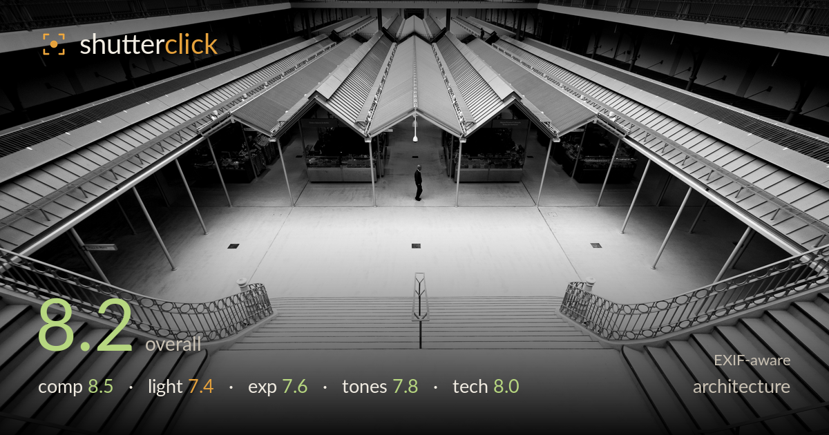
Lone figure in a symmetrical atrium
Photo by Afsalgado

| Focal length | 10 mm |
| Aperture | f / 4.5 |
| Shutter | 1/250 s |
| ISO | ISO 400 |
| Exp. comp. | 0.0 EV |
| Shot at | 07:44 · Oct 14, 2022 |
A commanding use of symmetry — the mirrored staircases, converging rooflines and central lone figure lock the eye to a single vanishing point with real authority. The near-perfect axial balance is the image's greatest strength, and the solitary silhouetted man gives the vast empty space a sense of scale and quiet drama. What holds it back is the tonal handling of the foreground: the lower steps blow toward pure white and lose gradation, flattening the bottom third of the frame. A touch more highlight recovery and a slightly firmer contrast curve through the midtones would give the geometry the crispness it deserves.
The symmetry is the engine here, and it works. Twin balustrades sweep inward, the pitched roof folds converge on a central peak, and the lone figure sits almost exactly on the axis, anchoring the emptiness. The high vantage stacks the staircase, floor and roofline into clean receding planes with genuine depth. The verticals of the columns hold true and the vanishing point is well managed. The only weakness is the vast pale foreground, which occupies nearly half the frame without enough incident to justify its dominance.
The flat, diffuse interior light suits the graphic reading of the space, keeping the geometry legible without harsh shadow clutter. It renders the roof structure and balustrade detail evenly, which serves the symmetry. But that same softness is what leaves the image a little inert — there's no directional light to model the steps or lend the white floor texture and dimension. The brightest zones in the lower foreground push the diffusion into featureless glare, where a raking sidelight would have carved the treads into rhythm.
Exposure is broadly well judged for a high-key interior, holding the shadowed shopfronts and roof detail while keeping the figure readable as a silhouette. The problem is the foreground steps, which drift toward clipped white and lose tonal separation in the lower half — the histogram is crowding the right edge. The upper structure retains good detail throughout. Pulling exposure down a third of a stop, or recovering highlights in post, would restore gradation across the treads without darkening the balanced mid structure above.
The black-and-white conversion is clean and appropriate for this architectural subject, with a wide range from the deep shopfront shadows to the bright floor. Midtone gradation through the roof panels and columns is handled well. The high-key foreground, however, reads slightly washed — the whites lack a defined highlight roll-off and the steps risk merging into a single flat mass. A firmer contrast curve, or a subtle dodge-and-burn to reintroduce separation between adjacent steps, would sharpen the tonal architecture and give the image more presence.
The 10mm on the X-T30 is the right call for capturing the full sweep of this atrium, and the wide framing exploits the space without gross distortion — the verticals stay commendably upright, suggesting careful levelling or corrected barrel distortion in post. f/4.5 delivers front-to-back sharpness adequate for the deep scene, and detail in the distant roof trusses and balustrade ironwork holds up well. 1/250s is more than fast enough for the near-static figure, and ISO 400 keeps noise negligible while giving headroom. Focus appears accurately placed across the mid-distance planes. The one technical caveat is that the extreme wide angle stretches the foreground steps, exaggerating their scale and contributing to the empty lower half — a step back with a slightly longer focal length, or a marginally lower vantage, would have compressed that void. Overall the gear choices and execution are sound and the image is technically clean throughout.
What would elevate it
Tags
Shot something like this?
Expert photo critique, on demand — scored across six categories, EXIF-aware. Start with 3 free critiques, no credit card.
critique my photo — free