Lone poppy in a barley field
Photo by realworkhard

No EXIF metadata in this file
Technical analysis based on visual assessment only.
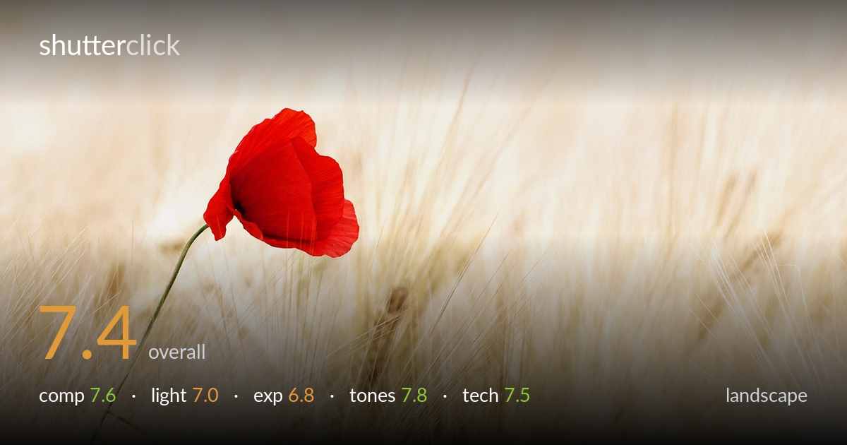
A single red poppy against a soft barley field is a clean, effective use of colour contrast and negative space, and the bold red anchors an otherwise pale frame with confidence. The shallow depth of field separates the bloom from the wash of golden stalks beautifully. What holds it back most is the exposure: the highlights in the background sit very bright, edging toward washed-out, flattening the field into near-white in places. A touch more highlight retention and slightly cooler grading would add dimension. The composition works, but the negative space leans heavily to one side without a counterweight.
Placing the poppy in the left third against a broad sweep of empty field is a confident minimalist choice, and the lone red subject reads instantly. The bent stem leads the eye down and adds a gentle diagonal. The right two-thirds, however, carry no secondary interest or tonal variation to anchor that emptiness, so the balance tips slightly toward dead weight rather than purposeful negative space. A subtle texture break or a second out-of-focus element low right would give the void a reason to exist while keeping the poppy dominant.
The light is soft and diffuse, likely overcast or shaded, which suits the delicate barley and keeps the poppy's reds from blowing out into harsh specular highlights. The flat quality flatters the flower's saturation but does little to model the field, which reads as an even, low-contrast wash. A lower, raking side light or backlight catching the seed heads would have separated the stalks into distinct strands and added the depth the background currently lacks. As shot, the lighting is pleasant but undirected.
Exposure is the weakest link. The background field sits very high on the histogram, with large areas pushing toward pure white and losing texture in the brightest barley. The poppy itself is well exposed, with detail held in the deep reds, but the surrounding key is bright enough to suggest exposure was biased to keep the flower from going dark, at the cost of the field. Pulling overall exposure down a third to half a stop would recover stalk detail and stop the high-key wash from tipping into emptiness.
The warm cream-to-gold palette of the barley against the pure saturated red is the photograph's strongest asset, a clean two-colour relationship that feels intentional. White balance leans warm, reinforcing the summer-field mood, and the red holds rich without clipping into orange. The overall low-contrast, pastel treatment is gentle and coherent. A slightly cooler or more neutral background would let the red sing even harder by contrast, and a touch more tonal separation in the highlights would prevent the creams from merging into one undifferentiated band.
Focus lands cleanly on the poppy's petals, with the bloom and upper stem rendered sharp while the field dissolves into smooth, pleasing bokeh. The shallow depth of field is well chosen for an isolating, minimalist treatment and does exactly what it should, lifting the subject off a busy field of stalks. The long, soft motion-blurred streaks of barley suggest a longer focal length and a wide aperture working together, possibly with a hint of breeze, which adds a painterly softness rather than distracting. Sharpness on the flower is good without being clinical. The main technical limitation is shared with exposure: the rendering of the highlights is so bright that fine detail in the out-of-focus stalks is lost not to blur but to clipping. Slightly stopping down would have deepened the field marginally without sacrificing isolation, and a marginally lower ISO or exposure would have protected those highlights. Execution overall is competent and the depth-of-field judgement is sound.
what would elevate it
tags
Shot something like this?
Expert photo critique, on demand — scored across six categories, EXIF-aware. Start with 3 free critiques, no credit card.
critique my photo — free