Lone striped beach hut
Photo by CapeCom

No EXIF metadata in this file
Technical analysis based on visual assessment only.
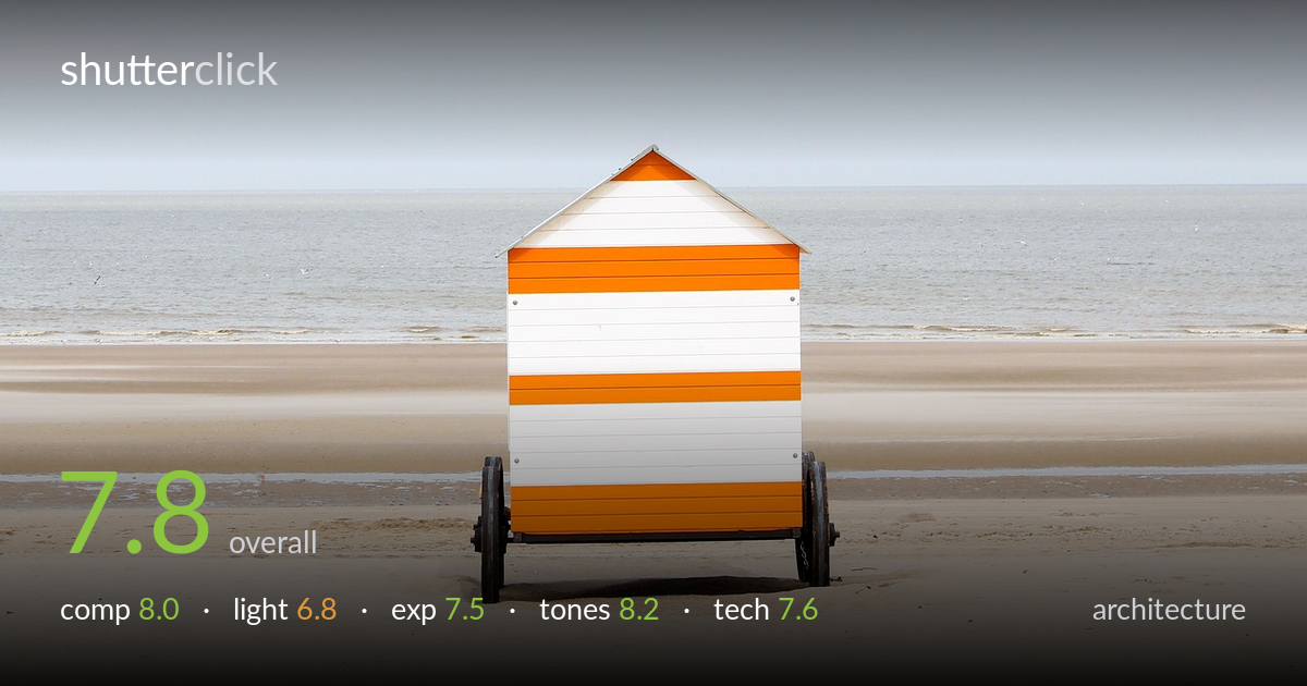
A clean, minimalist study of a striped beach hut anchored against a vast horizon — the strength here is restraint and graphic clarity. The wheeled cabin sits dead-centre on a low horizon, its orange-and-white bands punching cleanly against the muted sky and sand. The symmetry pays off because the subject is itself symmetrical. What holds it back most is the flat, overcast light, which leaves the hut without modelling and renders the foreground sand a little featureless. A touch more drama in the sky, or a raking lower sun, would lift this from tidy to memorable. As it stands, a confident, well-controlled minimalist frame.
The centred placement is the right call for a symmetrical subject like this hut — it reinforces the deadpan, frontal geometry rather than fighting it. The low horizon, sitting around the lower third, gives the sky room to breathe and isolates the cabin against open space. The wheels and apex of the roof are cleanly framed with breathing room on all sides. The expanse of empty sand below works as negative space, though it grows slightly inert toward the bottom edge. A whisper more foreground texture or a tide line would add interest without breaking the calm.
The overcast sky delivers soft, even illumination with no harsh shadows — flattering for the flat faces of the hut and its crisp stripes, but it costs the image dimension. The cabin reads almost graphically flat, with little to separate its planes or hint at form. The faint cast shadow at the base barely registers. Light timing here is functional rather than expressive; a low side light at golden hour would rake across the boarding, reveal the texture of the painted wood, and throw a longer, more dynamic shadow across the sand.
Exposure is well judged across a tricky range. The bright white stripes and pale sky hold without clipping into blank paper, and the orange bands retain saturation rather than glowing out. Shadow detail under the cabin and around the wheels stays open. The overall key is bright and airy, which suits the breezy subject. The sand in the lower frame sits a touch flat and could carry marginally more midtone separation, but there's no sign of accidental under- or over-exposure — the histogram appears comfortably contained end to end.
Tonally this is the strongest aspect. The muted blue-grey sky, sandy neutrals, and the single warm orange accent form a disciplined, harmonious palette. White balance reads accurate and cool-neutral, letting the orange sing without contaminating the whites. The gradation from the darker upper sky down to the pale horizon band is smooth and atmospheric. Saturation is restrained and tasteful — the orange has presence without shouting. Contrast is gentle and appropriate to the soft light. A subtle dehaze on the distant sea could add a little crispness to the horizon line.
Execution is clean and assured. Focus sits accurately on the hut, with the stripes, screw heads, and wheel spokes all rendered sharply, and detail holds back into the wet sand and distant waterline. Depth of field is ample — front-to-back sharpness is maintained, consistent with a small-to-moderate aperture suited to this kind of frontal architectural subject. No motion blur is evident; the still subject and bright conditions allowed a clean handheld or tripod capture. Noise is well controlled in the smooth sky, where banding or grain would show first. The lens choice renders the hut without obvious distortion — the vertical edges read true and the roof apex is undistorted, which matters for an architecture frame. The only minor technical observation is that the distant horizon softens slightly into atmospheric haze, but that is conditions rather than a focus error. Overall a technically tidy capture with no significant flaws in sharpness, rendering, or depth control.
What would elevate it
Tags
Shot something like this?
Expert photo critique, on demand — scored across six categories, EXIF-aware. Start with 3 free critiques, no credit card.
critique my photo — free