Looking down a tokyo avenue
Photo by Takatoshikun

No EXIF metadata in this file
Technical analysis based on visual assessment only.
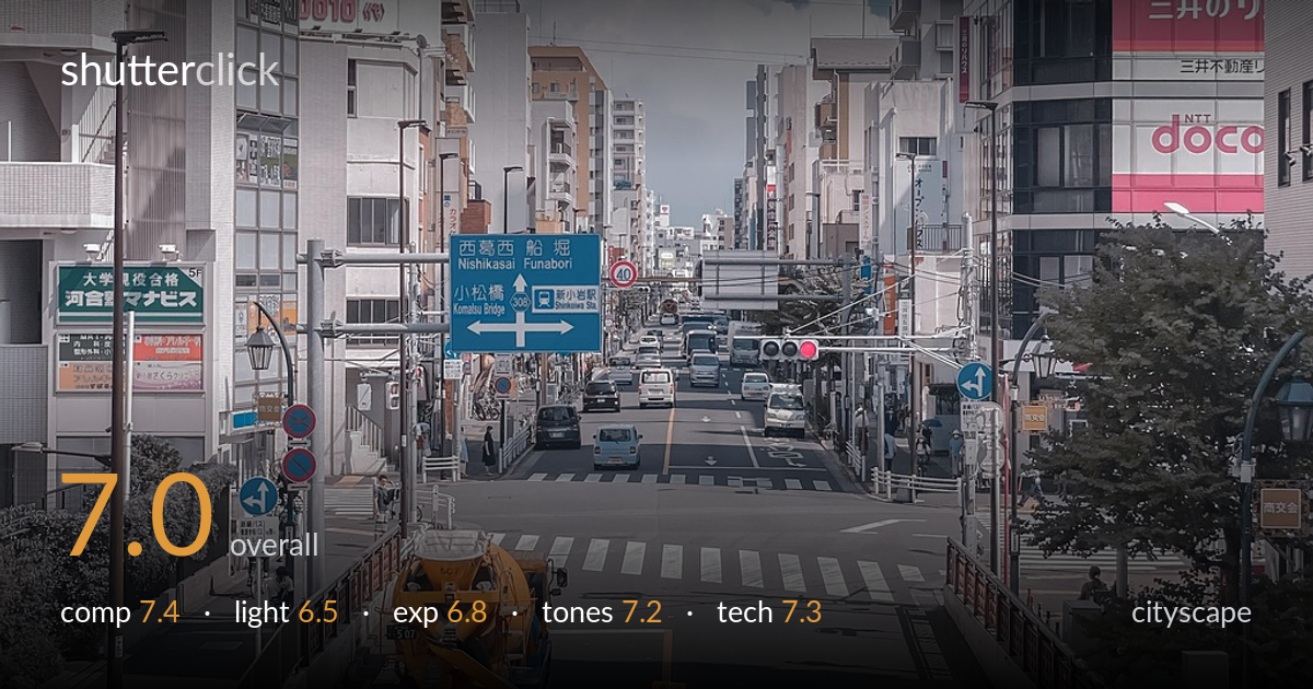
A well-observed Japanese street scene with strong depth, framed by buildings that funnel the eye down the avenue to a receding vanishing point. The elevated vantage and the yellow crane truck give the foreground a solid anchor, while the towering cumulus fills the sky gap between the flanking buildings. What holds it back most is the harsh midday light, which flattens the buildings and dulls the shadows into a slightly muddy, low-contrast rendering. The teal-and-orange grade is pleasant but pushed hard enough to sap warmth from the skin of the scene. A more considered moment of light and a lighter hand on the colour would lift this considerably.
The frame uses converging building lines and the road to pull the eye toward a strong central vanishing point, giving real depth. The yellow crane truck and white van anchor the foreground, and the cloud rising in the sky gap is a lucky, effective piece of negative space. The near-symmetrical framing suits the corridor of the street. The right edge feels slightly heavier with the large SHIMAMURA tower, and the very bottom is a touch cluttered with the traffic cone line, but overall the balance holds together well.
Shot under high, hard midday sun, which is the least flattering light for a cityscape. The buildings lack the raking modelling that low-angle light would bring, and shadows fall short and murky rather than shaping form. The one saving grace is the towering cumulus, dramatically lit and adding energy to the sky. The overall effect is flat and slightly hazy across the facades. Golden hour or a slightly overcast diffusion would give the architecture far more dimension and mood.
Exposure is broadly well controlled. The sky retains its blue gradient and the cloud holds highlight detail without blowing out, which is impressive given the bright conditions. The road and shadowed foreground carry adequate detail, though the darker recesses on the left buildings sit a little flat and could use a touch more separation. Nothing is badly clipped, and the midtones are placed sensibly. The exposure reads as deliberate and safe rather than expressive.
A clear teal-and-orange grade runs through the image, cooling the sky and shadows while the crane truck and warm signage carry the orange side. It gives the scene a coherent, modern look, but the grade is pushed hard enough that the buildings take on a slightly grey-teal cast that drains natural warmth. White balance leans cool. Contrast is moderate and the tonal range is fine, though a little more punch in the midtones and a lighter touch on the split-tone would feel more natural.
Focus and sharpness are handled well for a scene shot at distance — detail holds from the foreground crane truck through the receding traffic to the distant buildings, suggesting a sensibly stopped-down aperture that keeps the whole corridor acceptably sharp. There is no obvious motion blur despite the moving vehicles, indicating a shutter speed fast enough to freeze the street. Noise is not a visible problem, consistent with good light. The focal length choice — a moderate telephoto compression — is well suited to a cityscape, stacking the buildings and shortening the perceived distance to the vanishing point, which enhances the sense of a dense urban canyon. Verticals are largely upright, though a slight lean is visible on the far-right tower that a small perspective correction would tidy. The main technical limitation is not gear execution but the timing of light, which no setting can fully rescue. Overall this is competently executed work with clean rendering throughout.
what would elevate it
tags
Shot something like this?
Expert photo critique, on demand — scored across six categories, EXIF-aware. Start with 3 free critiques, no credit card.
critique my photo — free