Looking down a wooden spiral staircase
Photo by garten-gg

No EXIF metadata in this file
Technical analysis based on visual assessment only.
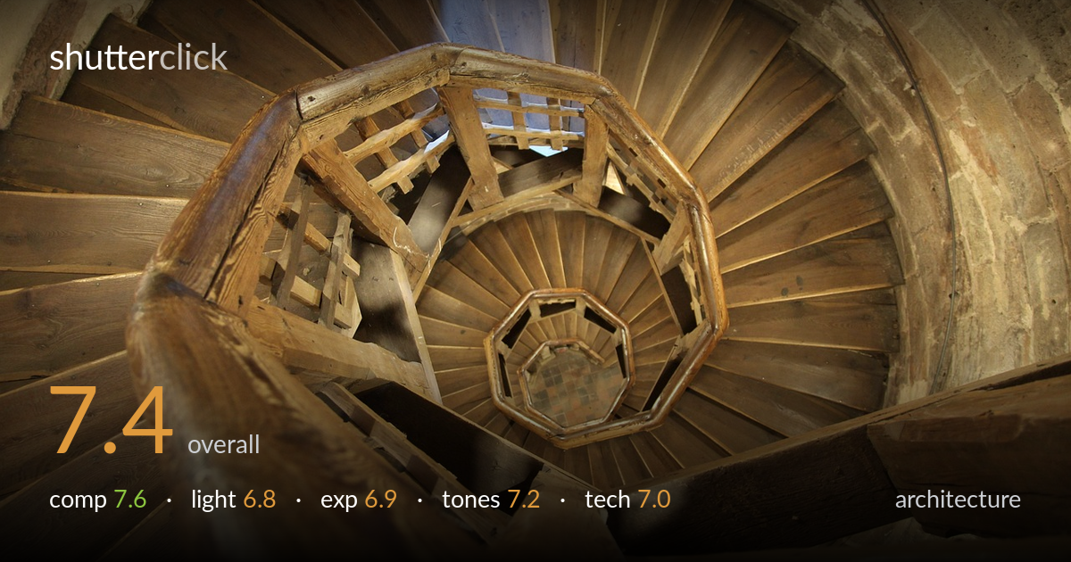
A confident downward shot of a wooden spiral staircase, carried almost entirely by the natural spiral the steps describe as they wind to the octagonal landing below. The radiating treads and concentric brick wall create genuine visual rhythm and a strong sense of depth. What most holds it back is the foreground handrail in the lower-left corner: it dominates the frame as a large, soft, out-of-focus mass that competes with the spiral rather than framing it. Tighter control of where the spiral's centre sits in the frame, and cleaner highlight handling on the brightest treads, would lift this from a strong record shot to a polished one.
The spiral is the picture, and it reads with real momentum, drawing the eye down to the small octagon at the base. The radiating treads against the curved brick build convincing depth. The weakness is the heavy out-of-focus handrail filling the lower-left corner; it is too large and too soft to act as a frame and instead blocks part of the spiral. The focal centre also sits low and slightly right rather than anchored. Pulling back or shifting position to give the spiral's vanishing point more breathing room would strengthen the geometry.
Soft, diffuse interior light wraps the wood evenly and keeps the grain readable across most of the spiral, which suits the subject. The trade-off is flatness: with little directional emphasis the steps lack the modelling that raking light would give, and the deeper recesses fall into murky shadow without quite resolving. The brightest treads near the centre edge toward washed-out. Light entering from upper frame gives some sense of source, but the overall rendering stays gentle to the point of muting the structure's three-dimensional drama.
Exposure is broadly well judged for a high-contrast interior. Midtones in the wood hold detail and the brick wall retains texture. The brightest step faces toward the centre push close to clipping and lose a little highlight information, while the darkest gaps between treads block up into near-black with no recoverable detail. The dynamic range here is demanding and the balance struck is reasonable, but a slightly more protective exposure for the highlights, lifted later in post, would preserve the full tonal sweep of the descending spiral.
Warm amber and honey tones unify the frame and give the aged wood an inviting, slightly nostalgic character that fits the subject. White balance leans warm, which feels deliberate and flattering here. Contrast is moderate and gradation through the mid-tones is smooth, letting the grain breathe. The risk is monotony: the palette is almost entirely one hue, so the eye has few tonal landmarks. The cooler stone and shadow areas provide the only relief. A touch more separation between wood and surrounding masonry would add dimension.
Focus sits on the mid-distance spiral and the treads there are crisp, with grain and joinery clearly resolved, which is the right plane to prioritise. The foreground handrail is well outside the depth of field and renders as a soft blur; whether intended as a framing device or not, its scale makes the softness conspicuous rather than supportive. A smaller aperture would have carried more of that near rail into acceptable focus, or a position further from it would have removed the problem entirely. The wide-angle perspective exaggerates the spiral's reach, which serves the composition, though the curved brick wall on the right shows mild distortion typical of such focal lengths. Noise is well controlled and the image looks clean at this scale. Handheld stability appears adequate — no obvious motion blur in the sharp zones. Overall execution is competent; the main improvement lies in managing the foreground element and choosing an aperture matched to the full depth of the scene.
what would elevate it
tags
Shot something like this?
Expert photo critique, on demand — scored across six categories, EXIF-aware. Start with 3 free critiques, no credit card.
critique my photo — free