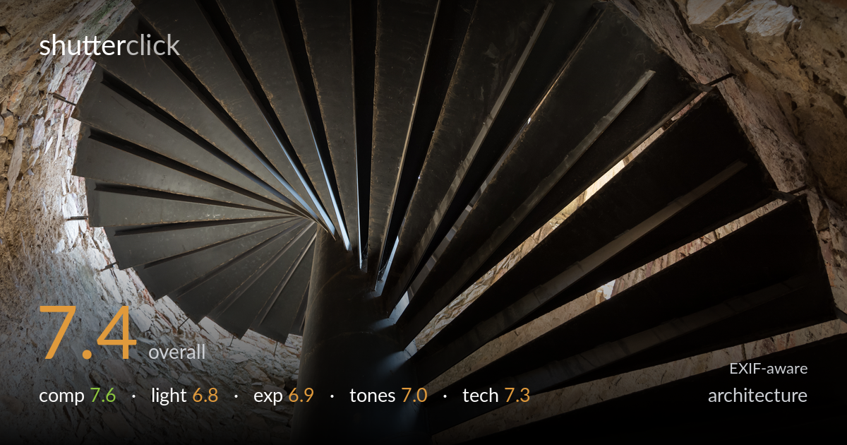
Looking up a spiral staircase
Photo by Jacek Halicki

| Focal length | 18 mm |
| Aperture | f / 4.0 |
| Shutter | 1/60 s |
| ISO | ISO 800 |
| Exp. comp. | 0.0 EV |
| Shot at | 15:27 · Aug 28, 2016 |
The radial geometry of the spiral staircase is the clear strength here — the fanning treads and converging central column create a strong graphic spiral that reads instantly from below. The black metal against weathered stone gives good material contrast. What holds it back most is the off-centre placement of the spiral's focal point, which sits high-left and leaves the lower-right corner heavy with stair undersides and less resolved geometry. The flat, ambient light also undersells the texture of both stone and steel. A more deliberate centring of the vanishing spiral and a cleaner tonal separation would lift this from competent record to striking abstract architecture.
Shooting straight up the spiral exploits the staircase's natural radial pattern well, and the fan of treads delivers genuine visual rhythm. The eye is drawn cleanly into the converging centre. The weakness is balance: the spiral's hub sits high and left, while the lower-right fills with the dark undersides of steps that lack the same clarity. The bright stone wedge at upper-right pulls attention away from the spiral. A composition that placed the convergence point closer to centre would give the radial pattern more symmetry and impact.
The light is soft and ambient, coming from windows out of frame, which keeps the stone wall and metal treads evenly lit but flat. There is little directional modelling to bring out the texture of the rough stonework or the worn steel, so surfaces read somewhat lifeless. The brightest patches at upper-right and mid-right hint at window light that could have been used more deliberately. Raking light grazing the stone or catching the edges of the treads would have given the geometry more dimensionality and depth.
Exposure is broadly serviceable but sits on the dark side for the metal treads, where shadow detail in the undersides verges on muddy without fully clipping to black. The stone walls retain highlight detail and the brighter window-lit patches are held. The dynamic range between the near-black steel and the pale stone is wide, and the metal could carry slightly more midtone separation. Nothing is badly blown, but a touch more lift in the shadow regions would recover form in the lower steps that currently merge together.
The palette is restrained: warm ochre and grey stone against near-monochrome dark steel. White balance reads neutral-to-slightly-warm, which suits the aged interior. The stone carries pleasant earthy variation, but the metal treads are a fairly undifferentiated dark mass with limited tonal gradation, flattening their form. Contrast is moderate and the overall rendering is honest rather than dramatic. Deepening the blacks while teasing more separation into the steel, and slightly enriching the stone's warmth, would give the frame more tonal vitality without tipping into artificiality.
At 18mm the wide angle was the right call for capturing the full spiral from directly beneath, and the fisheye-like sweep is an asset rather than a fault here. Focus lands well on the central column and the treads nearest the hub, which is where it matters. At f/4 depth of field is adequate for this near-overhead subject, and the more distant outer steps remain acceptably sharp. ISO 800 is a sensible choice for the dim interior and noise is well controlled on the D7100, visible only faintly in the darker stone shadows. The 1/60s shutter is fine for a static subject handheld at this focal length. The main technical limitation is not the settings but the flat available light combined with shadow areas that read slightly soft and dense in the lower treads. Stopping down marginally to f/5.6 would have firmed up corner-to-corner sharpness across the full fan with little cost.
what would elevate it
tags
Shot something like this?
Expert photo critique, on demand — scored across six categories, EXIF-aware. Start with 3 free critiques, no credit card.
critique my photo — free