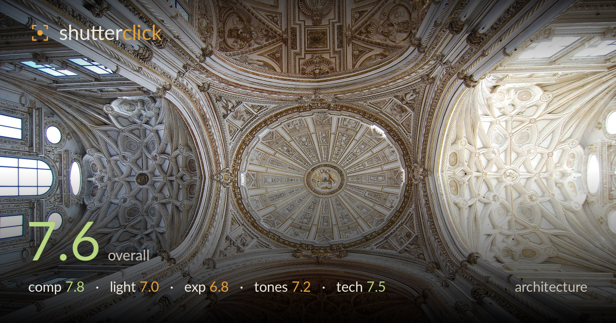
Looking up into the vaulted dome
Photo by laurentgraphiste

No EXIF metadata in this file
Technical analysis based on visual assessment only.
A confident vertical-up ceiling study that uses radial symmetry to organise an extraordinarily busy subject. The central oval dome anchors the frame while four vaults radiate outward, giving the eye a clear path through the ornament. What most holds it back is highlight handling — the right-hand vault and upper-right window blow to pure white, losing carved detail exactly where the light draws attention. The colour balance also drifts warm-yellow in the lower vault against cooler whites elsewhere, an uneven cast rather than a deliberate grade. Strong bones, competent execution; recovering the highlights and evening the white balance would lift it further.
Pointing straight up and letting the four vaults spoke outward from the central dome is the right call for this space — the radial symmetry does the organising work. The oval dome sits close to centre, appropriate here since the whole ceiling is the subject. The lower Gothic vault adds tonal and stylistic contrast that keeps the frame from feeling uniform. Balance is slightly heavier on the bright right side; a hair of rotation would true the near-symmetry, and the top edge crops through ornament a touch abruptly.
The illumination is entirely ambient window light, and it shapes the plaster relief well on the left and centre, where directional falloff reveals the carving. The problem is unevenness: the right vault receives far stronger light and flattens into glare, while the central dome sits in a pleasant, gentler gradient. Nothing could be staged here, so the fix is exposure and timing — an overcast day or a moment with softer through-window light would even the two halves and preserve the delicate stucco detail across the whole ceiling.
Midtones across the central dome and left vault are well placed, holding the intricate carving. The weakness is clipped highlights — the right vault and the upper-right window burn to paper white with no recoverable texture, and smaller window blowouts dot the frame. Shadows remain open and detailed, so dynamic range wasn't the limit; the exposure simply favoured the shadows at the highlights' expense. Bracketing and blending, or exposing a third of a stop darker, would have retained the bright vault's ornament.
The whites-and-gold palette suits the space, and the central dome's soft cream gradation reads beautifully. Contrast is judged well enough to separate the layered relief. The main issue is white-balance drift: the lower vault leans distinctly warm-yellow while the left and centre stay neutral to cool, so the frame reads as two colour temperatures rather than one coherent grade. Evening that cast and pulling a touch of saturation from the yellow would let the gold accents feel intentional rather than like a stray tungsten tint.
The ultra-wide vertical composition demands sharpness edge to edge, and detail holds impressively across most of the frame — the central dome's radiating panels and the left vault's tracery stay crisp. Depth of field is sufficient throughout, consistent with a small aperture appropriate to the subject. Handheld shake isn't evident, so either a fast enough shutter or steady support was used. Two things temper the execution: the corners soften slightly, typical of wide-angle glass wide open or near it, and there is mild chromatic fringing along the high-contrast window edges. The biggest technical cost, though, is the blown highlight vault, which no lens correction recovers. A slightly narrower aperture wouldn't hurt corner rendering, and the fringing is straightforward to correct in post. Overall this is careful, competent capture of a genuinely difficult, detail-dense interior; the framing and steadiness are the strongest elements, the highlight and corner handling the areas with most headroom.
What would elevate it
Tags
Shot something like this?
Expert photo critique, on demand — scored across six categories, EXIF-aware. Start with 3 free critiques, no credit card.
critique my photo — free