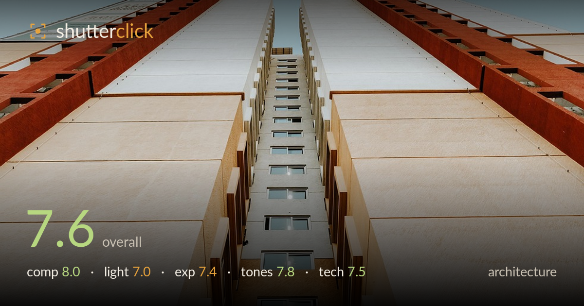
Looking up the building corridor
Photo by Roaming_Revolution

No EXIF metadata in this file
Technical analysis based on visual assessment only.
A strong vertical-perspective study that uses the gap between two building wings as a receding vanishing corridor — the eye is pulled cleanly from the near window up to the pinpoint of sky at the top. The symmetry is the driving idea and it largely holds, though the central seam drifts slightly right of the frame's true centre and the two wings aren't perfectly balanced in width. The warm stucco against the flat teal sky is pleasing. What holds it back most is a slight tilt in the convergence and some flatness in the midday light. A cleaner alignment and richer window detail would sharpen an already graphic composition.
The one-point perspective converging on a distant sliver of sky is the strength here — the recessed window column marches upward with real rhythm, and the two flanking wings frame it symmetrically. Placing the largest near window at the bottom anchors the base well. The central axis, however, sits slightly right of true frame centre, weakening the intended mirror symmetry. The left and right wings also differ in apparent width, so the balance reads a touch off. A dead-centred axis with matched margins would make the geometry snap.
The light is high and fairly flat, typical of near-midday, which keeps the two large angled facades evenly lit but robs the stucco of raking texture and modelling. The recessed inner column falls into cooler, shadowed light that helps separate it from the bright outer walls, which is useful. Highlights on the sunlit faces stay controlled. Lower-angle side light would carve depth into those broad tan planes and give the red trim more dimension. As shot, the surfaces read a little featureless.
Exposure is well judged for a high-contrast subject. The sunlit stucco holds highlight detail without clipping, and the sky retains its smooth gradient rather than blowing out. The shadowed inner window column keeps enough detail to read structure, though the very deepest recesses go slightly murky. Midtones on the tan walls sit comfortably. Nothing looks accidental here — the brightness balance across bright facade and shaded corridor is handled with care. A touch more shadow lift in the recess would recover the finest window detail.
The warm sandstone and terracotta tones play nicely against the muted teal sky, a clean complementary pairing that gives the frame its graphic appeal. White balance leans warm, which suits the stucco. The sky's flat, slightly desaturated blue keeps attention on the architecture. Contrast is moderate and appropriate — the red trim bands provide punctuation without shouting. The only tonal weakness is a slight sameness across the broad tan panels; a subtle contrast lift in those planes would add separation between adjacent facade sections.
Focus is accurate on the near window and holds acceptably up the receding column, suggesting a well-chosen aperture for deep depth of field. Sharpness across the sunlit facades is good, with the stucco texture rendering cleanly at the base. Noise is not an issue in these bright conditions. The main technical concern is verticality: the convergence pulls slightly, and the frame reads a touch tilted, so the two wings don't rise as perfectly mirrored lines — the kind of thing perspective correction or careful in-camera levelling resolves. Lens choice appears wide enough to capture the full vertical sweep without excessive distortion at the edges, which is well managed for this looking-straight-up angle. The recessed window column loses fine detail toward the top as it shrinks, but that's an inevitable consequence of the extreme perspective rather than a fault. Overall execution is clean; tightening the alignment is where the biggest gain lies.
What would elevate it
Tags
Shot something like this?
Expert photo critique, on demand — scored across six categories, EXIF-aware. Start with 3 free critiques, no credit card.
critique my photo — free