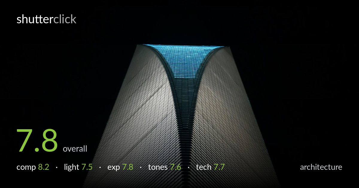
Looking up the lit tower
Photo by Leslin_Liu

No EXIF metadata in this file
Technical analysis based on visual assessment only.
A confident upward-looking study of a skyscraper that converts the building's tapering corner and ribbed facade into a strong central axis. The symmetry and the vanishing point that resolves into the carved void at the crown carry the frame. What most holds it back is the slightly off-centre placement of that apex and the very heavy black surround that reads more as absence than deliberate negative space. The detailed louvered texture is the real reward here, and it survives the night exposure with surprisingly little noise. A more precise centering and a touch more presence in the shadows would lift it further.
The low, dead-on vantage point is the right call, turning the tapering corner into a powerful central spine that draws the eye up to the carved void at the crown. The receding floor lines act as ribbed leading lines toward that vanishing point. The apex sits a fraction left of true centre, which slightly undercuts the symmetry the rest of the frame promises. The surrounding black is vast — it isolates the form but contributes little, and a tighter horizontal crop would let the facade fill more of the frame.
The building is lit by its own facade illumination, and that even, cool glow rakes across the ribbed louvers to reveal the horizontal banding cleanly. The light falls off naturally toward the base corners, giving the form some dimensionality rather than flat uniformity. The cyan-lit recess at the crown is the brightest accent and works as a focal payoff. The downside is the uniformity of the source — there is no directional drama or gradient across the face, so the surface reads as texture rather than sculpted by light.
A well-judged night exposure that holds the bright louvered highlights without obvious clipping while letting the surrounding sky fall to pure black — a deliberate, effective choice. The midtones across the facade carry the fine horizontal detail, and the brighter crown recess retains its blue without blowing out. The deepest corners of the building near the base lose some detail to shadow, which is acceptable given the scene but leaves the form slightly anchorless at the bottom. Overall the brightness placement looks intentional rather than accidental.
A restrained, near-monochrome palette dominated by cool steel-blue greys, with the brighter cyan crown providing the single warmer-cool accent. White balance leans cold, which suits the nocturnal architectural mood and the metallic facade. Contrast is high but controlled — the building separates crisply from the black ground. The tonal gradation across the louvers holds well in the mids, though the transition into the darkest corners is abrupt. A touch more separation in the shadow tones would preserve the structure where it currently merges into black.
Focus is accurate across the facade, and the repeating louver pattern stays crisp deep into the frame, which speaks to a well-chosen aperture and a stable platform — likely a tripod or a braced position given the night conditions. Noise is impressively controlled in the black surround, suggesting a sensible ISO and a longer exposure rather than pushing sensitivity. The wide focal length captures the full taper of the tower but introduces only modest perspective distortion, kept in check by the dead-centre, symmetrical vantage that avoids visible keystoning along the verticals. Depth of field is more than adequate; everything that matters is sharp. The main technical limitation is the fine moiré-like shimmer the dense horizontal banding can produce — visible in places where the louver spacing approaches the sensor's resolving limit. Slightly tighter framing or careful sharpening would manage that. Execution overall is clean and assured for a handheld-difficult subject.
what would elevate it
tags
Shot something like this?
Expert photo critique, on demand — scored across six categories, EXIF-aware. Start with 3 free critiques, no credit card.
critique my photo — free