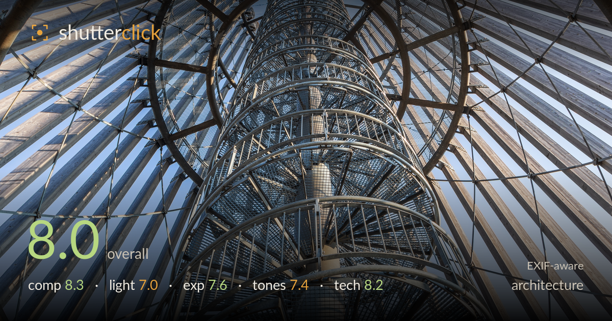
Looking up the spiral tower
Photo by Ansgar Koreng

| Focal length | 24 mm |
| Aperture | f / 8.0 |
| Shutter | 1/60 s |
| ISO | ISO 125 |
| Exp. comp. | 0.0 EV |
| Shot at | 14:52 · Jan 20, 2019 |
A commanding upward view that turns a spiral staircase and its surrounding timber-and-steel cage into a dizzying radial composition. The central helix draws the eye straight up while the ribbed outer structure fans out in near-perfect symmetry — a strong graphic idea, well executed at 24mm. What holds it back most is the flat, mid-day quality of light: the wood and galvanised steel read cool and even, without the modelling that raking light would give. Highlights in the sky and on the top rails sit close to clipping. The framing is disciplined, but the vertical axis drifts slightly off-centre, softening the intended symmetry.
The upward, near-symmetrical framing is the picture's engine — the spiral staircase climbs the centre while the timber ribs and steel rings radiate outward, filling the frame with rhythm and depth. The nested elliptical rings create genuine layering and pull the eye up the shaft. The main weakness is that the central axis leans slightly right of centre, so the symmetry that the composition promises isn't fully delivered; the mesh cylinder converging at top-centre anchors it well regardless. A tighter alignment of the vertical spine would resolve the last bit of tension.
Even, high daylight fills the structure without hotspots on the staircase, which keeps the mesh and treads legible throughout the climb. But the light is essentially flat and directionless — the galvanised steel and weathered timber both read as a uniform cool grey, and the ribs lack the shadow modelling that would separate one plane from the next. The sky is bright and slightly hazy, offering an even backdrop but little drama. Lower-angle side light would rake across the timber grain and give the metal dimensional sparkle.
Exposure is well judged for a high-contrast upward shot: shadow detail survives in the darker steelwork and mesh, and the treads retain texture. The brightest sky patches and the top rails push toward clipping but mostly hold. Midtones on the central column sit a touch flat, which suits the material but flattens depth. The balance between bright sky and shaded structure is handled cleanly with no obvious blocked shadows. A slight negative exposure adjustment, or a graduated recovery on the sky, would protect those upper highlights.
The palette is restrained and coherent — cool blue sky against warm-grey timber and neutral galvanised steel. White balance leans slightly cool, which reinforces the industrial feel but leaves the wood a little lifeless where a touch of warmth would help it read as timber. Contrast is moderate and appropriate; the mid-tones carry the fine mesh and grating well. There's no colour cast beyond the intentional coolness. A gentle contrast lift and selective warming of the wood tones would give the two dominant materials more separation and presence.
The 24mm on the 5D Mark IV is the right call for this cramped, look-straight-up perspective, exaggerating the radial sweep without obvious distortion — the rings stay convincingly circular. f/8 is well chosen for the deep front-to-back range, keeping the near rails and the distant mesh cylinder acceptably sharp across the frame, and ISO 125 keeps the file clean with no visible noise in the shadows. Focus is placed sensibly on the mid-structure, giving good critical sharpness through the staircase. 1/60s is fine here since nothing moves, though it leaves little margin — a slightly faster shutter with the IS engaged would guard against any handheld softness at the frame edges. The main technical opportunity is verticals: shooting dead-level on the central axis, or correcting convergence in post, would tighten the symmetry the composition is built on. Overall a well-controlled capture that uses the gear to the subject's advantage.
What would elevate it
Tags
Shot something like this?
Expert photo critique, on demand — scored across six categories, EXIF-aware. Start with 3 free critiques, no credit card.
critique my photo — free