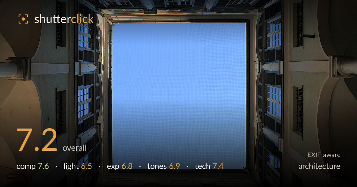
Looking up through the courtyard
Photo by John Samuel

| Focal length | 21 mm |
| Aperture | f / 5.6 |
| Shutter | 1/250 s |
| ISO | ISO 200 |
| Exp. comp. | 0.0 EV |
| Shot at | 18:02 · Oct 7, 2016 |
A strong vertical-perspective concept — the courtyard framing the sky into a near-square window works and the four converging walls create genuine graphic pull. The central sky panel dominates too much of the frame, leaving a large flat blue void that could carry more architectural detail or a cloud to anchod it. The colonnade arches at the corners give depth, but the frame isn't quite symmetric, and the balance leans slightly. Warm-cool tonal split between the sunlit walls and shadowed sky is pleasant. Tightening the symmetry and reclaiming some sky detail would lift a good idea to a memorable one.
The looking-straight-up approach turns the courtyard walls into a radiating frame, and the near-square of open sky is a satisfying central shape. The four surrounding facades converge convincingly, giving strong depth. The main weakness is the sky-to-structure ratio: the flat blue centre eats a large share of the frame with nothing to hold the eye. The framing is also not perfectly symmetrical — the top and bottom walls carry unequal weight, and the sky rectangle sits slightly off-centre, undermining the geometry this shot depends on.
Light is doing useful work — hard directional sun rakes across two of the walls, revealing the render texture and the modelling on the columns, while the opposite faces fall into cool shadow. That warm-cool contrast gives the frame dimension. But the light is midday-hard, and the highlight side edges toward glare on the pale plaster. Softer, lower-angle light, or a moment when the sun grazed all four walls more evenly, would balance the frame and reduce the stark bright-versus-dark split between facades.
Exposure is balanced sensibly for a high-contrast scene — the sunlit plaster retains detail without blowing out, and the shadowed walls keep enough information to read. The sky sits in a clean, well-placed midtone blue. The darkest window recesses block up a little, losing detail in the deepest shadows, and a few bright wall edges approach clipping. Overall a competent single-exposure handling of a wide brightness range; a touch of shadow lift in post would recover the window interiors without harming the highlights.
The warm ochre and cream walls against the cool blue sky make an appealing, natural colour split, and white balance reads accurate for hard daylight. Contrast is a touch high, deepening the shadow-side walls almost to black in places. The blue sky is uniform and slightly flat — some subtle gradation toward the corners would add life. Saturation is restrained and believable. A gentler tone curve through the shadows would preserve the render texture on the darker facades and soften the harsh tonal jump between sunlit and shaded walls.
The settings suit the subject well. At 21mm the 18-55 delivers the wide angle needed to take in all four walls, though this focal length introduces mild barrel distortion and the converging verticals inherent to shooting straight up — acceptable here since the effect is intentional and radial. f/5.6 gives ample depth of field for a scene at effective infinity, so everything from near columns to distant sky is sharp; stopping down further would gain nothing. ISO 200 keeps noise negligible, visible only faintly in the shadowed recesses. 1/250s is far faster than a static building requires, but it guarantees a handheld shot free of shake at this angle. Focus is accurate across the frame. The one gain available would be careful lens-correction in post to straighten the residual distortion and tidy the rectangle of sky, plus a subtle perspective nudge to true up the symmetry the composition leans on. Solid, well-judged execution overall.
What would elevate it
Tags
Shot something like this?
Expert photo critique, on demand — scored across six categories, EXIF-aware. Start with 3 free critiques, no credit card.
critique my photo — free