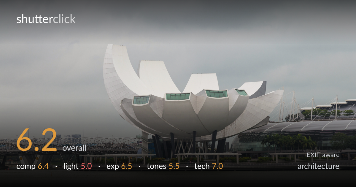
Lotus museum across the water
Photo by Marcin Konsek

| Focal length | 105 mm |
| Aperture | f / 16.0 |
| Shutter | 1/50 s |
| ISO | ISO 200 |
| Exp. comp. | 0.0 EV |
| Shot at | 09:56 · Feb 10, 2016 |
The lotus-form ArtScience Museum is rendered cleanly and reads instantly as the subject, well isolated against open water and a blank sky. The flat overcast light is what most holds the frame back: it strips the white petals of dimension and the sky of any tonal interest, leaving large empty grey expanses top and bottom. The bridge on the left adds welcome layering, but the composition gives too much to a featureless sky. A return in directional light, with the horizon repositioned and the frame tightened around the building and its surroundings, would lift this from a competent record shot to something with depth and presence.
The museum sits slightly left of centre with the cable-stayed bridge providing a useful counterweight and a sense of place. The horizon falls roughly mid-frame, splitting attention between water and sky — neither of which carries enough interest to justify its share. The top third is almost entirely empty grey, and the foreground water is similarly blank. A tighter crop favouring the architecture, or a lower angle reducing the dead sky, would concentrate the eye where the form rewards it. The bridge layering is the strongest compositional asset here.
Heavy, uniform overcast is the limiting factor. The white sculptural petals depend on light to model their curves, and this flat illumination flattens them into near-shapeless masses with little shadow separation between the overlapping forms. There is no directional emphasis, no highlight sparkle on the metal cladding, and the sky offers no texture or mood. Late afternoon side light, or a break in cloud, would carve the petals' geometry and give the white surfaces the gradation they need. As shot, the lighting records the subject but does not shape it.
Exposure is handled sensibly for difficult conditions. The white cladding holds detail without blowing out, which is the real risk against a bright overcast sky, and shadow areas under the structure retain information. The overall image leans a touch dark and muddy, partly a consequence of the flat light rather than the exposure itself. The histogram likely sits compressed in the midtones with little reaching the highlights. A modest brightening of the whites in post would give the building more presence without clipping, since there is headroom to work with.
The palette is dominated by greys — sky, water and concrete all sit in a similar narrow band, and the white museum struggles to stand apart from them. Contrast is low, which suits the overcast honesty but leaves the image feeling lifeless. The greens of the museum windows and the palms provide the only relief. White balance is neutral, perhaps slightly cool. A contrast curve to separate the building from the sky, plus a small lift in the petal whites, would inject the tonal separation the scene currently lacks.
The settings are reasonable for a static architectural subject from across the water. ISO 200 keeps the file clean, and f/16 delivers ample depth of field — though for a distant subject like this, f/16 is past the lens's sharpness peak and starts to introduce diffraction softening; f/8 to f/11 would have held front-to-back focus while keeping the cladding crisper. The 105mm reach on the 6D compresses the scene nicely and isolates the museum, a sound choice. At 1/50s handheld at this focal length, the IS-equipped 24-105 is doing real work; the shot appears free of obvious motion blur, but a faster shutter would have given more margin. Focus lands on the building accurately. Critically, no perspective correction was needed at this distance — verticals read acceptably straight, which serves the architecture. The main technical gain available is opening the aperture for edge-to-edge bite on the panel detail.
what would elevate it
tags
Shot something like this?
Expert photo critique, on demand — scored across six categories, EXIF-aware. Start with 3 free critiques, no credit card.
critique my photo — free