Low-angle bridge framing
Photo by bstad

No EXIF metadata in this file
Technical analysis based on visual assessment only.
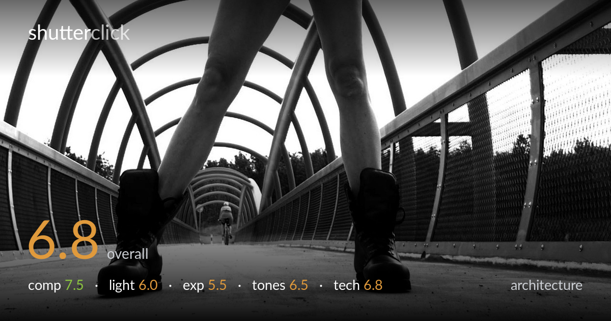
A bold low-angle conceit that frames a distant cyclist through the spread legs and looping tubular spans of a footbridge — the framing-within-framing is the strongest idea here. The wide lens exaggerates the boots and converging rails to dramatic effect, and the cyclist provides a perfect focal anchor at the vanishing point. What most holds it back is the blown-out sky, which strips the bridge's overhead arches of any tonal separation and flattens the upper third. Slightly retained highlight detail and a marginally cleaner foreground would lift this from a clever snapshot to a fully resolved architectural-portrait hybrid.
The legs-as-frame device is genuinely inventive, channeling the eye down the receding deck to the lone cyclist parked dead at the vanishing point — a strong central anchor justified here by the radial symmetry of the tubular arches. The low camera position exaggerates the converging rails into powerful leading lines. The right-side chain-link fence is busier and brighter than the left, pulling slight imbalance, and the figure's torso is cropped abruptly at the top edge. A touch more deck in the foreground would steady the base.
Flat, diffuse overcast light dominates, which keeps the boots and skin evenly lit but offers little modelling on the tubular steel — the arches read as outlines rather than three-dimensional forms. The blown sky behind them eliminates any rim or separation light that could have carved the loops against the background. A lower, raking sun would have caught the curved tubes and thrown directional shadows across the deck, adding the depth the geometry deserves. As shot, the light is serviceable but does little to dramatize the structure.
The sky is fully clipped to paper white, taking the upper arches and the tree line behind the cyclist with it — the single biggest technical limitation. The shadow side of the boots and the deck retain reasonable detail, so the midtones are placed acceptably, but the dynamic range was exposed for the foreground at the total expense of the highlights. Bracketing or exposing for the sky and lifting shadows in post would have preserved the overhead geometry that the composition depends on.
The black-and-white conversion suits the graphic, linear subject and gives the dark boots satisfying depth against the pale deck. Contrast is reasonable through the midtones, with decent gradation on the skin and concrete. The highlight roll-off, however, is abrupt — the sky hits pure white with no transition, so the upper structure dissolves. A gentler tonal curve in the brightest values and a hint more local contrast on the steel tubes would strengthen the separation and give the frame a more controlled, finished feel.
The wide-angle choice is the defining technical decision and it works for the concept — the dramatic foreground boots, the exaggerated convergence of the rails, and the deep field that keeps both the near boots and the distant cyclist acceptably sharp all serve the idea. Focus appears placed adequately for the deep depth of field, though the cyclist at the vanishing point is small and a little soft, more from distance than error. The low shooting position is committed and deliberate. The main technical shortfall is exposure handling: shooting into a bright overcast sky without bracketing or a graduated approach has clipped the highlights irrecoverably, and no amount of conversion recovers that detail. Noise is well controlled and the image is clean in the shadows. A slightly faster reframe to keep the figure's hands and the top arch intact, or a marginally higher angle, would have balanced the structural geometry without losing the dramatic perspective.
What would elevate it
Tags
Shot something like this?
Expert photo critique, on demand — scored across six categories, EXIF-aware. Start with 3 free critiques, no credit card.
critique my photo — free