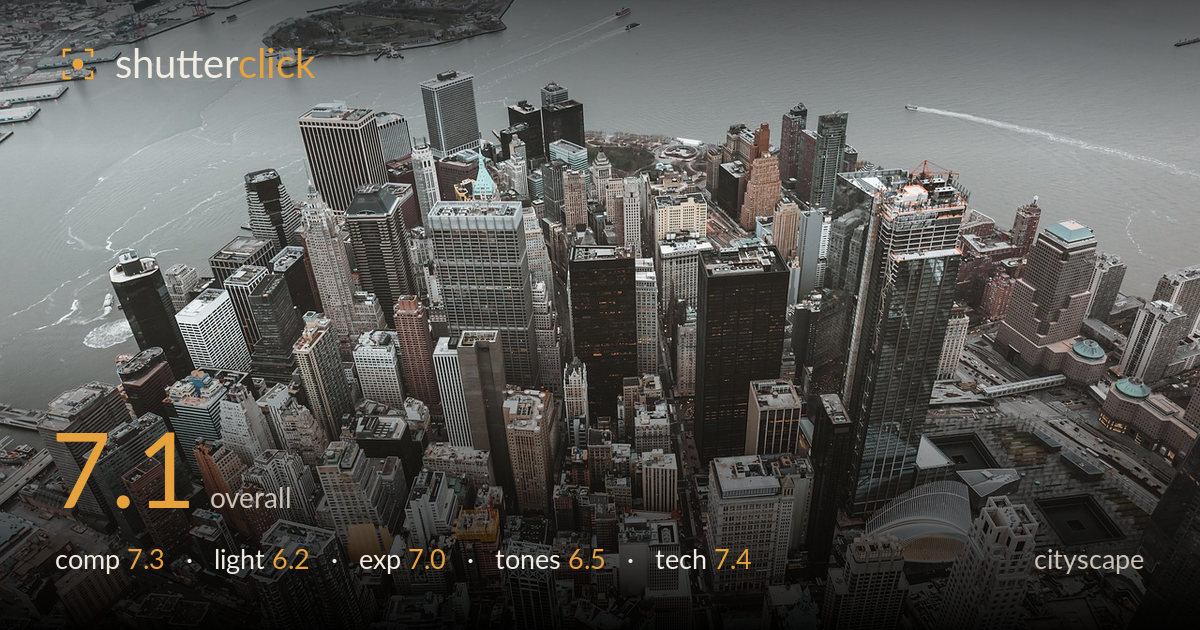
Lower manhattan from above
Photo by noelsch

No EXIF metadata in this file
Technical analysis based on visual assessment only.
A commanding aerial view of Lower Manhattan that trades on density and the interlocking geometry of the financial district. The dense cluster of towers packed against the water gives real weight and scale, and the recognisable landmarks anchor the read. What most holds it back is flat, overcast light that drains the scene of dimension — the shadowless midday cloud cover leaves the buildings looking grey and undifferentiated. The muted, slightly desaturated grade suits the mood but risks tipping into lifeless. Strong bones and a genuinely striking vantage point; better light or a more decisive grade would lift it considerably.
The high-angle vantage packs the towers into a dense, layered mass that fills the lower two-thirds while the harbour opens a breathing space of negative space up top — a sound balance. The water's diagonal edge running upper-left to right introduces welcome movement against the vertical clutter. The frame is busy by nature, and no single anchor point commands the eye, so it reads as texture more than a story. A slightly tighter crop favouring the tower cluster and the Oculus roof would sharpen the focal hierarchy.
Flat overcast light is the biggest limitation here. The heavy cloud cover erases directional shadow, so the towers lose the modelling and depth that raking or golden-hour light would carve into their facades. Everything sits at a similar tonal value, which flattens the sense of height and separation between buildings. The diffuse light does keep highlights controlled and detail even across the frame, but the trade-off is a scene that reads grey and dimensionless. Shooting near sunrise or blue hour would transform this vantage.
Exposure is handled competently for the conditions. The bright overcast sky over the water holds detail without blowing out, and the shadowed canyons between buildings retain readable information rather than crushing to black. The dynamic range of an overcast scene is narrow, so there is little clipping risk, and the histogram sits comfortably in the midtones. If anything the overall render is a touch flat and could use slightly more contrast separation, but nothing here reads as an exposure error — the brightness placement is deliberate and even.
The muted, cool-leaning grade reinforces the overcast mood, but the palette hovers close to monochrome grey with only scattered warm accents — the ochre rooftop, hints of copper patina — breaking it up. Contrast is soft, which compounds the flat lighting and leaves the towers merging tonally. White balance sits slightly cool and neutral, appropriate for the sky. A little more separation in the midtones, or a warmer, more decisive grade, would give the buildings more distinction and stop the scene from settling into uniform grey.
Sharpness is solid across the frame, with fine architectural detail resolved from the near foreground rooftops through to the distant harbour edge — the vantage appears to have been shot at a small enough aperture and steady enough support to hold deep focus throughout. There is no obvious motion blur despite the aerial position, suggesting a shutter fast enough to counter platform vibration. Noise is well controlled in the shadowed street canyons, indicating a sensible ISO for the available light. The lens choice renders the dense cluster convincingly without severe distortion, and verticals on the nearest towers stay reasonably controlled given the oblique downward angle. The main technical limitation is inherent to the flat light rather than execution. Overall this is clean, well-resolved capture; the deep depth of field is exactly right for a scene where every plane carries interest, and focus is placed to keep the whole tower mass crisp.
What would elevate it
Tags
Shot something like this?
Expert photo critique, on demand — scored across six categories, EXIF-aware. Start with 3 free critiques, no credit card.
critique my photo — free