Man in a respirator mask
Photo by rottonara

No EXIF metadata in this file
Technical analysis based on visual assessment only.
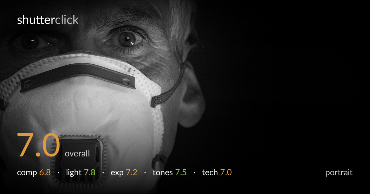
A tense, low-key portrait carried by strong directional light and the pale respirator mask reading bright against deep black. The eyes hold genuine intensity and the monochrome treatment suits the somber mood. What most holds it back is the framing: the face is pushed hard left while the right half is a vast empty black field, and the top of the head is cropped tight. That negative space feels more like dead space than deliberate breathing room. Sharpest detail sits on the mask rather than the eyes, softening the connection a touch. A reconsidered crop and a sharper eye plane would elevate it.
The subject is pushed to the left edge with the entire right half of the frame given to black void. Some negative space builds isolation and mood, but this much reads as imbalance rather than intent, and the right side carries no tension to justify its size. The top crop clips the forehead and hairline tightly, cramping the head. The mask dominates the lower frame effectively, but a placement nearer a vertical third with a touch more headroom would balance the eyes against the void more deliberately.
Hard directional light from the upper left sculpts the face and rakes across the mask, picking out its pleats, texture and the metal nose strip with real dimension. The fall-off into black is dramatic and suits the clinical, ominous subject. Catchlights in the eyes give them life against the surrounding shadow. The trade-off is that the right side of the face plunges into near-total darkness, losing the ear and cheek; a hint of fill or a subtle rim there would preserve form without softening the mood.
Exposure is judged for the mask, which holds detail across its bright surface without blowing out the highlights — the brightest pleats stay just shy of clipping. The deep blacks read as a deliberate low-key choice rather than accidental underexposure, and the shadow side of the face retains enough information to register form. The eyes sit at a readable midtone. The only concern is how much of the frame falls to pure black, which sacrifices any environmental separation, but as an intentional decision it works.
The black-and-white conversion suits the stark, clinical subject and the wide tonal range from the luminous white mask to true black is handled with control. Highlight roll-off on the mask is smooth, holding texture rather than glaring. Shadow depth is genuinely black where it should be. Mid-tone gradation across the skin is a little compressed on the lit side, with the transitions slightly abrupt, but contrast overall is well pitched for the mood. The tonal separation between mask and dark background is excellent.
Focus appears to land on the mask — its valve, pleats and printed text are the crispest elements — while the eyes, the priority in any portrait, sit just behind the plane of sharpest focus and read marginally soft. With the face turned and the mask projecting forward, a narrow depth of field placed on the nearest plane left the eyes wanting. Stopping down slightly, or shifting the focus point onto the near eye, would bring the gaze into full crispness without losing the mask detail. Noise is well controlled in the lit areas; the deep shadows are clean rather than mottled, suggesting a sensible ISO. The hard light source and resulting specular detail on the mask are rendered without harsh artifacting. Overall execution is solid and the low-key handling is technically clean — the single weak link is the focus priority. For a portrait, the eyes earning the sharpest plane would make the strongest difference, and it is an easily correctable choice on a reshoot.
what would elevate it
tags
Shot something like this?
Expert photo critique, on demand — scored across six categories, EXIF-aware. Start with 3 free critiques, no credit card.
critique my photo — free