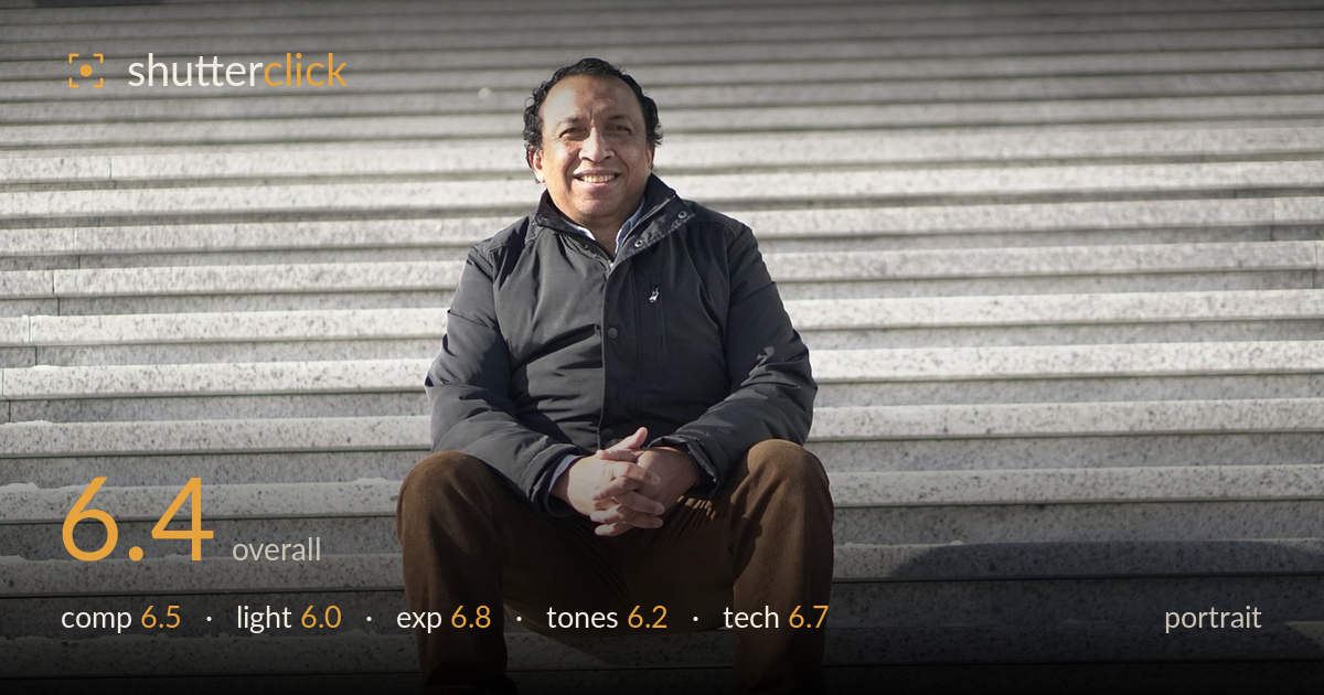
Man smiling on granite steps
Photo by u_ufq3pzxywi

No EXIF metadata in this file
Technical analysis based on visual assessment only.
A relaxed, genuinely warm portrait let down mainly by flat midday light and a background that competes with the subject. The horizontal step lines run edge to edge and pull the eye across the frame, and the receding staircase gives a pleasant repeating texture, but the pale granite and the subject's dark jacket share too much of the tonal load without much separation. The expression is the strongest asset — an unforced, engaged smile that carries the image. Softer directional light and a tighter, less symmetrical framing would turn a competent snapshot into a portrait with real presence.
The subject sits near dead-centre with the staircase forming strong horizontal bands, which gives order but also a static, symmetrical feel. The receding steps offer texture and lead the eye, yet they also slice repeatedly through the frame and flatten depth. There is generous headroom above and space at the feet — a slightly tighter crop or lower shooting angle would give the figure more command. The clasped hands and folded legs form a stable pyramid that anchors the composition well.
Bright, high, frontal sunlight lights the face fairly evenly but flattens the features and offers little modelling. Shadows fall directly below the subject and under the brow, and there are no catchlights doing much to bring the eyes alive. The light is functional rather than shaping — it renders the scene clearly but adds no mood or dimension. Shooting during golden hour, or turning the subject so light rakes across the face, would sculpt the features far more flatteringly.
Exposure is well balanced overall. The bright granite holds detail without blowing out, and the dark jacket retains texture rather than blocking up — a tricky range handled competently. The face is exposed correctly and skin tones read naturally. Some of the brightest step highlights sit close to clipping but stay recoverable. The midtones on the stone are slightly heavy, keeping the frame a touch grey, but nothing here reads as accidental. A deliberate, controlled exposure across a wide tonal range.
White balance leans neutral-to-cool, which suits the grey granite but leaves the overall palette a little flat and lifeless. The stone dominates as a wash of mid-grey, and the brown trousers and black jacket are the only real colour anchors. Contrast is moderate and skin tones are handled well, warm and believable against the cool surroundings. A touch more separation between the subject and background — through warmth on the skin or a cooler background — would help the figure step forward.
Focus appears accurately placed on the face, with the eyes and smile rendered sharply enough to carry the portrait. Detail in the jacket seams and corduroy trousers holds up well, suggesting a steady capture with adequate sharpness across the subject. The depth of field is deep — the entire staircase stays in focus, which works against subject isolation; a wider aperture or longer focal length would have thrown the steps into soft blur and lifted the subject off the background. There is no visible motion blur or noise concern, indicating clean capture conditions and a well-chosen shutter speed for a static pose. The framing sits fairly level, with the step lines running true across the frame. The main technical limitation is not execution but choice: the everything-sharp rendering suits a documentary record more than a portrait, where separation from that busy repeating background would have served the subject better.
What would elevate it
Tags
Shot something like this?
Expert photo critique, on demand — scored across six categories, EXIF-aware. Start with 3 free critiques, no credit card.
critique my photo — free