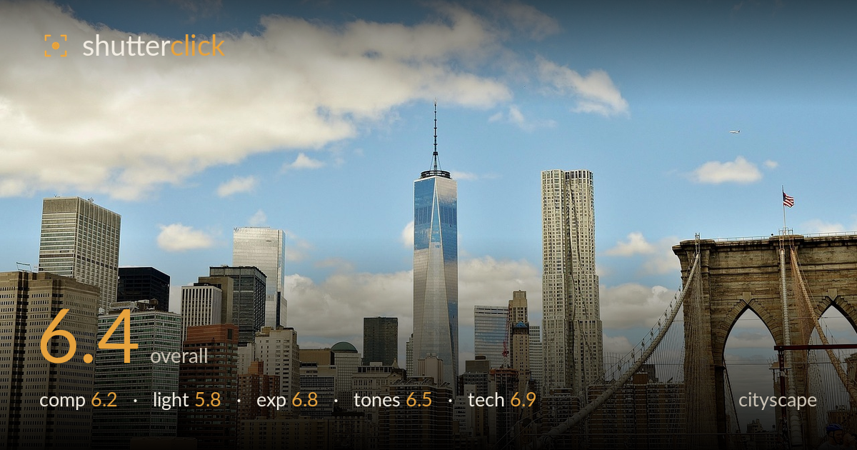
Manhattan skyline from the brooklyn bridge
Photo by GLady

No EXIF metadata in this file
Technical analysis based on visual assessment only.
A clean, well-known view of Lower Manhattan anchored by One World Trade Center, with the Brooklyn Bridge tower providing a strong right-side counterweight. The frame reads clearly and the skyline layering is decent. What most holds it back is flat midday light that leaves the buildings without shape or drama, and a lot of empty sky pushing the actual subject matter into the lower half. A cluttered bottom edge with pipework and cropped figures adds distraction. The bones of a strong image are here; timing and framing are the levers that would elevate it.
The bridge tower on the right gives welcome depth and a sense of place, balancing the skyline block. One World Trade centres naturally and holds the eye. But the sky occupies roughly the top half, leaving the buildings — the real content — compressed low in the frame. The bottom edge is busy and untidy: pipework, railings and partially cropped cyclists clutter the base without contributing. A tighter vertical crop favouring the skyline, or waiting to include the full bridge arch cleanly, would sharpen the intent considerably.
The light is high, hard midday sun, which flattens the buildings and offers little modelling on the facades. Shadows are short and unhelpful, and the skyline lacks the dimensional glow that golden or blue hour would bring. The blue sky and scattered cumulus are pleasant but generic. One World Trade's glass catches some sky reflection, which helps, yet the overall scene reads as a bright record shot rather than a lit composition. Time of day is the single biggest limiting factor here.
Exposure is handled competently. The bright sky retains cloud detail without blowing out, and the buildings hold shadow information across the range. Highlights on the pale stone and glass sit just under clipping. The overall balance is a touch bright but well within a recoverable range, and nothing looks accidentally lost. Midtones on the masonry are readable. A slight reduction in overall brightness would add a little punch to the cloud detail and skyline, but the current rendering is clean.
White balance leans warm on the stone and bridge, which suits the daytime feel, while the sky stays a natural blue. Contrast is moderate and a little flat, consistent with the overcast-free but hazy midday atmosphere. Colours are believable rather than vivid. There's a faint muddiness in the distant skyline that a small contrast and clarity lift would clean up. Overall the palette is coherent — warm architecture against cool sky — but it lacks the saturation and separation that would make the scene sing.
Sharpness is solid across the skyline, with One World Trade and the bridge stonework rendering crisp detail, suggesting a well-chosen aperture and steady capture. Depth of field is appropriately deep for a cityscape, keeping both near tower and distant buildings acceptably sharp. Focus lands on the mid-distance skyline where it should. Noise is not an issue at this apparent light level. The lens choice frames the scene without obvious distortion, and the verticals of the buildings are reasonably upright — the towers do not lean noticeably, which is a credit given the vantage point. The main technical weakness is the cluttered, slightly soft foreground pipework at the base, which pulls attention and adds no value. There's also a small amount of haze softening the far skyline that some capture-stage or post contrast would counter. Cleaner management of the bottom edge and a marginally more deliberate framing would let the technical strengths carry the image fully.
What would elevate it
Tags
Shot something like this?
Expert photo critique, on demand — scored across six categories, EXIF-aware. Start with 3 free critiques, no credit card.
critique my photo — free