Manhattan skyline overview
Photo by noelsch

No EXIF metadata in this file
Technical analysis based on visual assessment only.
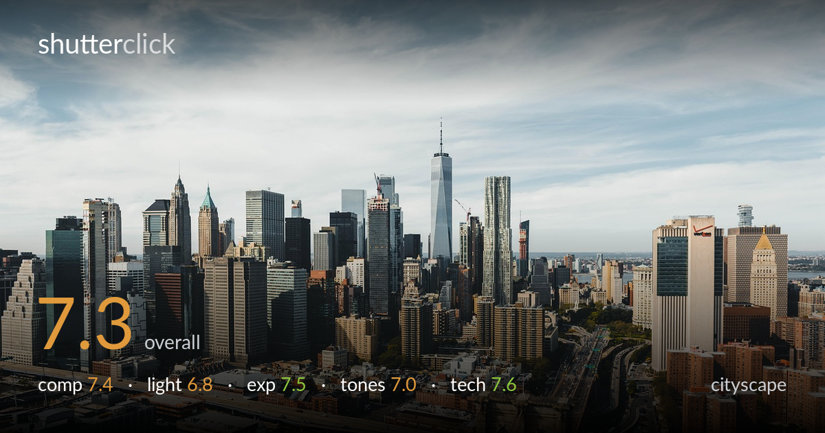
A clean, well-organized aerial of Lower Manhattan with One World Trade as a natural anchor and the Brooklyn Bridge tower providing a strong foreground entry point. The layering from water to dense midground to skyline reads well and the verticals are kept honest. What most holds it back is the flat, diffuse midday light — the sky is busy but lacks drama, and the buildings sit in soft, low-contrast illumination that mutes the city's texture. The bridge tower, placed dead-centre bottom, competes slightly with the skyline for attention. Stronger directional light and a more deliberate foreground placement would lift this considerably.
The frame layers cleanly: water and piers at the base, dense low-rise midground, then the skyline rising to One WTC as the apex. The Brooklyn Bridge tower anchors the foreground but sits centred at the bottom edge, creating a slightly awkward tug against the skyline. The horizon is placed high, giving the city room to breathe, though the busy sky takes nearly half the frame. Verticals stay convincingly upright. Shifting the bridge tower off-centre or lowering the viewpoint to integrate it more would tighten the read.
Light is the weakest element here — flat, diffuse midday illumination filtered through high cloud. It renders the skyline evenly but without the modelling that makes glass and stone come alive. There is some faint side-light catching the bridge tower and warmer building faces, but it lacks the directional bite of golden hour. The sky has texture but no real drama or colour. Shooting near sunrise or sunset, or during the blue-hour transition when artificial lights kick in, would transform the mood and reveal far more dimension.
Exposure is well controlled across a wide dynamic range. Highlights in the bright sky and pale buildings hold without clipping, and shadow detail survives in the darker building faces and water. Midtones sit comfortably, giving an even, readable image throughout. Nothing reads as accidentally under- or over-exposed; the balance looks deliberate. The slightly hazy sky may flatten the histogram's upper end, but that is atmospheric rather than an exposure fault. A touch more contrast in post would give the tonal range more punch.
The colour palette is naturally muted — cool grey-blues in the glass and sky against warmer brick and stone in the foreground. White balance reads neutral, leaning slightly cool, which suits the overcast feel but contributes to the overall flatness. Contrast is gentle, and saturation is restrained. Atmospheric haze softens the distant tones, reducing separation between layers. A subtle contrast lift and a dehaze adjustment would sharpen the distinction between foreground warmth and skyline cool, giving the image more tonal depth and energy.
Sharpness is solid across the frame, with detail holding well from the foreground piers through to the distant skyline — the depth of field appears more than adequate, suggesting a sensibly stopped-down aperture for this kind of aerial scene. Focus lands accurately on the midground cityscape. Noise is not a visible concern, indicating a low ISO and good light. The focal length captures a wide, comprehensive sweep without obvious distortion, and the verticals are kept commendably upright, which is harder than it looks from an elevated angle. The main technical limitation is atmospheric haze softening the far buildings, which is environmental rather than a gear fault. A polariser could have cut some of that haze and deepened the sky, and a slightly tighter crop or longer focal length might have isolated the skyline more powerfully. Overall, execution is clean and competent — the technical foundation is sound, and the image would benefit more from light and timing choices than from any change in handling.
What would elevate it
Tags
Shot something like this?
Expert photo critique, on demand — scored across six categories, EXIF-aware. Start with 3 free critiques, no credit card.
critique my photo — free