Manhattanhenge canyon sunset
Photo by Life-Of-Pix

No EXIF metadata in this file
Technical analysis based on visual assessment only.
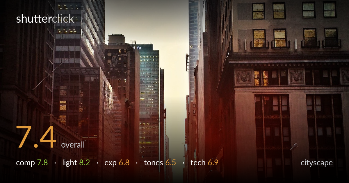
A well-timed Manhattanhenge frame where the sun sits perfectly in the urban canyon, the strongest asset here. The vertical canyon walls funnel the eye straight to the burst at the vanishing point, and the elevated vantage gives the street life a sense of scale. What holds it back most is the heavy red-orange cast and lens flare that overwhelm the lower frame, flattening detail and pushing colour toward the artificial. Cleaner white balance and tighter management of the flare veil would let the geometry and the moment breathe with more credibility.
The canyon framing is the engine of the shot: tall buildings on both flanks compress toward the sun at the vanishing point, a textbook Manhattanhenge alignment. The elevated viewpoint adds layered foreground with traffic and signage. Placing the sun slightly below centre keeps the sky from dominating. The slight rightward lean of the verticals weakens the geometry, and the lamppost rising into the centre-right competes with the burst rather than supporting it. A touch more symmetry between the two building walls would tighten the funnel effect.
The timing is the achievement here — sun centred in the street grid is a narrow window, and it was caught. The low golden light rakes across facades, lighting the right-hand classical building warmly while leaving the left in cooler shadow, which builds depth. The burst itself reads as the natural focal anchor. The trade-off is that the same low sun spawns aggressive flare that smears across the lower third, robbing local contrast. A small aperture or a hand-shaded lens would have controlled it.
Exposure is a reasonable compromise for a brutal dynamic range — the sun's core blows out, which is largely unavoidable, while shadowed facades still hold structure. The midtones in the buildings are placed sensibly. The problem is the flare veil lifting blacks across the street level, leaving the lower frame milky and low in contrast. Highlight clipping around the sun bleeds wider than necessary. A slightly darker base exposure, recovering shadows selectively, would protect the burst and restore punch to the foreground traffic.
The warm grade leans hard — the red-orange wash saturates everything below the skyline, tipping from golden-hour glow into an artificial, near-monochrome red that buries colour separation in the cars and signage. White balance is pushed warm enough that neutral surfaces read orange. The cooler blues in the upper-left towers offer welcome contrast and should be protected. Pulling back red saturation and nudging white balance cooler would recover the yellow of the taxis and the natural stone tones, giving the frame more tonal range.
Sharpness across the building facades is acceptable for what appears to be a small-sensor or phone capture, with the distant tower detail holding up well given the haze. Depth of field is deep, suiting a cityscape where front-to-back focus matters. The main technical liability is the lens flare — a broad red veil and ghosting streaks running diagonally through the lower frame, which softens local contrast and overlays artefacts on the street. This is the kind of flare a lens hood or careful framing to shade the front element would have reduced. There is also mild softening and noise in the shadowed lower-left, consistent with limited dynamic range. Verticals lean slightly right, suggesting the camera wasn't perfectly level — easily corrected with a perspective fix in post. Focus accuracy is fine; the issues are optical contamination from shooting straight into the sun, which is the inherent risk of this exact shot. Stopping down further would also tighten the sunstar.
What would elevate it
Tags
Shot something like this?
Expert photo critique, on demand — scored across six categories, EXIF-aware. Start with 3 free critiques, no credit card.
critique my photo — free