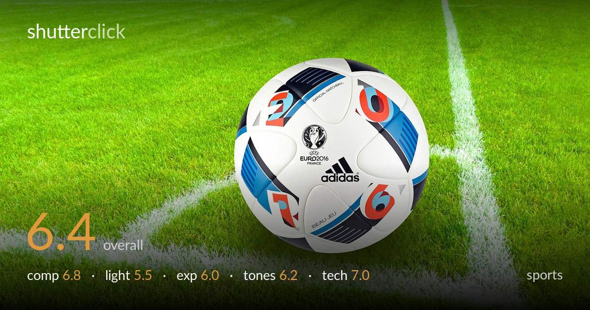
Matchball on the corner arc
Photo by stux

No EXIF metadata in this file
Technical analysis based on visual assessment only.
A clean, product-style still of a Euro 2016 matchball on a corner arc — competently framed and sharp where it counts, but it reads as stock imagery rather than sport. The ball sits slightly above centre with the corner line converging behind it, which gives reasonable depth, but the flat, even light and oversaturated green do most of the talking. What holds it back most is the lack of a moment: there is no action, no player, no tension. As a static subject it is well executed; as a sports image it needs context, light, or motion to earn its place.
The ball is placed just above centre with the white corner lines forming a useful diagonal that pulls the eye through the frame, and the converging lines add a sense of place. The negative space of grass around it is generous but a little undifferentiated — large areas read as empty texture. Lowering the camera further would have given the ball more presence against the field. The logos are legible and well oriented toward the lens, which suits the product-shot intent, though the framing leaves the subject feeling slightly small and static.
Light is flat and broadly even, likely overcast or open shade, which keeps the ball evenly lit but offers little modelling. The roundness is conveyed mostly by the printed pattern rather than by any gradient of light across the surface. There are no strong directional shadows to anchor the ball to the grass, so it floats slightly. A lower, raking side light would have carved out the panel seams and the grass blades, adding texture and a tangible sense of the ball resting on the turf.
Exposure is generally safe, holding detail in the white panels and the printed graphics without obvious clipping on the ball itself. The grass, however, sits very bright and pushes toward the top of the histogram in places, draining some mid-tone separation between blades. Shadow under the ball is shallow and offers little contact information. A touch less exposure overall, or a more careful highlight recovery in post, would restore detail to the brightest grass and give the whole frame more tonal breathing room.
The green is heavily saturated to the point of feeling artificial, which is the dominant tonal issue — it overwhelms the more nuanced colour on the ball. White balance leans slightly cool in the white lines and panels. The blues, reds and blacks of the ball graphics are crisp and well separated, which keeps the subject reading clearly against the green. Dialling back the green saturation and warming the whites a touch would produce a more natural field and let the ball's colours stand out without competing.
Focus is accurate on the ball, with the adidas logo, the UEFA crest and the panel stitching all rendering sharply — the key plane is well chosen. Depth of field is moderate: the foreground and background grass soften gently, which helps isolate the subject without going so shallow that the scene loses context. There is no visible motion blur, appropriate for a static subject, and noise is well controlled in the bright conditions. The grass texture holds fine detail across most of the frame. The main technical limitation is not in execution but intent: as a sports image this is a still product capture, so there is no shutter-speed or panning decision being tested. For what it is, the rendering is clean and competent; a slightly lower shooting position and tighter control of the background would elevate the result further.
what would elevate it
tags
Shot something like this?
Expert photo critique, on demand — scored across six categories, EXIF-aware. Start with 3 free critiques, no credit card.
critique my photo — free