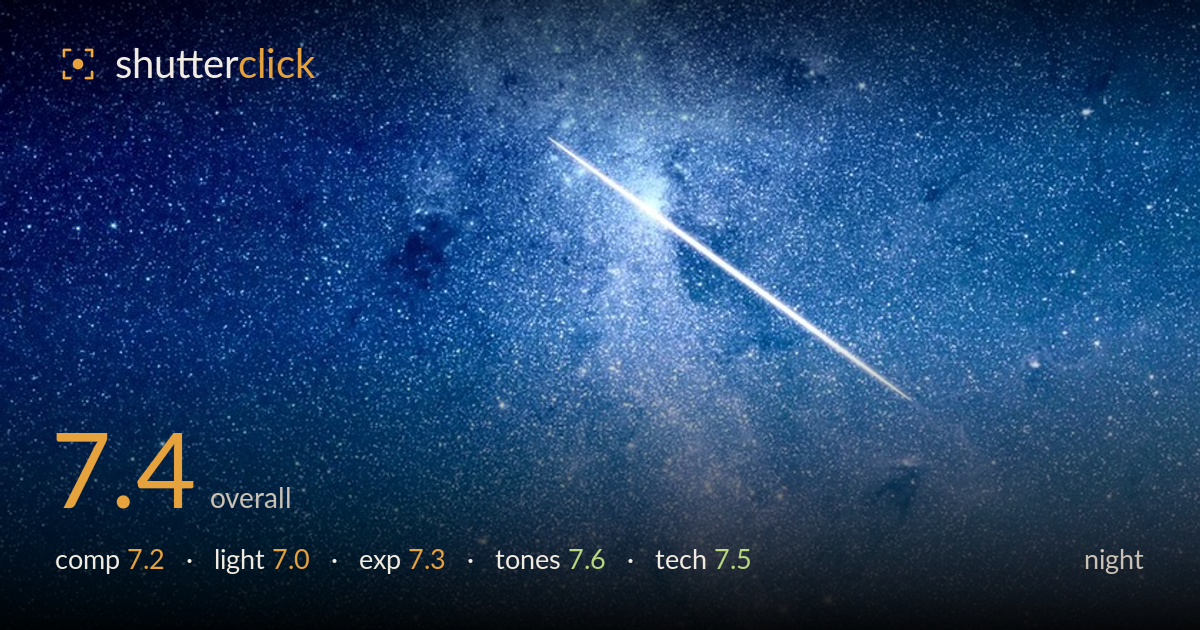
Meteor over the milky way
Photo by promo25

No EXIF metadata in this file
Technical analysis based on visual assessment only.
A well-executed Milky Way frame anchored by a bright, cleanly captured meteor streak crossing the galactic core — a genuine payoff moment that most nightscapes never land. The vertical orientation lets the core rise through the frame with real presence, and star density is rich without turning to mush. What holds it back most is the near-empty foreground: the dark ridgeline reads only as a thin silhouette with no interest, leaving the bottom third dead space. A stronger foreground anchor and slightly more shadow lift on the terrain would give the sky something to stand on and complete the scene.
The vertical framing suits the rising galactic core well, and placing the meteor across the brightest section of the Milky Way gives the eye a clear focal event. The ridgeline sits low, which is the right instinct for sky-dominant work. The weakness is that the ridge is featureless — a flat, empty silhouette that offers no anchor or scale. The lower third becomes dead weight. A recognisable foreground element, a tree or rock breaking the horizon, would tie sky to earth and reward the vertical format.
This is essentially available starlight and the faint glow of the galactic core, and the natural gradient from deep blue up top to a warm band near the horizon reads convincingly. The meteor supplies the single dramatic light accent, and it lands where it counts. There is little the light can do beyond what nature offered here, but the low warm glow near the ridge suggests light pollution rather than airglow — a darker site would deepen contrast in the core and let fainter structure emerge.
Exposure is handled with care for a night scene. The core retains detail and gradient without blowing out, star highlights hold their points, and the meteor streak stays crisp rather than clipping to a featureless white bar. Shadow areas in the ridgeline go fully black, which is acceptable given the silhouette intent but means no recoverable foreground detail exists. The overall balance leans slightly bright in the lower sky from ambient glow. A touch less exposure there, or a graduated adjustment, would preserve more star contrast.
The colour grade is the standout. The blue-to-warm gradient feels natural, the core carries subtle magenta and gold that reads as real nebulosity rather than oversaturated processing, and the star field keeps neutral whites. White balance is well judged — cool enough to feel like night, warm enough near the horizon to avoid a flat monochrome cast. Saturation is restrained. The only caution is the warm band low in the frame, which is light pollution masquerading as tone; a cleaner sky would let the grade breathe.
The capture is technically sound for a nightscape. Stars render as reasonably tight points across most of the frame, suggesting exposure length and focal length were matched to avoid obvious trailing — a common failure point that is handled here. Focus on the stars appears accurate, with the core structure resolving cleanly rather than smearing. Noise is controlled well enough that the dense star field holds together without turning grainy or plasticky from heavy noise reduction; fine stars survive, which indicates a measured processing hand. The meteor is sharp and well defined, a matter of both timing and steady capture. What can't be judged without EXIF is whether stacking was used, but the shadow noise stays clean enough to suggest either a low ISO base or careful reduction. The main technical limitation is the foreground: it sits in pure black with no detail, so any focus or exposure blending for the terrain simply isn't present. A separate foreground exposure would round out an otherwise strong technical result.
What would elevate it
Tags
Shot something like this?
Expert photo critique, on demand — scored across six categories, EXIF-aware. Start with 3 free critiques, no credit card.
critique my photo — free