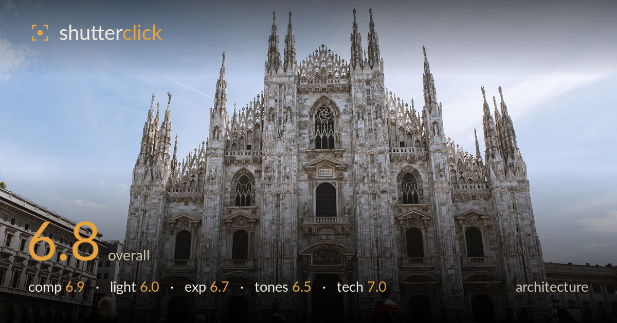
Milan cathedral across the square
Photo by ShenXin

No EXIF metadata in this file
Technical analysis based on visual assessment only.
A confident, symmetrical frontal capture of Milan's Duomo that renders the Gothic facade in impressive detail, but the flat midday light and slight verticals lean hold it back from its potential. The wide-angle low vantage gives grandeur and includes lively square activity, yet the crowd reads as scattered rather than anchoring the eye. The main challenge is timing: overhead sun flattens the marble's texture and leaves the sky pale. Corrected verticals, richer directional light, and a cleaner foreground moment would elevate this from a solid record shot to a genuinely commanding architectural image.
The centred, symmetrical framing suits the Duomo's own axial symmetry, and placing the full facade with breathing room above the spires works well. The flanking buildings on both edges frame the plaza nicely. However, the woman in the floral skirt walking toward the entrance creates a useful central anchor, though the surrounding crowd is busy and unstructured, competing for attention. The lower third is a wide expanse of paving that adds scale but little interest. A cleaner foreground gesture or a lower angle would strengthen the base.
Bright overhead midday sun flattens the marble facade, muting the intricate carving and sculptural relief that this cathedral depends on. Shadows fall short and hard directly beneath ledges, giving little of the raking modelling that reveals Gothic detail. The pale, hazy sky offers weak contrast and no drama. Golden-hour or a lightly overcast sky would render the stone with far more dimension and tonal richness. As is, the light is serviceable and even but does the architecture few favours in showing off its texture.
Exposure is well controlled for a high-contrast daylight scene. The white marble holds highlight detail without blowing out, and the shaded portals and figures retain shadow information. The sky is a touch pale but not clipped. Overall the dynamic range is handled competently, keeping the bright facade and darker crowd both readable. A slightly deeper exposure or graduated adjustment on the sky would add presence, but nothing here reads as accidental — the brightness placement is deliberate and balanced across the frame.
The marble reads believably white with a neutral-to-slightly-cool white balance that suits the stone. The pale blue sky is somewhat washed and lacks saturation, weakening the separation between building and background. Overall contrast is modest, a direct result of the flat light, leaving the mid-tones a little muddy in the facade's detail. A touch more contrast and a boost to the sky's blue would give the image more punch and better separate the spires against their backdrop without looking artificial.
Focus is accurate across the facade, and the deep depth of field keeps both the near crowd and distant spires acceptably sharp, appropriate for architecture. The wide-angle lens captures the full cathedral from a close vantage, but it introduces the expected drawbacks: the verticals lean slightly inward toward the top and there's mild stretching of the flanking buildings at the frame edges. The vertical spires are not quite parallel, which a perspective-correction pass or a tilt-shift approach would resolve. Sharpness holds well into the detailed tracery, suggesting a solid aperture choice and stable capture. Noise is a non-issue in this bright light. The main technical improvement lies in keystoning control — either shooting from further back with a longer focal length to flatten perspective, or correcting convergence in post. Overall execution is clean and competent; the geometry is the one element that separates this from a truly polished architectural rendering.
What would elevate it
Tags
Shot something like this?
Expert photo critique, on demand — scored across six categories, EXIF-aware. Start with 3 free critiques, no credit card.
critique my photo — free