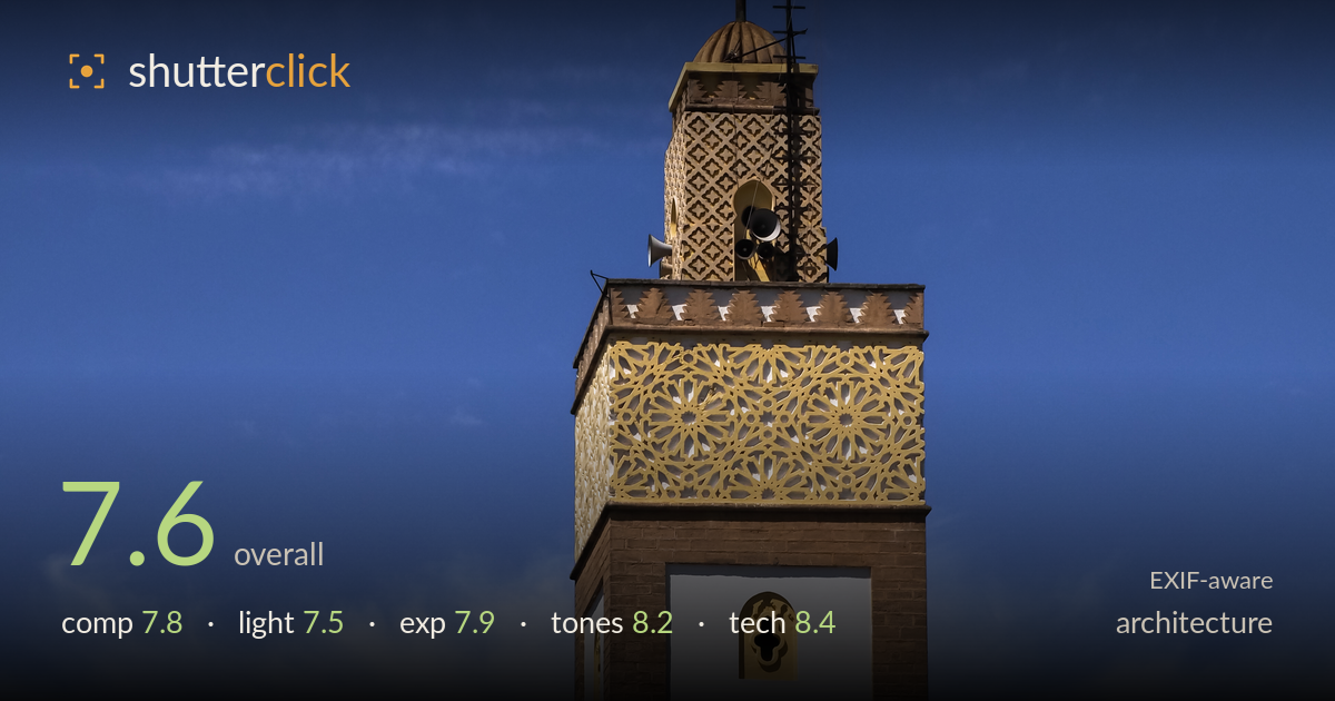
Minaret against a deep blue sky
Photo by Petar Milošević

| Focal length | 41 mm |
| Aperture | f / 8.0 |
| Shutter | 1/2000 s |
| ISO | ISO 200 |
| Exp. comp. | -0.3 EV |
| Shot at | 11:51 · Mar 28, 2024 |
A clean, confident study of a Moroccan minaret against a deep blue sky, carried by strong colour and precise execution. The interplay between the golden filigree, green-tiled roof, and whitewashed foreground wall gives the frame a distinctly regional identity. What holds it back is the composition's slightly awkward tension between the diagonal wall in the lower right and the vertical tower — the two elements compete rather than resolve. The minaret is also cut tight against the left edge of the wall, and a touch more breathing room would let the geometry read cleaner. Colour and technique are the standout strengths here.
The vertical framing suits the minaret and the diagonal of the white parapet adds welcome dynamism, leading the eye up toward the tower. The green-tiled roof provides a strong colour and textural mid-ground. However, the tower sits almost centred horizontally and the wall's peak crowds close to its base, creating a slightly cramped junction where the two forms meet. The layering of foreground wall, tiled roof, and tower is well conceived, but a step left or a wider gap would separate the competing verticals and give the geometry more room to breathe.
Light is clean, directional side-lighting from the upper left that models the tower's facets and brings out the relief in the golden fretwork and stucco starbursts. The green tiles catch enough sheen to read as glazed ceramic. The rendering is a touch flat and high in the sky's brightness, and midday-adjacent light leaves the white surfaces somewhat clinical rather than warm. Late-afternoon light would deepen the gold and add warmth to the whitewash, but the current conditions keep detail intact across the ornate surfaces without harsh, blocked shadows.
Exposure is well judged for a bright scene with expansive white surfaces and a saturated sky. The -0.3 EV compensation protects the whitewashed wall from clipping while holding the blue's density, and highlight detail survives in the gold and pale plaster. The tiled roof retains texture in its shadowed valleys. Nothing appears crushed or blown, and the histogram spread looks deliberate and controlled. The whites sit just below pure white, which is the right call for detail retention while keeping the render bright and airy against the deep sky.
This is the strongest aspect — the colour relationships are the image's engine. The deep gradated blue sky, the emerald glaze of the tiles, the warm gold filigree, and the neutral white plaster form a rich, complementary palette that feels authentically Moroccan. White balance is accurate; the whites read clean and the blue avoids oversaturation despite its depth. Contrast is well controlled, holding both the bright wall and the shadowed roof valleys. The wispy cirrus adds subtle tonal variation across an otherwise clean sky. Saturation is confident without tipping into artificiality.
The settings are well matched to the subject. At f/8 on the 12-100mm, depth of field is ample for this distant architectural subject, holding the tower's fretwork and the foreground wall equally sharp, and f/8 sits near the lens's optimal aperture for corner-to-corner resolution. ISO 200 keeps the file clean with no visible noise, giving smooth gradation in the sky. The 1/2000s shutter is far faster than needed for a static subject — 1/500s would have sufficed — but it does no harm at base ISO. Focus is accurate on the tower's detail, and the 41mm focal length gives a natural perspective that compresses the layers without exaggeration. Vertical lines on the tower stay largely upright, suggesting careful camera alignment or minimal correction was needed, though a slight lean is detectable. Overall a technically assured capture: the gear choices are sound and execution is clean, with only the redundant shutter speed as a minor inefficiency.
What would elevate it
Tags
Shot something like this?
Expert photo critique, on demand — scored across six categories, EXIF-aware. Start with 3 free critiques, no credit card.
critique my photo — free