Moody escalator ascent
Photo by 652234

No EXIF metadata in this file
Technical analysis based on visual assessment only.
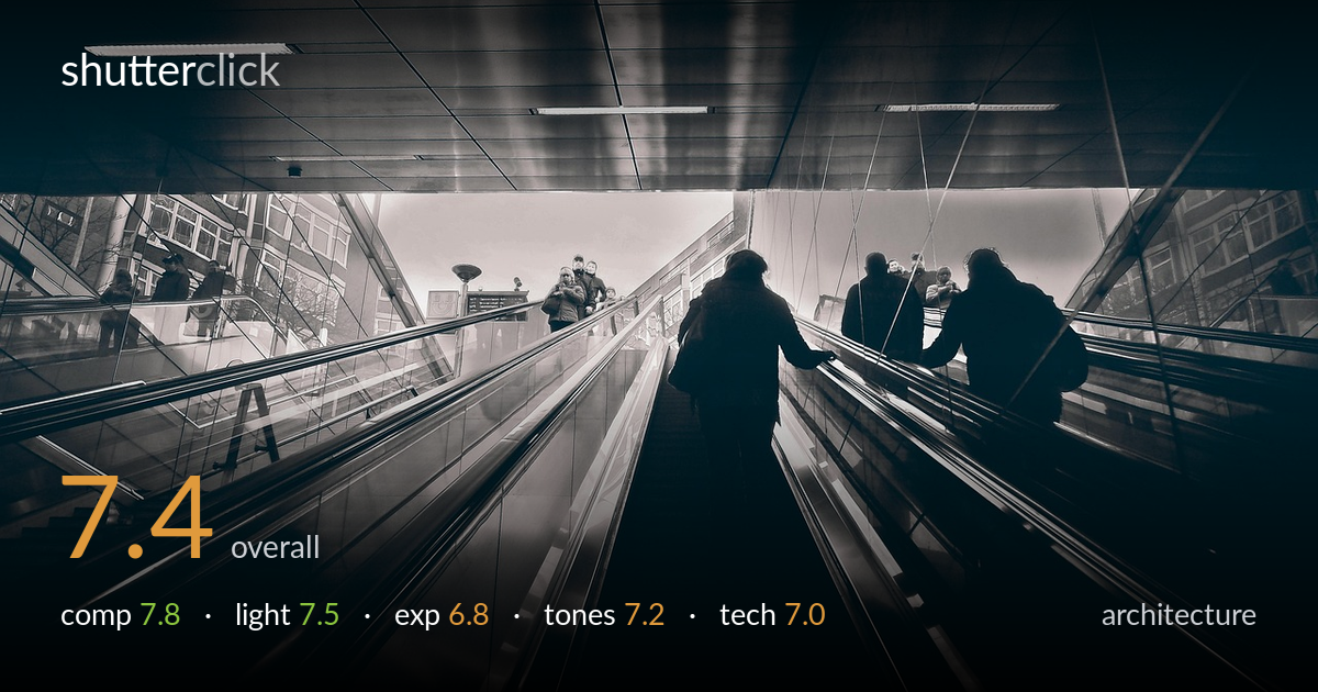
A strong low-angle perspective turns a mundane transit escalator into a converging tunnel of lines, with the central silhouetted figure anchoring the eye precisely where the rails meet the bright exit. The wide lens and upward viewpoint create genuine drama and depth. What most holds it back is the bright sky at the top, which blows out and flattens the upper transition zone, and a slight tilt that softens the otherwise rigorous geometry. The mood is moody and atmospheric, but the deep shadows swallow detail in the ceiling and lower steps that could have added structure.
The escalator rails form powerful leading lines that converge toward the bright upper opening, pulling the eye through the frame with real momentum. The central walking figure sits at a natural focal point where the rails meet the light. The low, upward angle exaggerates the architecture and is the image's chief strength. The flanking figures on the right balance the lone silhouette on the left. A very slight clockwise tilt unsettles the otherwise strong symmetry, and the dark ceiling consumes a large share of the upper frame without much payoff.
The backlighting is the engine of the image, rimming the rails and reducing the figures to clean silhouettes against the bright station opening. Overhead fluorescent strips add directional streaks across the ceiling that reinforce the perspective. The contrast between the dim foreground tunnel and the blown exit creates atmosphere and a strong sense of emerging into light. The trade-off is that the brightest zone offers no detail, so the architectural transition at the top reads as a flare rather than a defined space.
Exposure is built around the silhouette, and as an intentional choice it largely works. The bright upper opening clips hard, however, losing the building forms and structure visible behind the glass on either side. Shadow detail in the ceiling and lower steps is crushed into near-black, sacrificing the texture of the panels and treads. A slightly more restrained exposure, or a bracketed blend, would have held the highlight transition while preserving more of the architecture that frames the scene.
The monochrome conversion suits the industrial subject, and the split-toned, slightly warm cast adds a moody, filmic atmosphere. Mid-tone gradation in the metallic rails is handled well, with subtle reflections tracing the curves. Contrast is pushed firmly, which builds drama but also accounts for the blocked shadows and the bleached highlight. The tonal range is compressed at both ends; a gentler highlight roll-off would recover the upper transition, and lifted blacks would reveal more of the floor and ceiling structure.
The wide-angle lens is well chosen for the cramped escalator shaft, exaggerating the convergence of the rails and lending the scene scale. Depth of field is ample, keeping both near steps and distant figures acceptably sharp, which suits the architectural intent. Focus appears to land around the central figure and the converging rails, where it matters most. The deep shadows hide any noise, and the rendering is clean overall. The main technical limitation is the handling of the extreme dynamic range: the blown exit suggests a single exposure pushed past its highlight tolerance, where bracketing or exposing slightly to protect highlights would have preserved the building detail. The slight tilt is a small handheld imperfection that could be corrected in post with a level adjustment. Wide lenses also introduce mild barrel distortion in the rails near the edges, which lens-correction profiles would straighten for a cleaner geometric read.
What would elevate it
Tags
Shot something like this?
Expert photo critique, on demand — scored across six categories, EXIF-aware. Start with 3 free critiques, no credit card.
critique my photo — free