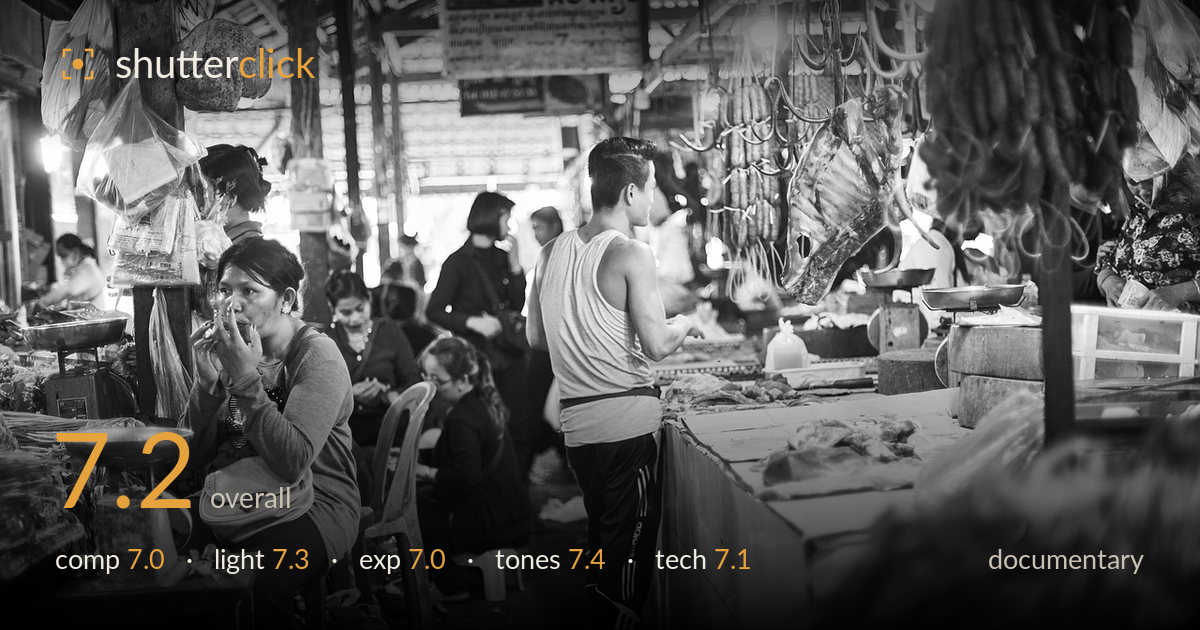
Morning at the market stalls
Photo by Engin_Akyurt

No EXIF metadata in this file
Technical analysis based on visual assessment only.
A layered market scene that captures genuine daily life with strong atmosphere. The hanging meat, scales, and busy stalls build authentic context around two clear human anchors: the seated woman on the left and the standing man in the tank top. The composition is dense but reads well thanks to the depth of hanging goods and receding roofline. What holds it back is a slight ambiguity of focus — the eye splits between the woman and the man without a decisive gesture to unify them. Tightening the moment and cleaning the busy right-edge foreground would sharpen the narrative.
The frame divides into two competing zones: the woman applying makeup at left and the man facing the meat stall at center-right. Both are worthy anchors, and the hanging sausages, meat hooks, and stacked scales layer real depth into the scene. The receding roofline and background figures add welcome recession. The out-of-focus produce mass at bottom-right is a heavy dead weight, though, crowding the corner without adding information. A slightly higher angle or a step left would let the two subjects relate rather than sit as separate vignettes.
The soft, diffused overhead market light is handled well — it wraps the faces and the man's shoulders without harsh shadow, which suits the candid mood. The bright openings at the back and the overhead lamp give the scene a natural glow and a sense of the covered space breathing. The tank top holds gradation nicely under this even illumination. The one weakness is flatness: the lighting is even enough that some subjects lack separation from equally-toned backgrounds, and a shaft of directional light would have added drama.
Exposure is well balanced for a high-contrast interior. The background doorways are bright but not blown to distraction, and shadow detail survives in the darker stalls and clothing. The seated woman's face is exposed cleanly, holding skin tone and expression. Some deeper shadow areas at the lower left go nearly black, but they carry no critical detail, so this reads as a reasonable trade to protect the midtones. Overall the histogram sits comfortably, with no accidental murk and no reckless highlight loss in the main subjects.
The black-and-white conversion suits the reportage subject and unifies a visually chaotic scene. Mid-tone gradation is the strength here — skin, fabric, and the metal scales all separate cleanly, and the contrast is judged to keep both bright doorways and shadowed stalls legible. Highlight roll-off on the back openings is graceful rather than clipped. The overall tonality leans slightly flat in the middle, and a touch more local contrast on the two main figures would lift them off the equally-grey backdrop. A solid, honest grade.
Focus appears placed on the mid-plane, with the seated woman and the standing man both acceptably sharp, while the produce in the extreme foreground and some background figures fall soft — consistent with a moderately open aperture that gives useful subject separation in a cluttered space. That shallow-ish depth of field is a sensible choice for isolating people from the visual noise of the market. Sharpness on the woman's face and hands holds up well enough to read the gesture of applying makeup. Noise is well controlled given the dim interior, suggesting the ISO was kept reasonable, and there is no obvious motion blur despite the moving crowd, so the shutter speed handled the scene. The lens choice gives a natural, immersive field of view that places the viewer inside the market. The main technical limitation is that the foreground produce mass is soft and prominent enough to distract; a slightly different position would have let that blur work rather than dominate.
What would elevate it
Tags
Shot something like this?
Expert photo critique, on demand — scored across six categories, EXIF-aware. Start with 3 free critiques, no credit card.
critique my photo — free