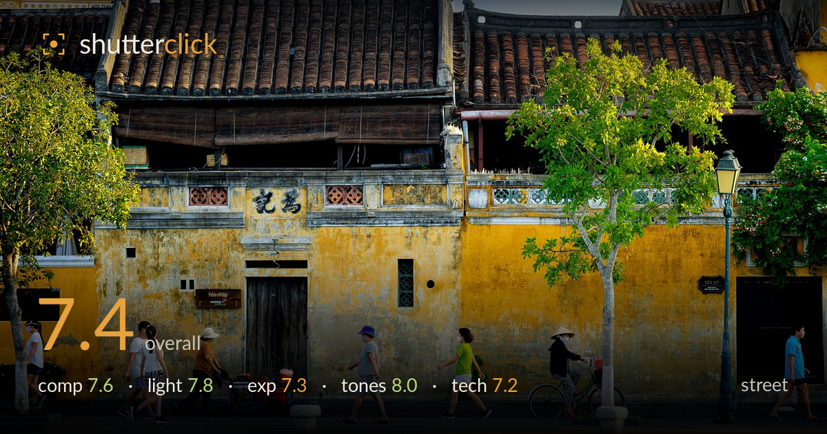
Morning walk past the ochre wall
Photo by tienthinhphoto

No EXIF metadata in this file
Technical analysis based on visual assessment only.
A well-observed frontal street scene where the ochre wall and weathered tiled roofs of Hoi An do most of the storytelling, while a row of figures parades across the base like a frieze. The layered rhythm of walkers, the conical-hatted vendor and cyclist among them, gives the strip of pavement a documentary charm. What holds it back is that the human moment is thinly spread — everyone in mid-stride, none anchoring the eye, and figures cropped tight at the edges. Strong colour and clean light carry it; a tighter grip on the decisive moment would lift it further.
The strong horizontal architecture is well handled — the wall, roofline and pavement stack into clean bands, and the trees break the mass at left, centre and right. The line of walkers forms a lively lower register. The weakness is that the human interest is evenly distributed rather than resolving to a focal moment; the eye scans left to right without landing. Figures are clipped at both edges, and the central doorway, which could anchor the frame, sits half-hidden behind a walker. A moment with clearer interaction would sharpen it.
Warm, low side light rakes across the yellow wall and sets the tiled roofs glowing, with the blue sky above giving a pleasing complementary lift. The direction reveals the wall's texture and the depth of the roof brackets nicely. Shadows fall soft and open on the figures, keeping faces readable under the hats. The tree foliage is caught with good backlight sparkle at left. Slightly harder contrast in places on the roof, but overall the timing near golden hour serves the scene's colour and mood well.
Exposure is largely well judged for a high-contrast scene. The bright sky retains its blue without blowing out, and the sunlit yellow wall holds colour rather than clipping. Shadow areas under the roof eaves and in the recessed upper storey go quite dark, swallowing some architectural detail, but that reads as an acceptable trade to protect the highlights. The figures' faces are held in printable midtones. A touch more shadow recovery under the eaves would reveal the timber structure without flattening the overall tonal weight.
The colour is the standout. The saturated ochre wall, terracotta roofs and green foliage against a clean blue sky make a rich, cohesive palette that speaks of the location. White balance sits warm and appropriate for the light. Contrast is punchy without crushing, and the greens are lively rather than garish. The figures' clothing — greens, blues, whites — punctuates the base without fighting the wall. Saturation is pushed but stays credible. A hair less vibrance on the yellow would keep it from edging toward the artificial.
Sharpness across the wall and roof detail is good, suggesting a well-chosen aperture with enough depth of field to hold the flat frontal plane crisp from edge to edge. The figures along the base are rendered sharply enough to read gesture and clothing, indicating a shutter speed adequate to freeze the walking pace — no smearing in the strides. Noise is not an issue in this bright light, pointing to a low ISO. The lens handles the wide horizontal field with only mild distortion; verticals stay reasonably upright, which matters given the strong architectural lines. Focus appears set on the wall plane, and since the subjects share roughly that distance, they hold acceptable sharpness. The main technical limitation is the framing decision rather than execution: figures cropped mid-body at both edges, and no single point of critical focus emphasised. A moment where one figure was caught at a peak of gesture, sharply resolved, would give the technical craft a clearer payoff.
What would elevate it
Tags
Shot something like this?
Expert photo critique, on demand — scored across six categories, EXIF-aware. Start with 3 free critiques, no credit card.
critique my photo — free