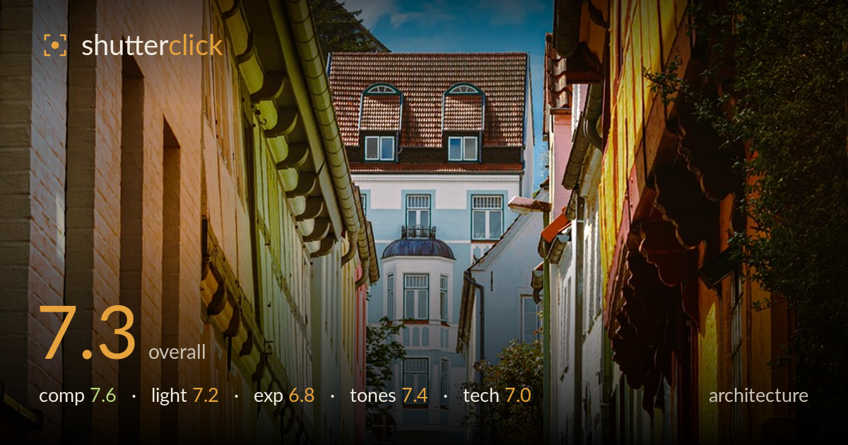
Narrow lane through the old town
Photo by Bluetenkuss

No EXIF metadata in this file
Technical analysis based on visual assessment only.
A well-observed narrow-street perspective that uses the converging paving and flanking facades to pull the eye deep toward the pale building at the end. The strong central vanishing point gives the frame purpose, and the colour contrast between the ochre left wall and the golden-lit right facade adds warmth. What most holds it back is the near-central symmetry combined with slightly clipped highlights in the sky and the wet foreground running a touch dark. A cleaner vertical alignment and gentler highlight handling would lift a solid, atmospheric composition into a genuinely refined architectural study.
The receding cobblestone path is the frame's backbone, drawing the eye cleanly to the terminating white building — a classic and effective one-point perspective. The flanking facades funnel attention well. Placement is close to dead-centre, which suits this converging-corridor treatment but leaves the composition feeling symmetrical to a fault; a slight offset would add tension. The large sky area at top is a little empty relative to the interest below, and the green vehicle at mid-distance sits awkwardly as an unintended focal snag.
Directional daylight rakes across the right-hand yellow facade, giving it a warm glow that contrasts nicely with the shaded, cooler left wall — good use of the light's angle to separate the two sides. The overcast-to-broken sky softens shadows in the street, keeping detail readable. However, the light on the terminal white building is flat, muting the very element the composition points toward. Warmer, lower-angle light on that end building would have rewarded the perspective more fully.
Overall exposure is reasonable, holding facade detail across a wide range of surfaces. The sky, though, shows blown patches around the brightest cloud edges, sacrificing tonal information in the upper frame. The wet foreground paving falls into deep shadow, losing texture in the lower corners where the eye enters. Bracketing or a graduated adjustment would have balanced the bright sky against the dark stone, and lifting the foreground shadows slightly would preserve the reflective wet-cobble detail that adds mood.
The colour palette is the image's strength — saturated ochre and gold facades against blue sky and cool white stonework create a satisfying warm-cool balance. White balance reads accurate, with believable brick and tile hues. Contrast is punchy without crushing the mids too aggressively. The saturation in the yellows edges toward vivid but stays this side of overcooked. The wet paving picks up subtle warm reflections that tie the foreground to the buildings, though the darkest stone areas go slightly muddy.
Sharpness is good through the mid-ground facades and the terminal building, with fine detail visible in the tile roofs, dormer windows and brick courses — evidence of a competent aperture choice keeping depth across the corridor. Focus appears set well into the scene, which suits the deep perspective. The foreground paving softens slightly at the very bottom, suggesting the near plane fell outside critical focus, though for architecture this matters little. No obvious motion blur or noise intrudes, so a low ISO and stable capture are likely. The main technical shortfall is verticals: the flanking buildings lean inward from lens perspective and the frame is not perfectly level, giving a mild keystoning that architectural work is judged strictly on. A slightly narrower framing or perspective correction in post would tidy the converging parallels. Overall a technically clean capture whose execution is solid but not fully disciplined on the geometry front.
What would elevate it
Tags
Shot something like this?
Expert photo critique, on demand — scored across six categories, EXIF-aware. Start with 3 free critiques, no credit card.
critique my photo — free